| If you find WORDS helpful, Bitcoin donations are unnecessary but appreciated. Our goal is to spread and preserve Bitcoin writings for future generations. Read more. | Make a Donation |
About The Bitcoin Financial Journal
 This special journal is a collection of Bitcoin valuation models and indicators. Special thanks to Adam Taché for your epic tweetstorms collecting these models.
WORDS is a monthly journal of Bitcoin commentary. For the uninitiated, getting up to speed on Bitcoin can seem daunting. Content is scattered across the internet, in some cases behind paywalls, and content has been lost forever. That’s why we made this journal, to preserve and further the understanding of Bitcoin.
Donate + Download the Bitcoin Financial Journal
Remember, if you see something, say something. Send us your favorite Bitcoin commentary.
On-Chain Valuation Models
Introducing Realized Capitalization
By the Coinmetrics Team
Posted December 14, 2018
The motivation for the creation of Realized Cap was the realization that “Market Capitalization” is often an empty metric when applied to cryptocurrencies. Market Capitalization, borrowed from the world of equities, is calculated for cryptocurrencies as
circulating supply * latest market price
However, unlike with equities, large fractions of cryptocurrencies tend to get lost, go unclaimed, or become otherwise inert through bugs. By design, there is no Depository Trust and Clearing Corporation which keeps track of everyone’s stock certificates. So when tokens or virtual coins get lost, they stay lost. In Bitcoin, this means that roughly 15% of supply is assumed to be permanently lost and out of circulation. Market Cap does not consider these nuances, instead aggregating the value of all coins ever mined and assessing them at the last market price.
We wanted to create a measure that reflected this, at least for UTXO chains. Our design goals were as follows:
- De-emphasize lost coins
- Where possible, maximize generalizability (so reduce reliance on idiosyncratic adjustments)
- Do not deviate from Market Cap by more than a single order of magnitude
The eureka moment came when Pierre Rochard asked for data on a historically-weighted UTXO market cap for Bitcoin. This was mentioned to Coinmetrics engineer Antoine Le Calvez, who figured out an appropriate methodology and also dubbed it “Realized Capitalization.” (It was previously called “Effective Cap”.) Realized Cap seemed to fit the bill:
- It reduces the contemporary impact of long-lost coins
- It is trivially generalizable to UTXO chains, and, with some effort, generalizable to account chains
- It doesn’t deviate from Market Cap by too much
- It is automated: it doesn’t require (much) human oversight or intervention
When we first worked out the numbers in September, Bitcoin’s Market Cap was $115 billion and its Realized Cap $88 billion. That seemed to make sense. Deriving new metrics from scratch is always tricky, so they need to pass the smell test too. Realized Cap seemed to do just what it said on the tin: weight coins according to their actual presence in the Bitcoin economy. It is one of a new generation of economic measures which hybridizes market and on-chain data.
Of course, exotic new measures are not without risks. There are a few challenges here: dealing with deep-cold-storage coins, interpreting Realized Cap for coins with little turnover, and generalizing it to account based coins.
First, imagine Satoshi’s ~ 700k-1m coins really were just in deep storage, and our dear leader was planning on spending them all on Bitcoin’s 10th birthday – Jan. 03 2019. In that case, Realized Cap would be seriously underweighting the economic weight of Bitcoins in circulation, since it prices those long-lost coins at 2009 values… of $0 per BTC. Realized Cap has a hard time differentiating between truly lost/abandoned coins and coins that are merely in yearslong deep cold storage. However, even the coldest of storage schemes do require periodic awakenings – to renew a multisig scheme, to take advantage of a fork, or to cash out a portion. So many of these accounts will have some amount of churn anyway.
Another issue is Realized Cap on smaller chains. Outside of the industry “blue chips,” there are many chains with relatively little turnover. This poses a challenge for Realized Cap, as it is the sending of new coins that triggers the upwards (or downwards) revaluation at a new price. One common phenomenon we observed was price spikes, with many coins getting sent back and forth to exchanges, and an increase in Realized Cap, followed by a slow, low-velocity grind down where Realized Cap hardly moves. In this case the high Realized Cap was more of an artifact of the low turnover rather than a fair reflection of the network’s pricing.
So how is Realized Cap calculated?
The realized cap attempts to improve on the market cap by trying to discount coins that might be lost. Its crux is to value different part of the supplies at different prices, instead of using the daily close as market cap does.
For UXTO coins, this consists in valuing outputs at the price at the time of their creation. For example, for a UTXO currency of supply 10 and market price of $10, its market cap would be $100. But if the UTXO set is as follows:
| Value | Time of creation | Price at time of creation | USD Value at time of creation |
|---|---|---|---|
| 8.3 | 2009-02-01 | $0.00 | $0.00 |
| 1.2 | 2011-03-17 | $1.00 | $1.20 |
| 0.5 | 2018-11-15 | $10.00 | $5.00 |
Its realized cap would be $0.00 + $1.20 + $5.00 = $6.20 or 6.2% of its market cap as 83% of the supply hasn’t moved for years.
Extension to account based chains
Extending this metric to account based coins is a bit more complex. Instead of a list of unspent coins, the state in this case is represented as a list of accounts:
| Account | Balance |
|---|---|
| 0xabc | 8.3 |
| 0xdef | 1.2 |
| 0xfad | 0.5 |
Compared to the UTXO model, it is not possible to always assign a time of creation to a balance which makes assigning it a price, and thereby a value, hard.
Let’s take an example transaction history for an account and see what methods can be used to accurately value its balance. We’ll assume the current time is 2018-11-01 and the market price is $150.00
| Time | Change in balance | Price at time | Balance |
|---|---|---|---|
| 2015-08-01 | +1,000.00 | $0.01 | 1000.00 |
| 2016-02-01 | +100.00 | $10.00 | 1100.00 |
| 2017-05-01 | -50.00 | $50.00 | 1050.00 |
| 2017-12-17 | -100.00 | $1200.00 | 950.00 |
| 2018-04-01 | +20.00 | $200.00 | 970.00 |
From this data, several approaches can be used to value the balance:
Last movement price
We use the price at the last movement on the account: here $200.00, this gives a realized balance of $194,000.
This values accounts when they are active at all on the network. However, if someone sends dust to a lost account, its whole balance is re-valued at the current market price.
Last outgoing movement price
To avoid lost accounts being re-valued when someone sends money to them, we can use the price of the last time it had an outgoing movement (defaulting to the creation of the account if no outgoing payment).
In our case, this price is $1200.00, the realized balance would be $1,164,000.
Virtual UTXO
One downside of using the last movement price is that an account which has a very high balance and sends a tiny amount out would trigger a re-valuation of the whole balance at market price.
While it’s the desired effect (after all, we just want to discount lost coins), it is unfair to UTXO based chains where the whole balance of an address is not taken into account for the realized cap, but just the coins used.
To reduce this undesirable effect, we can simulate a UTXO set for account based systems:
- each incoming payment creates a new coin attached to the account, the coin is valued at the price of the movement
- each outgoing payment triggers a coin selection on the coins attached to the account, the change is valued at the current market price
Let’s replay the example account’s history while maintaining this virtual UTXO, the coin selection we’ll use is largest coins first:
| Time | Change in balance | Price at time | Balance | Virtual coins | Realized balance |
|---|---|---|---|---|---|
| 2015-08-01 | +1,000.00 | $0.01 | 1000.00 | (1000.0 at $0.01) | $10.00 |
| 2016-02-01 | +100.00 | $10.00 | 1100.00 | (1000.0 at $0.01), (100.00 at $10.00) | $1,010.00 |
| 2017-05-01 | -50.00 | $50.00 | 1050.00 | (100.00 at $10.00), (950.00 at $50.00) | $48,500.00 |
| 2017-12-17 | -100.00 | $1200.00 | 950.00 | (100.00 at $10.00), (850.00 at $1200.00) | $1,021,000.00 |
| 2018-04-01 | +20.00 | $200.00 | 970.00 | (100.00 at $10.00), (850.00 at $1200.00), (20.00 at $200.00) | $1,025,000.00 |
This gives this account a realized balance of $1,025,000.
Using Realized Cap on Coinmetrics
Right now, Realized Cap is only available for UTXO chains – we are still refining it for account-based chains.
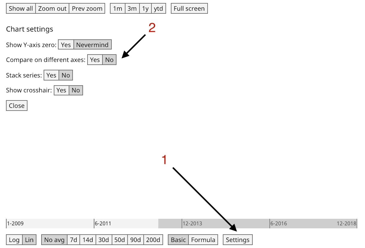
For charting, you can find it on the chart as Realized Network Value (in keeping with our naming convention of using “Network Value” rather than Market Cap). If comparing Realized Cap to Market cap, we recommend hitting settings and selecting no on Compare on different axes.
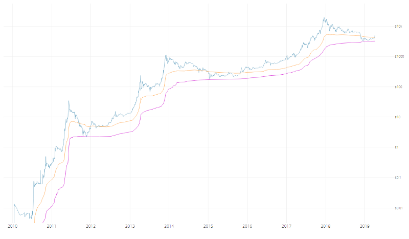
This lets you create nice comparisons like this:
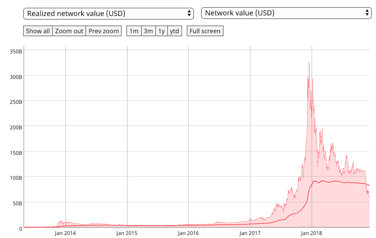
Bitcoin realized network value (solid red line) and network value (shaded area). Link here Keep in mind that on our charts builder page, the command for realized cap is
Ticker.realizedCapUsd
You can also create a ratio of the two.
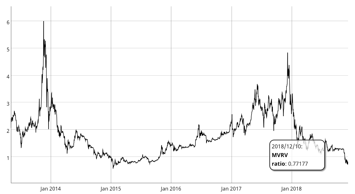 Market cap to realized cap ratio The reasoning behind the ratio has been explored by Murad Mahmudov and David Puell here.
Coin Days Destroyed
By Joaquin Roibal
Posted July 1, 2018
The idea of “bitcoin days destroyed” came about because it was realised that total transaction volume per day might be an inappropriate measure of the level of economic activity in Bitcoin. After all, someone could be sending the same money back and forth between their own addresses repeatedly. If you sent the same 50 btc back and forth 20 times, it would look like 1000 btc worth of activity, while in fact it represents almost nothing in terms of real transaction volume.
With “bitcoin days destroyed”, the idea is instead to give more weight to coins which haven’t been spent in a while. To do this, you multiply the amount of each transaction by the number of days since those coins were last spent. So, 1 bitcoin that hasn’t been spent in 100 days (1 bitcoin * 100 days) counts as much as 100 bitcoins that were just spent yesterday (100 bitcoins * 1 day). Because you can think of these “bitcoin days” as building up over time until a transaction actually occurs, the actual measure is called “bitcoin days destroyed”. This is believed to give a better indication of how much real economic activity is occurring on the bitcoin network.
So how well does it work? Well, it’s still not perfect, because the other day I moved some coins out of a wallet they’ve been in for several months without spending them or giving them away. And some genuine businesses have very rapid turnover in bitcoins, so they’re not being measured well by this method. But it does do a good job of filtering out the “noise” of bitcoins that are just “bouncing around” without really going anywhere. The graph of overall bitcoin days destroyed is believed to show that the genuine level of activity in the Bitcoin economy is continually increasing–it’s not just one person experimenting by rapidly sending the same coins back and forth, flooding the network with meaningless chatter. Looks pretty good, hey?
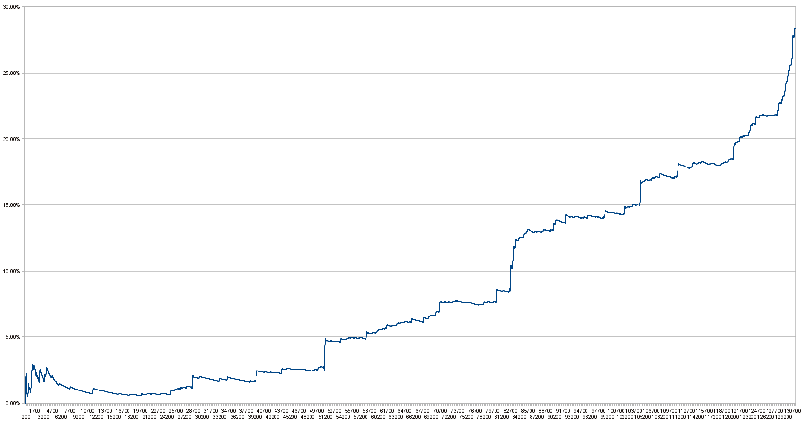
Image from the Bitcoin wiki. The above graph is in percentage of bitcoin days destroyed and a little out of date–for a regularly updated version in bitcoin days destroyed check out Bitcoin Days Destroyed - Active Chart instead!
Experiments on Cumulative Destruction
Two Approaches to Bring Bitcoindays Destroyed Into the Price Domain
By David Puell and Willy Woo
Posted April 9, 2019
Disclaimer: Nothing here should be considered investment or trading advice.
Okay, so this article is now well overdue given the recent price action. BTC never rests! The last few months have been very productive in terms of discovering new valuation metrics based on on-chain analytics. The recent proposals using coindays destroyed by Tamas Blummer and the team at Adamant Capital have put this essential metric once again on the map. We thought we’d give it a go at coming up with a way to best translate the concept of destruction into a precise price level for market analysis.
Experiment A: Cumulative Value-Days Destroyed (CVDD) by Willy Woo
When coins move from one investor to another, the transaction carries both a USD value and also destroys a time value relating to how long the original investor held their coins. CVDD tracks the cumulative sum of this value-time destruction as coins move from old hands into new hands as a ratio to the market age. It is calculated with the following formula:
Note that 6 million is used for calibrating the chart. This number is arbitrary and would be different had we used hours or blocks as unit for the age of the market.
CVDD has hit the historical Bitcoin price bottoms with remarkable accuracy.
 CVDD
CVDD
Unlike delta cap, CVDD tends to consistently climb in value — this becomes useful to frame an increasing lower bound for a market bottom during bear seasons when the market price is falling.
When used in conjunction with the top price model, CVDD and top price provide upper and lower bands for price action.
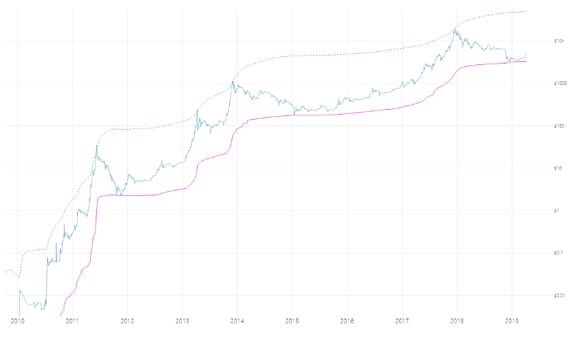 CVDD and top price
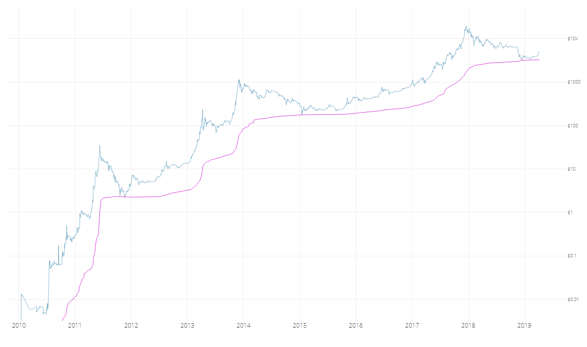
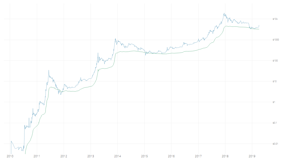
When used in conjunction with Coinmetric’s realized price, CVDD can help the visualization of Bitcoin’s accumulation bottoms.
 CVDD and realized price
Both CVDD and realized price have remarkable resemblances in shape, so it is no coincidence that they both use HODL time by the investor in their calculation. It is important to note that both CVDD and top price are interesting curiosities, and are not guaranteed to work in future cycles.
Experiment B: Transferred Price and Balanced Price by David Puell
Instead of using a 6-million figure, transferred price uses supply to bring destruction into the price domain:
Looking at this as a life-to-date moving average of spending behavior (again, old hands selling into new hands), it can be assumed that when subtracted from realized price (the average paid for all coins in the market), a “fair” valuation measure emerges. Balanced price denotes the level at which, during bear markets, a full detox has been achieved — market price matching what was paid minus what was spent.
 Balanced price
It goes without saying that this evokes delta price in both calculation and visualization. We believe that delta serves as a technical analysis proxy of balanced price. The former seems to be agile enough to catch exact bottoms — the “wicks” — while the latter catches the full accumulation level prior to the bull run, also defining the brief moment when price remains below it as “capitulation.”
More iterations on coindays destroyed to follow. Stay tuned…
Sources
- Woobull.com : Charts and early price data archeology.
- Coinmetrics.io : Realized price data.
- Blochchair.com: Coindays destroyed data. Authors
- Willy Woo, on-chain analytics pioneer @Woobull.com.
- David Puell, Head of Research @ Adaptive Capital.
Bitcoin Delta Capitalization
A New View of BTC Long-Term Valuation
By David Puell
Posted February 14, 2019
Disclaimer: Nothing contained in this article should be considered as investment or trading advice.
As a follow-up to Willy Woo’s recently-introduced Bitcoin Valuations live chart, this article aims to present delta cap with the goal of answering two of the most pressing questions in speculators’ minds at the present moment:
- Where is the bottom?
- When is the next bull run coming along?
Something’s Amiss
Two sets of items originated the search for what later became delta cap:
- Awe and Wonder’s studies on Bitcoin’s logarithmic regression and Plan B’s studies on Bitcoin’s power regression (R² of 0.93 and 0.95 respectively), which seem to suggest that the BTC trend is increasing at a decreasing rate.
- Murad Mahmudov’s exploration of historical moving averages, expressing a dissatisfaction with any particular SMA or EMA as definitive enough to “catch the bottom” in every bear cycle.
This initiated the search for a metric that both adapted to Bitcoin’s rapid, high-velocity parabolic moves and accounted for its overall trend decay over time. Two other valuation models seemed to provide a tentative answer: realized cap for the former and average cap for the latter.
Delta Capitalization
Delta cap is, as seen next, a hybrid of sorts — half “fundamental,” half “technical.” It is calculated through the following formula, measuring the difference between two long-term Bitcoin moving averages:

For the purposes of this piece, let’s review these definitions:
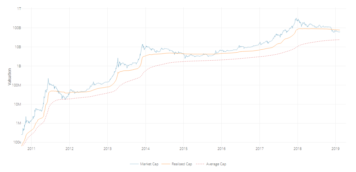
Realized capitalization
Invented and presented by the brilliant team at Coinmetrics, instead of counting all of the mined coins at current price, the coins are counted at the price when they last moved through the blockchain. This approximates the USD value paid for all the bitcoins in circulation. Best put by its co-creator Nic Carter, it can be described as an on-chain volume-weighted average price (VWAP) of BTC.
Average capitalization
Instead of setting a fixed period for calculating a moving average (e.g., a 200-day MA), this is a life-to-date, cumulative simple moving average that serves as the true mean of the whole history of market cap. Due to its “laggy” nature, it is the perfect mechanism to help decay the upward speed of delta cap over time. Shoutout to Renato Shirakashi for first pointing out this average.
Below, a view of both lines, courtesy of Willy Woo:
The aforementioned substraction of the two in turn provides the following delta cap line, both reactive locally and decaying globally:
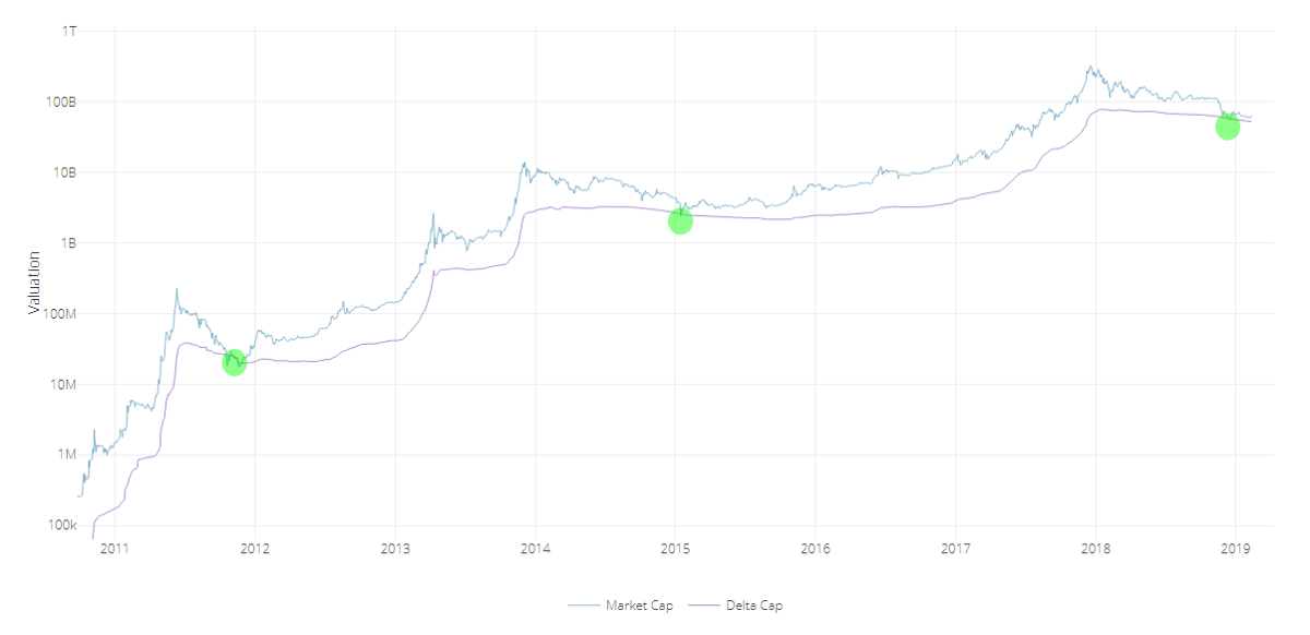
As seen at first glance, delta cap provides an excellent framework for catching global bottoms — or at the very least bottoms near the floor of the bear cycle. Please see the caveats of this indicator below to have a more nuanced view of the current state of affairs, since having just touched delta cap does not guarantee that we have bottomed.
Time Analysis
Another interesting (and still experimental) exploration of delta cap emerges when comparing it to its parent inputs through a logarithmic view, as follows:
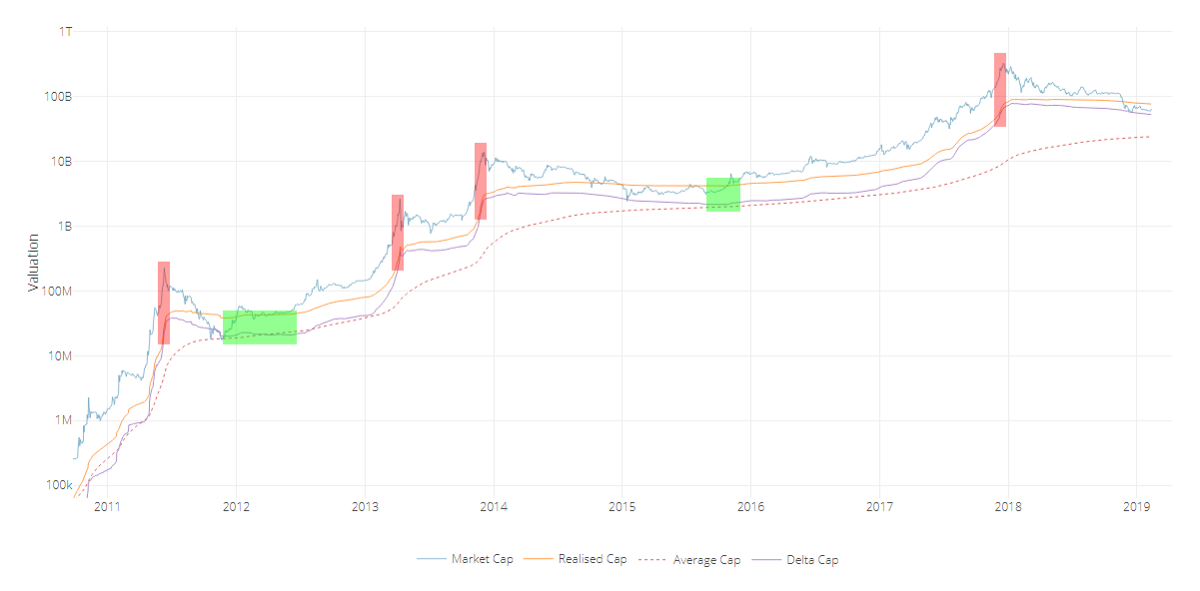
We can easily gauge periods were delta approaches realized cap during the bubble tops, and then evermore slowly descends to almost touching the average cap during the phases of breakout price behavior, signaling the inauguration of the new bull run.
The good news? If this pattern continues, people will have lots of time to buy up. The bad news? This bear-to-sideways market may last for an unprecedented while, going as far as projecting a post-accumulation breakout as late as Q2, 2020 — the moment when it could be expected for delta cap to get nearest to average cap if the extension of these lines continues as-is. Bear in mind that this is all pending on the overall rate of drop of realized cap and the rate of rise of average cap — local price action, velocity, and dormancy are all in play. Time domain here is still a broad estimate.
It goes without saying that we lack enough bottom samples to claim this as a certainty, but long-term investors must stay mentally prepared for this possible delay. It is further evidence that suggests Bitcoin’s cycles are elongating.
Yes, Another Ratio: MVDV
Since most will be curious about how the Market-Value-to-Delta-Value (MVDV) Ratio looks like, here it goes:
A few notes on it:
- Just as seen on MVRV Ratio and the Mayer Multiple, MVDV seems to indicate that each of Bitcoin’s blow-off tops is losing momentum. This is not necessarily bearish, as I believe it merely implies that each bubble is becoming less exuberant and getting closer to the mean.
- Major bearish divergences seem to announce global tops (red circles) while differentiating them from previous local tops of the same cycle.
- The bottoms seem to maintain a steadier horizontal longitudinal threshold at 1 (green line). If market cap were to revisit delta cap today at a lower low, the oscillator would present this event as a double bottom.
Caveats
- _Having touched delta cap recently does not imply a global bottom:_One must remember that delta cap is currently sloping down — and it will continue to do so for several months — so the likelihood of market cap revisiting it is not out of the question. Add to that the fact that the NVT tools are still just slowly trending into normal historical conditions and velocity remains weak. Touching delta cap on a lower low in the following months is still a likely possibility. Every penetration of market cap into delta cap should be best used as one componet of an averaging-in strategy over a prolonged period of time.
- Despite timeboxed halving days, the Bitcoin cycle seems to be elongating: This makes perfect sense, since larger bull runs require larger liquidity. The experiment here is to continue evaluating delta cap as a mean that keeps adjusting to Bitcoin’s curved trend. That being said, the time analysis section of this article remains highly speculative, especially for signaling the breakout events, so let’s take it one day at a time.
- _The market currently holds a major dissonance:_That of delta cap providing a good “baseline” for a relatively optimistic market floor, versus the current state of velocity as seen on NVT Ratio,Network Momentum, and NVT Caps— on life support relative to price.
- Delta cap remains experimental: Just as with most technical and on-chain tools, these indicators should be used with prudence and in the company of other trading mechanisms and a sound risk management strategy. Past events don’t reflect future outcomes.
Acknowledgements
Many thanks to the following individuals:
- Willy Woo, for the beautiful charts and valuable feedback.
- Murad Mahmudov,Phil Bonello,Hans Hauge,PositiveCrypto, and Plan B, whose comments helped perfect this article.
Sources
- Woobull.com : Charts and early market cap data archeology.
- Coinmetrics.io : Realized cap data.
- Blockchain.com : Market cap data.
On & Off-Chain Valuation Indicators
Bitcoin Mayer Multiple
By Trace Mayer
Unsure on original post date
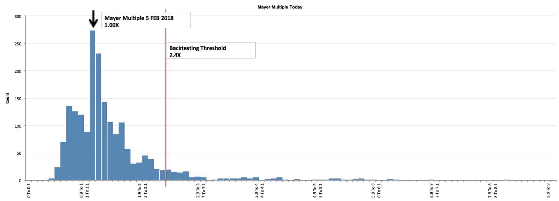
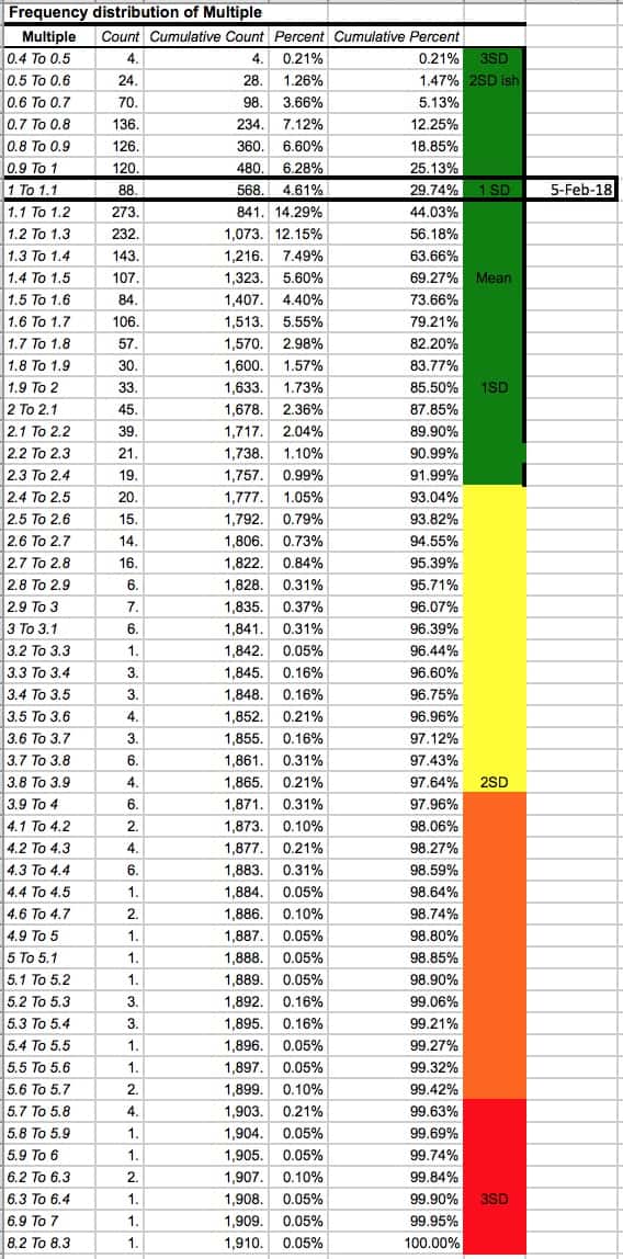
Below is a distribution chart of the multiple of the bitcoin price over the 200-day moving average. If a person decides to allocate a small portion of their portfolio to Bitcoin, this tool is intended to help people understand their emotions and corresponding probabilities of various price multiples (from a historical context). The charts and following information is not telling you to buy or sell Bitcoin. Bitcoin is insanely volatile. The charts do not suggest future results will be the same as the past. Please note, some suggest the long-term value of Bitcoin is high (in excess of $100,000 per Bitcoin), but there are also others that say Bitcoin is a mania and will be deeply regulated by the government if it is allowed to get too large. Either way, this page is simply a study to understand the probabilities of price multiples and what is normal and abnormal levels (from a historical context).
HOW THE MAYER MULTIPLE WORKS
The following explanation is how the to interpret the Mayer Multiple using 5 February 2018 at 4.00 PM EST as an example. Remember to check this page or follow us on Twitter, to get updates daily.
The 200 Day Moving Average is: $6858
The average Mayer Multiple is 1.47 for the history of Bitcoin.
The multiple on 5 February 2018 is 1.00X. A higher multiple has historically happened 75% of the time. A price less than $16461 would put the Mayer Multiple below 2.4X on 5 February 2018. A price of $10145 would put the price on the average multiple of 1.47X. The BTC price when this calculation was last conducted was $7000 USD.
THE MAYER MULTIPLE SINCE THE INCEPTION OF BITCOIN
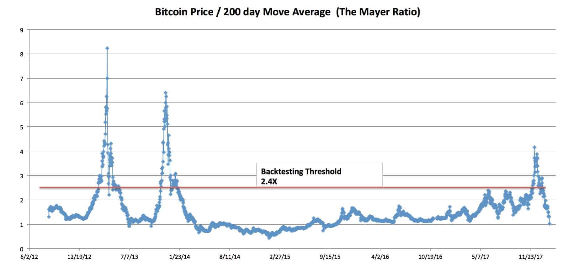
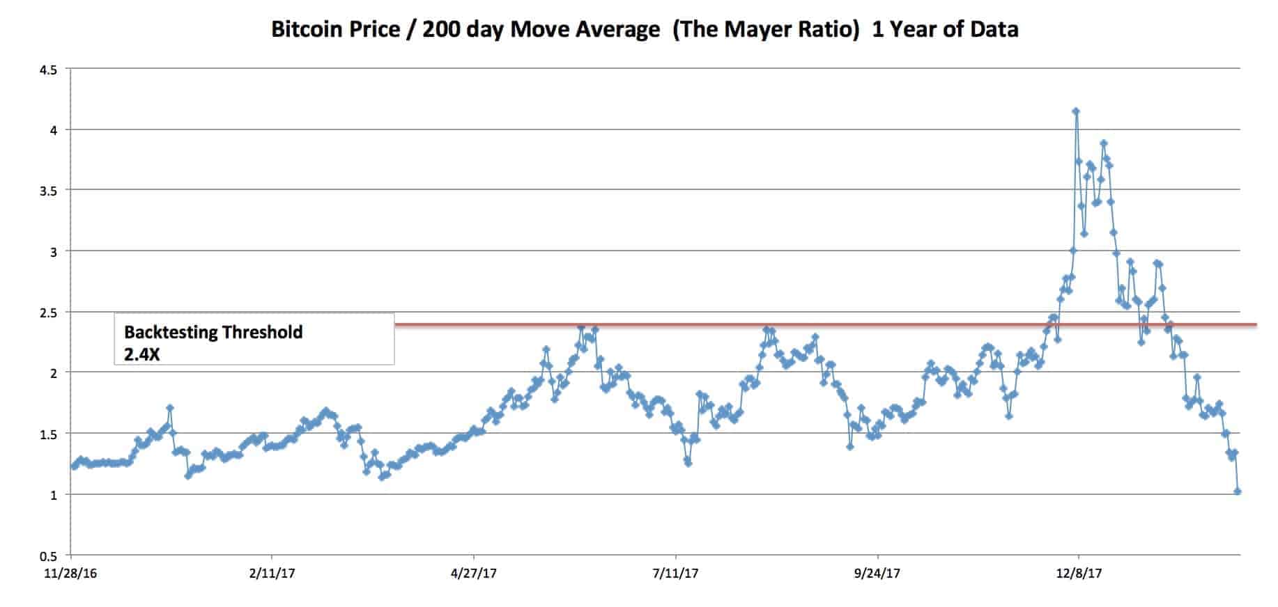
Please note: Bitcoin is not normally distributed. As a result, a typical Standard Deviation model is not accurate when talking about probabilities. With that said, this is the only model we can use to try and characterize normal and abnormal behavior. If you don’t like the use of this model, contact your college statistics teacher and he can help you invest in only absolute scenarios. Regardless of our distaste for academia, this model does have limitations and might not be the best way to represent the bitcoin price!
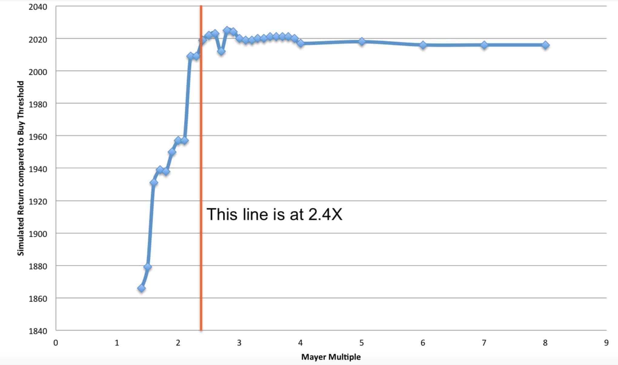
The chart below was determined by a simulation. The simulation assumed a person had $100 to invest in Bitcoin everyday since inception. There was only 1 control variable – the Mayer Multiple. If the price was < x Mayer Multiple, then the individual would buy $100 worth of BTC. If the price was >= x Mayer Multiple, the person would accumulate fiat until the price dropped back below x. The various x multiples that were tested are listed on the x axis below. When the simulation was run for various Mayer Multiples, it produced various returns (displayed in BTC on the y axis of the chart below). The chart demonstrates that anything over a Mayer Multiple of 2.4X failed to produce better results. When a multiple was selected below 2.4X, the BTC buyer got dramatically worse results. But, it’s very important to note that a new entrant buying below a 2.4X threshold would have an easier time emotionally during the first few quarters of ownership. Please note, every time the Mayer Multiple has gone above the 2.4X line, it has returned below 1.5X. In our simulation, we did not hold cash until reaching 1.5X (instead, the model simply purchased more BTC once below the 2.4X threshold). If the simulation would have waited for repurchase below 1.5X (after movement above 2.4X was achieved), the results would have likely been better than depicted below. This, however, may or many not be indicative of how the market might perform in the future, so those enhanced results were not displayed.
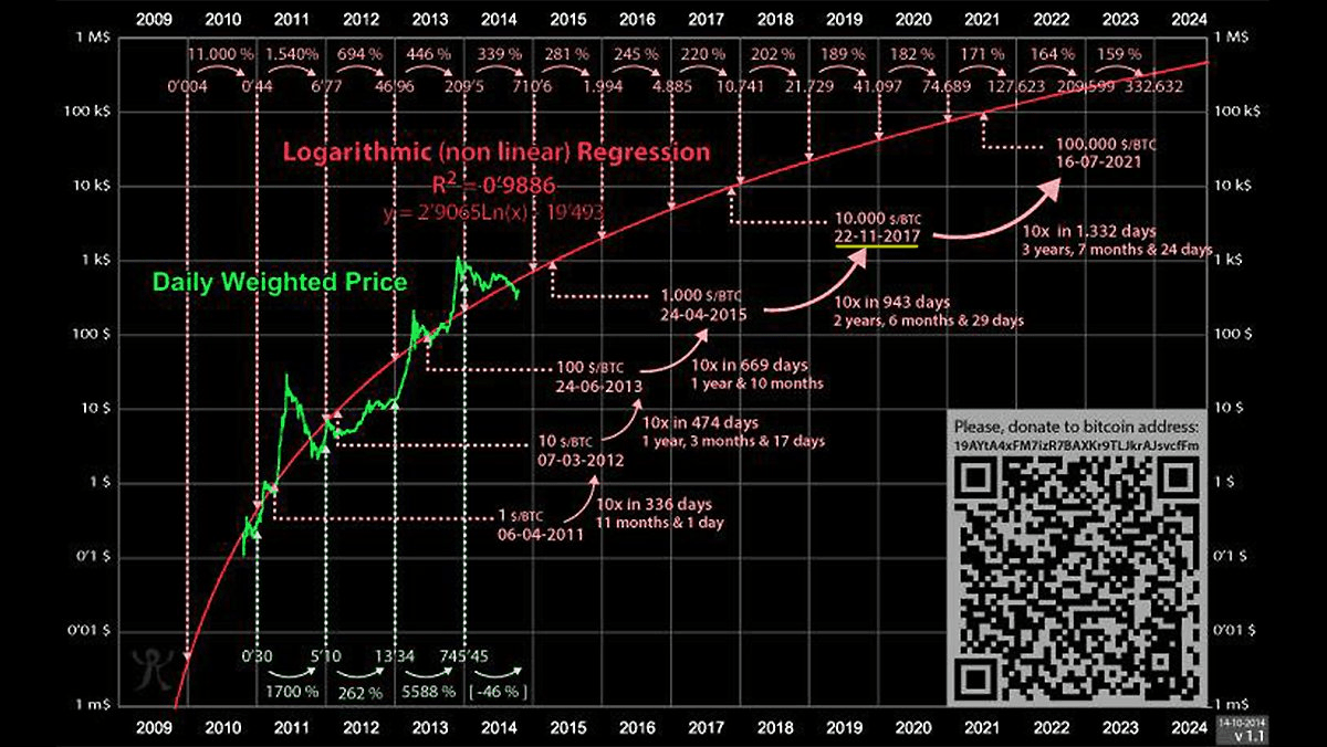
THE INTRINSIC VALUE AND NETWORKING EFFECT
The graph below shows how the value of Bitcoin might increase exponentially. The graph is derived from Metcalfe’s law that states that the value of a telecommunications network (fax machines, telephones, etc.) is proportional to the square of the number of connected users of the system. Companies like Facebook and Tencent showed that Metcalfe’s law, originally presented in 1980, held for both.
94% of the price movements from 2013-2017 has been explained by this law.
Questions? Please contact Preston Pysh or Trace Mayer .
Bitcoin’s Inflation Adjusted NVT Ratio - An UpToDate Assessment
By cryptopoiesis
Posted September 18, 2018
 Noon. Herd in the steppe by Arkhip Kuindzhi c. 1895
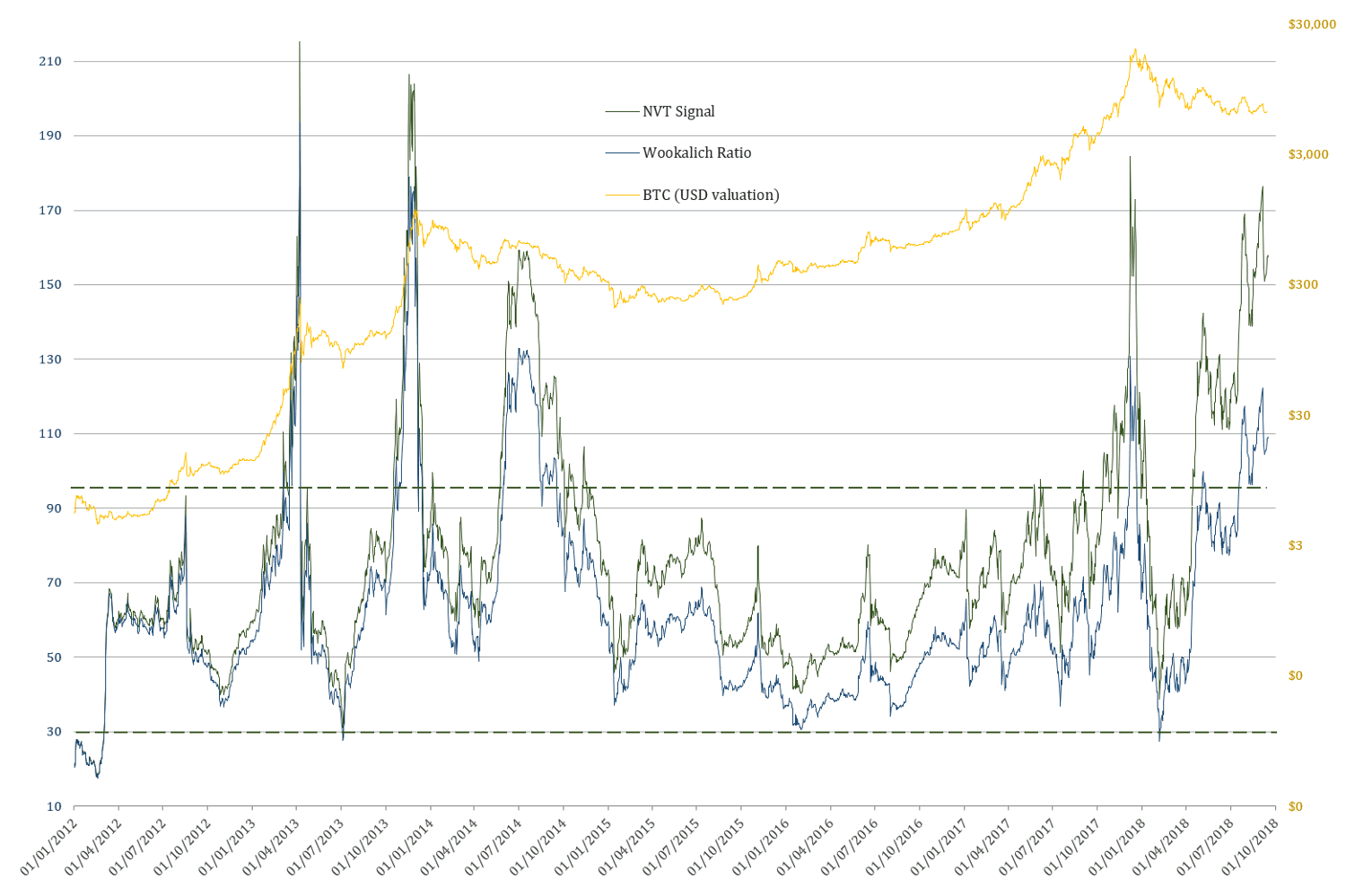
This analysis aims to take a closer look at the NVT Signal/Ratio adjusted for Bitcoin’s inflation in circulating supply, in the light of recent price developments and comparing it to the original NVT Ratio/Signal developed by Willy Woo and Dimitri Kalichkin. The data of these ratios, provides a good insight regarding the current market cycle, as well as a better understanding of the wider perspective in regard to the relevance & applicability of these metrics going forward.
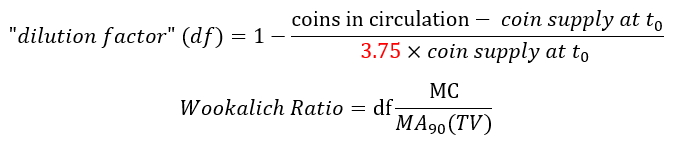
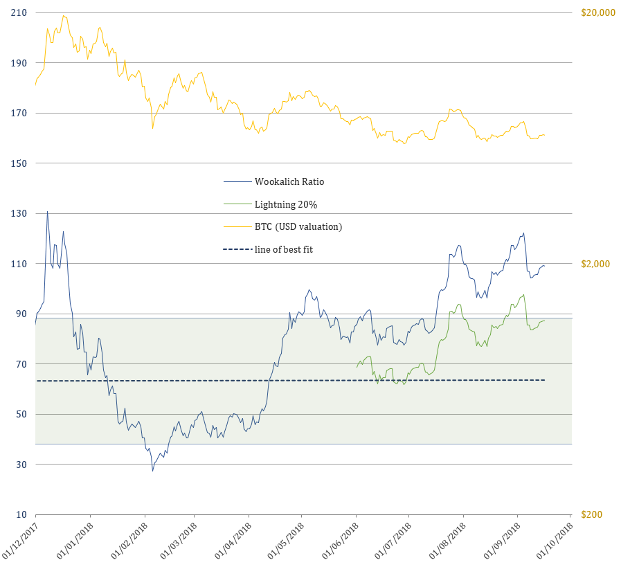
” Bitcoin’s NVT Ratio Normalised for Inflation in the Circulating Supply” will be referred to as: Wookalich Ratio for short and as credit to the developers of the original NVT Ratio & Signal. Whether that will be welcomed or disapproved off, remains to be seen.
The rationale for adjusting the ratio was put forward in the article Bitcoin’s NVT Ratio Normalised for Inflation in the Circulating Supply .The Wookalich Ratio charted in this article differs slightly in methodology by further “normalising” / flattening the trend line: a denominator factor of 3.75 replacing the 4 in the equation bellow:
Furthermore, the Wookalich Ratio had been charted in this article using a different set of price, coin supply and market cap data. The graph below assesses the reliability of this data in comparison to that used to calculating NVT Signal on woobull.com :
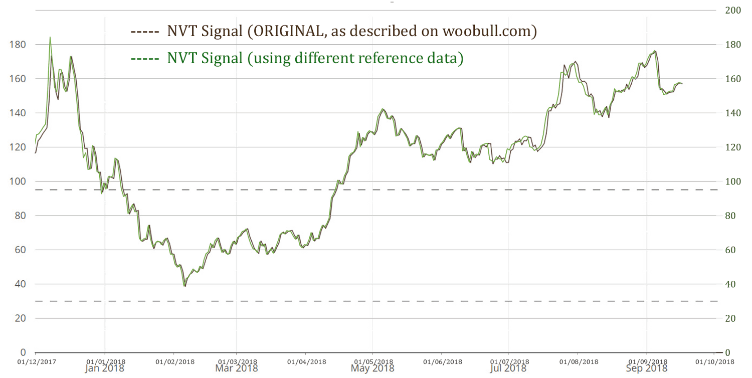
From the above chart, it can be concluded that the data is compatible, giving a virtually identical NVT Signal. The one subtle, nevertheless constant, difference is the slightly (1 day) leading “bias” generated by this data. The rationale and the methodology used for this reference data are succinctly described in the article: What is the Price of Bitcoin, or its Market Cap…. exactly?
NVT Signal & Wookalich Ratio Overview
The Wookalich & NVT Ratios in all charts have been plotted against BTC dollar valuation instead of those of the Market Cap for the purpose of being more “user friendly”.
The Wookalich Ratio
 2012 — Present
Wookalich Ratio properties:
- Average value (since 2012): 62.24
- Standard deviation from the mean (±δ): 24.48
- Upper bound (+δ): 86.72 & Lower bound (-δ): 37.77
Taking into consideration the levels at which the line of best fit is currently at the following approximate key levels can be determined:
- Wookalich Ratio average: 63
- Upper “overbought” bound: 88
- Lower “oversold” bound: 39
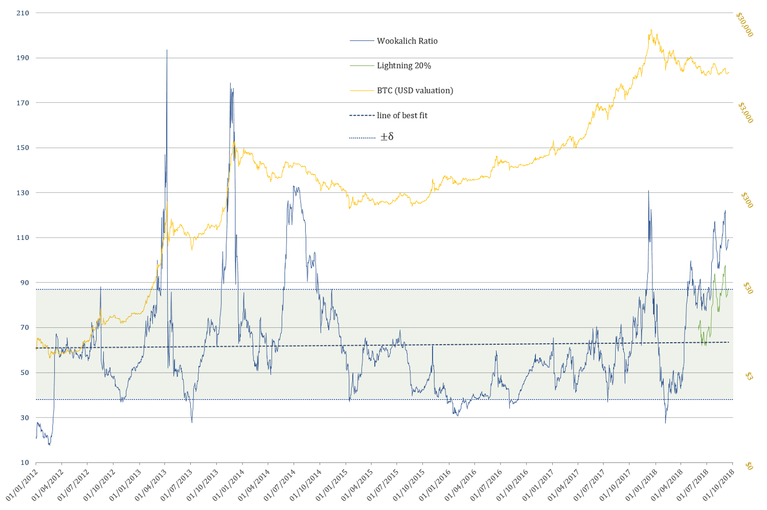
Discussion
If one is to expect an oversold condition, close to an NVT Signal level of 30, similar to the 2015 capitulation, the price would have to drop to c. $1239, tomorrow, as would be the case in the coming few weeks.
However, if an oversold condition is expected to mirror the NVT Signal levels of 40, as was the case in the first 2017 “capitulation”, the price would “only” have to drop to c. $1653.
As for the denominator side of equation, the value transferred over the network has been steadily declining for a while. Furthermore, the fact that a 90 day moving average is used in calculating the NVT Signal & Wookalich Ratio ensures that this trend is not bound to change in the near future.
Another reason that no considerable uptick is to be expected in the on-chain TV is the increasingly adoption of Lighting Network, which, so far, remains an unknown quantity in terms of its measurable effect on the overall TV.
If the large values are transferred by rich investors, speculators and exchanges, which until very recently would have had to be solely settled on-chain, now they have the option and every incentive to make use of the Lightning Network. The “smart money” can afford being smart, thus be managed with competency on the technical part as well.
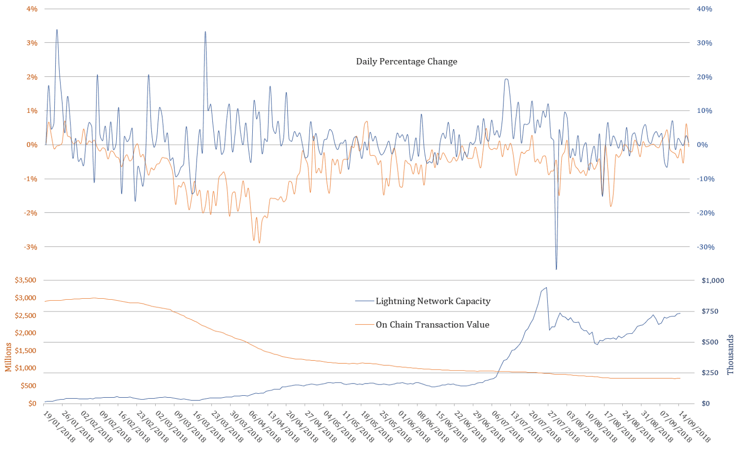 Note: On Chain Transaction Value and it’s percentage change refer to the smoothed 90d MA (as the one used in the ratios)
As highlighted in Brief Observations and Questions on the Lightning Network’s Effect on Bitcoin’s NVT Ratio, the Lightning Network Capacity is continuing to grow and does correlate with the on-chain TV (using percentage change). This can only be seen as proof that it is very much alive and kicking, mimicking the “on-chain behaviour”. Hence it has the potential to serve as proxy in estimating a more inclusive / overall transaction volume.
The Wookalich Ratio despite being “fudged” / normalised, it does not, however, offer any significantly less of a dire / bearish outlook. If one is expecting the metric to go into “oversold” territory (e.g. 1 standard deviation below the mean), tomorrow or in the coming weeks, the price would require taking a deep dive toc. $1615. If we are to assume that Lightning Network capacity handles 20% of the overall value transfer, the same “oversold” threshold would be reached at c. $2918.
Looking back for clues into a more volatile past
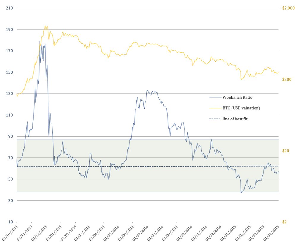 2014 Bear Market
The Wookalich Ratio could, however, signal an “oversold” level in the coming weeks, without a dramatic free fall in price, only if we are to assume the possibility that the lightning network takes care of approx. half of the overall value transfer. In this scenario an oversold level would be reached by dropping to a value of c. $4671 as of today.
Looking down a cliff or across the plains in the middle of nowhere?
 2018 Bear Market
Conclusion
If the Wookalich or NVT Signal /Ratio are to serve any purpose in the future, a method of quantifying and incorporating the transaction value over the Lightning Network would be essential.
Settling just for the on-chain transaction will increasingly make this metric less relevant, much like trying to assess combustion engines in terms of horsepower and continuing to attempt to match it against that of an actual horse.
The Lightning Network Capacity could serve as a proxy metric in estimating a more inclusive TV. To what extent however, remains to be answered.
Acknowledgements
- Willy Woo
- Dmitry Kalichkin & Cryptolab Capital
Disclaimer
The content is only to be take as my personal observations and opinions for the purpose to be further considered, answered or discarded, hence this article is far from exhaustive and IS NOT and CANNOT serve as basis for any financial / investment / trading advice.
Rethinking Network Value to Transactions (NVT) Ratio
Dmitry Kalichkin
Posted February 3, 2018
This is the first post in our series on cryptoasset valuation. Second one is “ Rethinking Metcalfe’s Law applications to cryptoasset valuation “.
Cryptoasset prices have been quite turbulent in the past few weeks. At times like this it’s especially important to look at the fundamental foundations of cryptoasset prices, and quantitative metrics. Today I will share with you one of the main metrics we use in our investing decisions at Cryptolab Capital.
Emerging field of cryptoeconomic ratio analysis
In traditional finance, ratio analysis is one of the most widely used valuation methods. Lacking the detail of other valuation approaches, such as DCF analysis, ratio-based valuation is much faster and is still a good proxy of fair value. It also allows one to easily track asset price dynamic over long periods of time as well as compare different assets to each other.
Over the course of the last year, a new study of cryptoeconomic ratio analysis emerged. The main idea behind this new field is to study the relationship between price of a cryptoasset and its fundamentals. One of the most widely known ratios is Network Value to Transactions, or NVT. Introduced and popularized by Chris Burniske, Willy Woo, and the team behind Coinmetrics, NVT is often called “crypto PE ratio.” Here’s the definition of the ratio:

In a traditional PE ratio, the earnings metric in the denominator is used as a proxy for the underlying utility of the company created for the shareholders. While cryptoassets don’t have earnings, one can argue that the total value of transactions flowing through the network is a proxy for how much utility users derive from the chain. It is worth highlighting that Daily Transaction Volume in NVT takes into account only on-chain transactions. All the trading activity that happens on exchanges and is, for the most part, speculative is not included in this volume.
This Forbes article argues that NVT can be successfully used to detect bitcoin price bubbles when valuation is not supported by fundamentals and differentiate them from consolidations. The chart below concisely illustrates this argument.
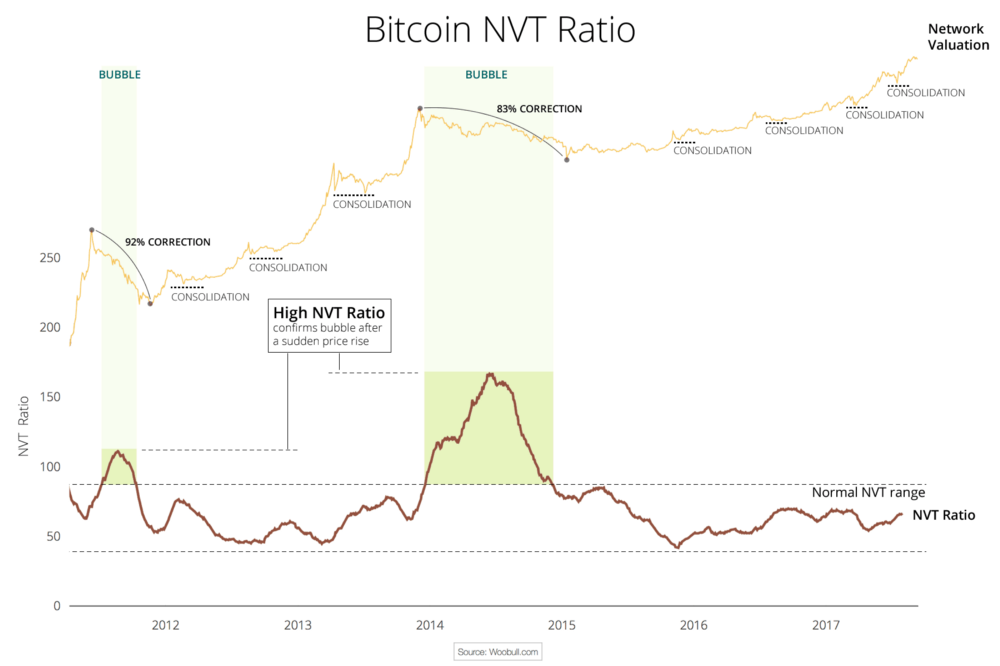
This chart also greatly illustrates what we at Cryptolab Capital don’t like about NVT in its current form. The spike in NVT follows the bubble with a considerable lag of a few months.Peak NVT coincides with the middle of a correction period. NVT is neither predictive (doesn’t precede the overvaluation), nor descriptive (doesn’t coincide with it). You can only detect the bubble a few months after it bursts.
Rethinking NVT ratio
Trying to dissect this issue and improve this ratio, we started by looking at the ratio definition:
“Ratio has been smoothed using moving averages, 14 day forward and 14 day backward facing…“
Mathematically speaking, this means the following:
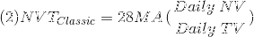
Hereinafter:
- NVT_Classic stands for “Classic definition of NVT”
- 28 MA_is “ _28-day Moving Average”
- NV is “ Network Value in USD”
- TV is “ Transaction Volume in USD”
Let’s pause here and look back at the conceptual meaning of NVT. In this ratio, Transaction Volume is used as a proxy for fundamental network utility value. When you look at Transaction Volume on a daily basis, there is a lot of noise, so I completely agree with the decision to smooth it by using a 28-day Moving Average. But we asked ourselves a few questions:
- Why 28 days, and not 10, 30, 90, or 180? A 28-day average might be not enough for a truly fundamental metric.
- Why 14 days forward and backward? If we are trying to develop a predictive, or at least descriptive, indicator we shouldn’t rely on future data.
- Do we need to smooth both parameters — ratio as a whole — or just the denominator?
We then experimented with different Moving Average periods, and came to an empiric conclusion that the optimal solution is to divide daily Network Value by 90 days Moving Average of Transaction Volume. So here’s a definition of our new NVT ratio:

Comparing old and new NVT for bitcoin
 Source: author’s calculations
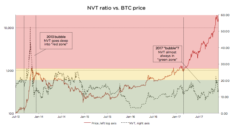
As can be seen from the chart above, when we move from a 28-day Moving Average to a 90-day Moving Average NVT definition, we get rid of the time lag issue described above. We can also see that every time NVT went to the Yellow or Red zone (autumn 2013, spring 2014, December 2017), a price correction followed.
We claim that this refined NVT ratio is a better descriptive metric of bitcoin bubbles. Conceptually, this makes sense. Given that Transaction Volume in NVT is a proxy for fundamental utility value of the network, a 90-day Moving Average is a better proxy for long-term fundamental value than a 28-day Moving Average.
Let’s now look at the recent bitcoin price performance using the refined NVT ratio in more detail. From January until mid-December 2017, bitcoin has appreciated almost 20x. For the most part of this rally, though, NVT ratio has stayed in the Green Zone. However, in December when price reached almost $20,000, NVT went into the Yellow for a few days. This rapid appreciation was shortly followed by a 30% price correction, and another even steeper price correction in the last weeks. After the correction, NVT has returned to the Green zone. This is another empiric evidence in support of 90 MA NVT.
Looking at the chart below, it is much harder (if at all possible) to foresee the December 2017 correction. Quite the opposite, during late 2017 price rally, NVT went down! How can it be?
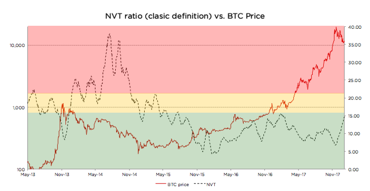 Source: author’s calculations
There is a non-static non-linear relationship between the numerator and denominator of NVT. Every time there’s a sharp increase in price, there’s growth in trading activity (off-chain transactions) that is shortly followed by on-chain transaction volume growth as investors liquidate their positions. Exchanges and wallets trade with each other to provide liquidity to their users. All this activity increases on-chain transaction volume, even though it is fully speculative.
In other words, the cryptoassets exhibit reflexivity. In the short run, the price changes the fundamentals. In this case, transaction volume follows price. I don’t want to go into much detail on this, but I can refer you to an excellent article on the topic by the Coinmetrics team: “ Mean-reversion and reflexivity: a Litecoin case study “.
So why does a longer period average result in a better indicator? Intuitively it makes sense. By definition, the role of Transaction Volume in the NVT denominator is to be a proxy for fundamental utility that users get from using the network. A longer smoothing period helps to get rid of the reflexivity effects described above — spikes in transaction volume that follow sharp price increase. These irregularities are speculation-driven and are bad descriptors of fundamental intrinsic utility of the network. When we remove these irregularities, we end up with a better proxy for fundamental value in NVT denominator, and, as a result, the new NVT ratio becomes a better descriptor of price level.
Analyzing Litecoin using the refined NVT
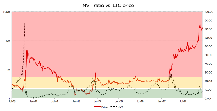 Source: author’s calculations
Looking at the chart, we can see that there were at least 3 cases since 2013 when the same logic applied: price spikes coincided with, or in some cases were even preceded by, spikes in 90-day NVT
- Autumn 2013
- Summer 2015
- Autumn 2015
- Late 2017
However, in a few cases it didn’t work as well. Those cases are usually explained by a strong trend or some big external news:
- In late 2014, an NVT spike happened during a one-year-long price correction, and the price just kept going down. A similar dynamic can be seen on the BTC graph above during the correction of the second half of 2014. NVT spiked a couple of times while BTC price was steadily declining.
- Most interestingly, in April 2017 NVT spiked really high, but price actually went up! Here there were a couple of strong external factors: (1) SegWit adoption speculation, and more importantly, (2) listing on Coinbase in May that propelled asset price to a whole new level and moved LTC to another league. The price did increase significantly, but the fundamentals shortly followed.
Despite these exceptions, the descriptive power of the refined NVT for detection of overvaluation is still quite strong. It is definitely stronger than that of the currently used NVT.
Using new NVT for BCash
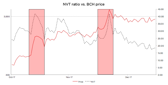 Source: author’s calculations
BCash is quite new, and its history has been full of breaking news, hostile attacks on bitcoin, and other exogenous events. Given this, it is hard for us to define the limits of the Green, Yellow, and Red zones for this currency. If we were forced to state Cryptolab Capital’s opinion, we would likely say it is rather overvalued at the moment, the NVT might still be in the Red zone, and the fundamentals have to catch up for the price to make sense.
But one thing that can be seen from the chart above is the sharp NVT spikes coincide perfectly with local price maxima. Yet another win for redefined NVT.
Summary
For every investor it is of crucial importance to understand what is going on in the market right now. As a result of Cryptolab Capital research, we have designed a metric that describes price bubbles well and without a time lag across different time periods and assets.
There is, however, another more fundamental weakness of NVT. It only takes into account total value of on-chain transactions, but it doesn’t factor in the number of transactions or the number of addresses (wallets) participating in these transactions. Let’s call this metric Daily Active Addresses (DAA).
For internet companies, especially marketplaces, social networks, and other businesses with strong network effects, the analogous Daily Active Users (DAU) indicator is one of the most important performance and valuation metrics. This and other metrics that now make up the language of valuing internet companies didn’t exist in the 1990s. It has been developed by technology investors over the last 20+ years. Similar valuation framework for cryptoassets is yet to be developed and is only starting to form.
In our next post, we will try to contribute to this framework and propose a way to use Daily Active Addresses (DAA) in cryptoasset network valuation.
Acknowledgements
I wanted to thank a few people who contributed to my understanding of cryptoasset investing, and gave valuable feedback in the process of this research:
- Professor Susan Athey from Stanford
- Professor Christian Catalini at MIT
- Chris Burniske from Placeholder.vc
- Willy Woo
Introducing SOPR: spent outputs to predict bitcoin lows and tops
PostedRenato Shirakashi
By April 25, 2019
One of the best things about Bitcoin is how the data is available for analysis. The blockchain itself can provide a lot of information on the money flow, and from these we can infer a lot on people’s sentiment and behavior.
In this analysis two important psychological turning points that significantly change the supply of bitcoin are going to be described by introducing a new oscillating indicator that signals when these major supply changes occur, using blockchain data.
Introducing the Spent Output Profit Ratio (SOPR)
The SOPR a very simple indicator. It’s calculated from spent outputs. It’s the realized value (USD) divided by the value at creation (USD) of the output. Or simply: price sold / price paid.
When SOPR > 1, it means that the owners of the spent outputs are in profit at the time of the transaction; otherwise, they are at a loss
By plotting the SOPR of all spent outputs combined, aggregated by the day in which they were spent (using blockchain date), the graph can be produced
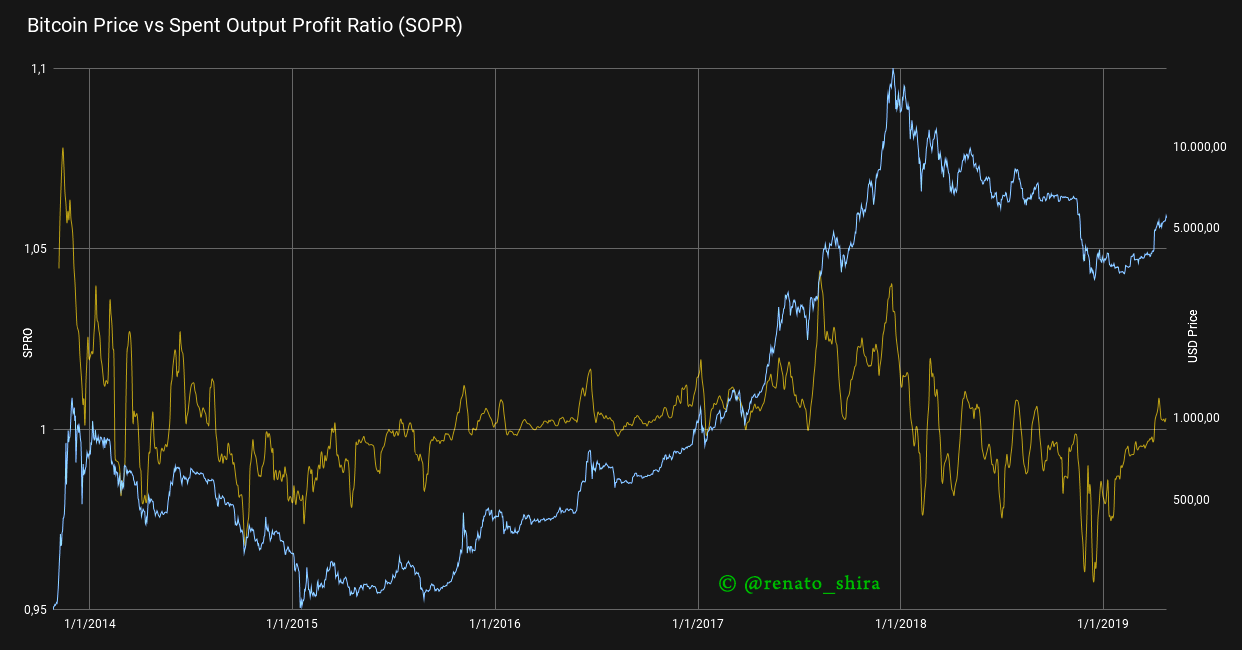 SOPR (sma 10) vs Price
There are several interesting observation that can be made from the chart above. First of all, SOPR appears to oscillate around the number 1. Secondly, during a bull market values of SOPR below 1 are rejected, while during a bear market values of SOPR above 1 are rejected. Therefore, the SOPR oscillator could serves as a reliable marker for identifying local tops & bottoms. This feature is highlighted in the graph below
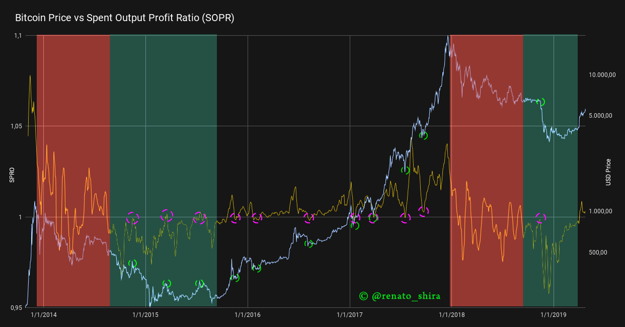 SOPR (sma 10) vs Price — Highlighted
Ignoring the areas in red, in which the SOPR is unstable (at the beginning of a bear market), it seems to work like a charm! But why?
People, in general, are much more comfortable selling when they are in profit(you can read more about this Daniel Kahneman’s work, Nobel prize 2002). In a bull market, when SOPR falls below 1, people would sell at a loss, and thus be reluctant to do so. This pushes the supply down significantly, which in turn puts an upward pressure on the price, which increases.
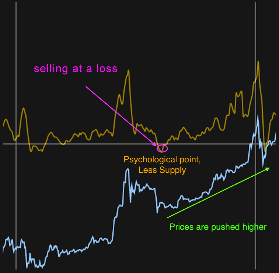 Bull market example
In a bear market, everyone is selling or waiting for the break-even point to sell. When SOPR is close/greater than 1, people start to sell even more, as they reach break-even. With a higher supply, the price plunges.
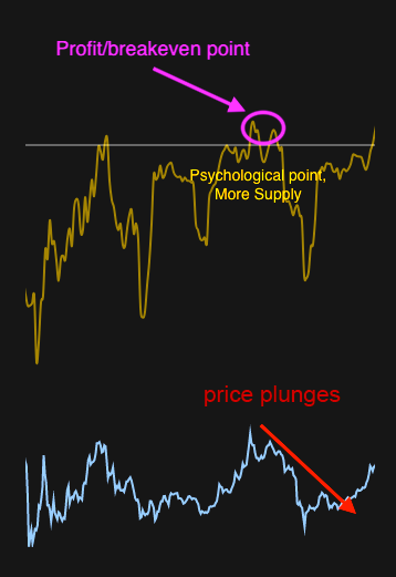 Bear market example
Due to the fundamental nature of underlying metrics on which the SOPR relies on, it would be fair to speculate that the Spent Output Profit Ratio is influencing price changes. This can be of considerable significance, since most current indicators are lagging indicators.
Next steps will be to further explore SOPR using different time-frames for the spent output as well as value sizes.
Interesting things to notice:
- SOPR suggests the bull run is starting
- SOPR also suggests the capitulation in 2018 was, technically speaking, pretty nasty ; and yes, there was pain,even when compared to 2015.
This is a preliminary work, if you want to have updates on this and future work, please follow me on twitter: @renato_shira
Revision by: @cryptopoiesis
Bitcoin Market-Value-to-Realized-Value (MVRV) Ratio
Introducing realized cap to BTC market cycle analysis
By Murad Mahmudov and David Puell
Posted October 1, 2018
Disclaimer: Nothing contained in this article should be considered as investment or trading advice.
Nic Carter from Castle Island Ventures (in a co-effort with Antoine Le Calvez from Blockchain.info) has recently presented his newly-termed concept of realized cap at Riga Baltic Honeybadger 2018 conference, inspired by some previous ideas of Pierre Rochard. Nic was kind enough to share some of his findings and data with us after the conference, and we wanted to delve into some analysis of the information available to us. For the purposes of this article, let’s define a couple of terms:
Market value
Otherwise known as total market capitalization, it applies to Bitcoin if you were to multiply the latest available BTCUSD trading price on exchanges by the number of bitcoins mined thus far (currently standing at 17,299,787 BTC as of Oct. 1, 2018).
Realized value
Instead of counting all of the mined coins at equal, current price, the UTXOs are aggregated and assigned a price based on the BTCUSD market price at the time when said UTXOs last moved.
The Logic Behind Realized Value
Realized cap’s effectiveness intuitively seems to adjust for two aspects of BTC’s nature: (1) lost coins, and (2) coins used for hodling, establishing the collective psychological sum of entries when users began seeing Bitcoin’s value and long-term potential. Realized cap seems to suggest the final layer of people’s cumulative cost basis and, in recent history, the ultimate line of “center of mass” where 2017 strong buyers remain unrattled by short-term uncertainty.
One way of looking at realized value is that it helps us eliminate some of the lost, unused, unclaimed coins from our total value calculations. Another way is seeing it as an indicator of the sum of levels where groups of long-term, legit, buyer-hodlers entered into their Bitcoin positions, with local and immediate emotions and manias stripped out.
MVRV Ratio
MVRV is calculated by simply dividing market value by realized value on a daily basis (in this case from Oct. 9, 2010 to Sept. 14, 2018). This formula provides the following oscillator:
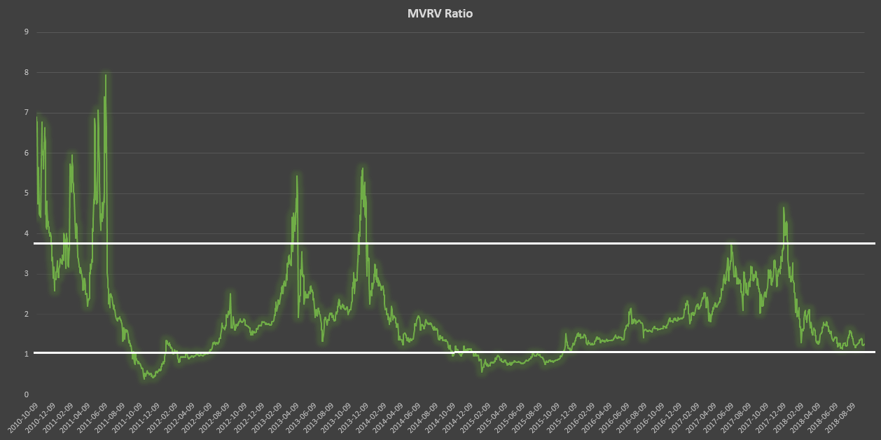
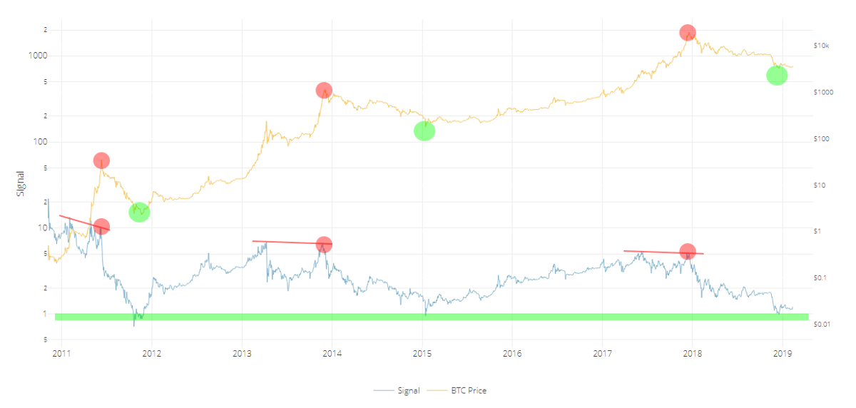
From this calculation, two historical thresholds emerge: 3.7, which denotes overvaluation, and 1, which denotes undervaluation. It is also interesting to see how MVRV evokes both the Mayer Multiple and Dmitry Kalichkin’s NVT signal without the need for a moving average.
Market Dichotomy?
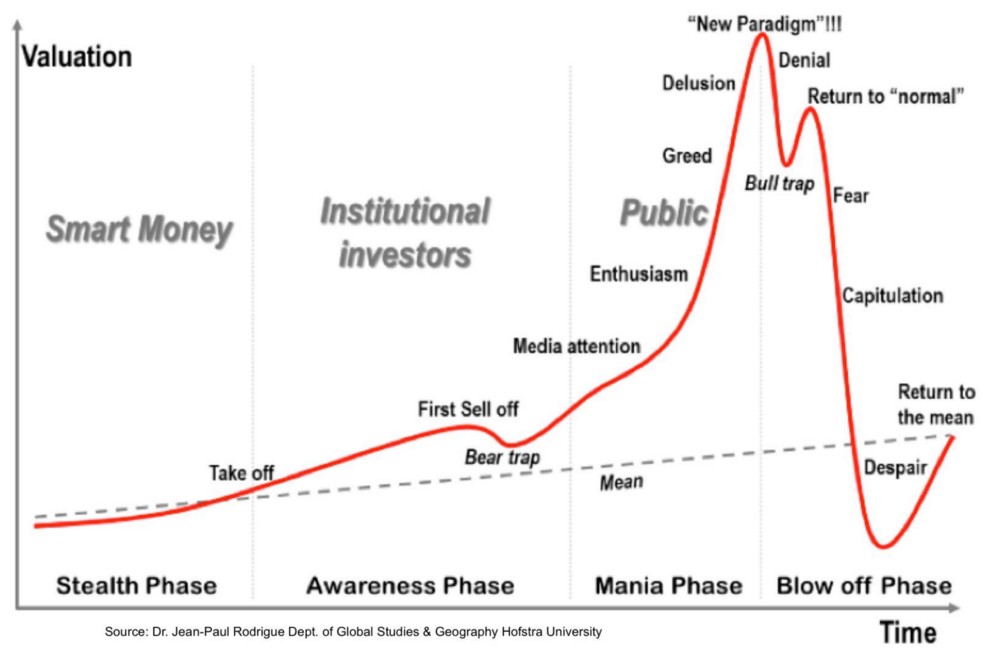
A theoretical framework for this ratio would echo a dichotomy that can be best expressed in the following:
- Speculators vs. hodlers.
- High time preference vs. low time preference (as argued by Saifedean Ammous in chapter 5 of The Bitcoin Standard).
- Irrational exuberance vs. uncertainty acclimation (as argued by Jimmy Song in “The Antifragility of Bitcoin” presentation).
We believe that both market concepts and participants are crucial for Bitcoin’s game theory and price action, since the booms seem to expand the network via an exuberant viral gossip mechanism that broadcasts the existence of Bitcoin to the world population; while the busts, in the long-run, seem to reward individuals who chose to delay short-term financial gratification in the search for sound money. This very dichotomy, in our opinion, also explains the relevance and effectiveness of MVRV ratio. Network value, to go back to Willy Woo’s terminology, is to us both market value and realized value.
Similar to Woo’s NVT principle, MVRV appears to track the interaction between the market actors that best describe the aforementioned dichotomy. It suggests the at times major divergence between price discovery at exchanges and the “sounder,” more steady rise of unmoved coins — either lost or used for hodling.
It is of particular interest whenever market value goes below a 1:1 ratio to realized value. We suggest that these periods account for both undervaluation and the capitulation-despondency stages of market psychology. Just as the upper levels of MVRV suggest the climax of euphoria, overshooting it’s “fair” value at the peaks, price action as discovered at exchanges tends to undershoot beyond BTC’s “real” value at the bottoms. Looking back at the past two Bitcoin bear cycles, we can say without a doubt that both occasions proved to be the most opportune periods to accumulate bitcoins.

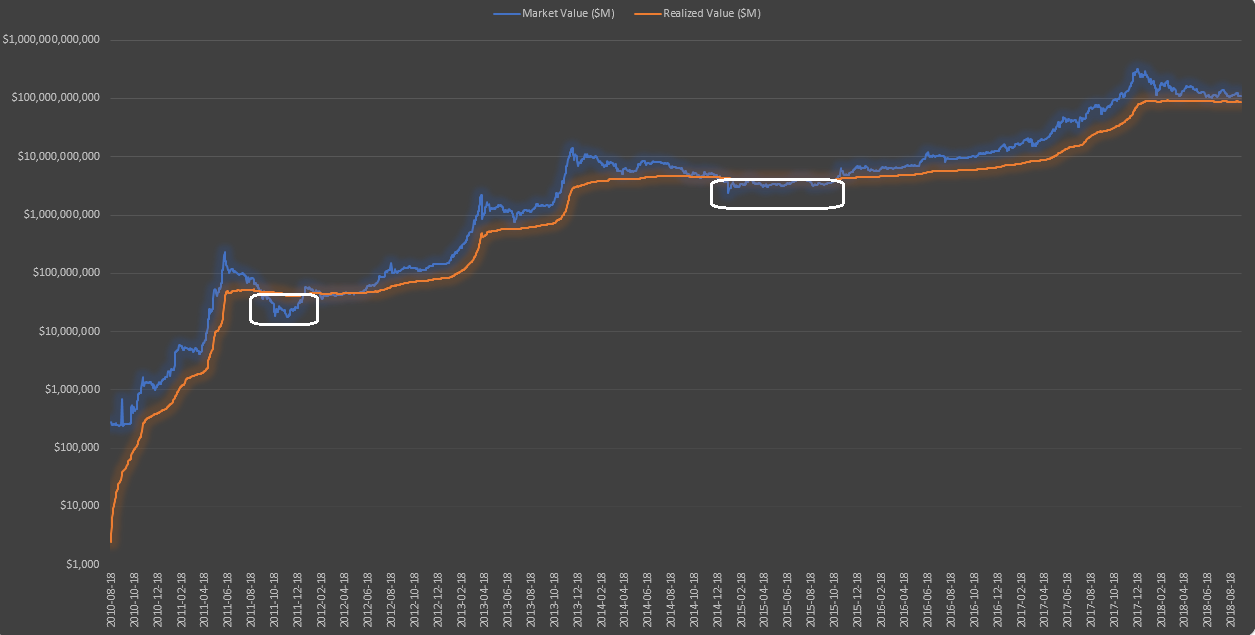
When plotted over the long run on a log chart, the realized value line of Bitcoin (orange above) is more similar to a stepwise function, with near-vertical moves upwards during peak months of bull market, then a prolonged period of horizontal flatness. That being said, each flatness level could be roughly interpreted as Bitcoin’s newfound stable fair value threshold. The traditional market cap, however, is more sharply pronounced by the emotion of the crowds, namely excessive euphoria when market value sharply diverges upwards away from realized value, and, conversely, excessive fear when market value drops below realized value for a multi-month period.
Current Environment
Simply put, we expect market value to descend below realized value on a mid-term basis, which in turn would establish a structural gap between them, to be filled after an accumulation period of potentially as long as several months. The following chart displays the historical periods when accumulation in Bitcoin took place (which would be represented by MVRV ratio’s descent below 1).
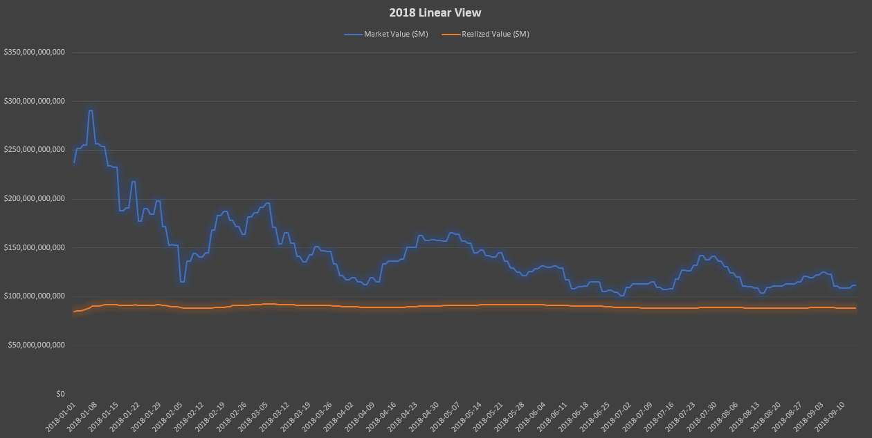
A zoomed-in linear version of the current environment gives us a clearer view of how market value remains overextended above realized value.
Some Caveats
As with any fundamental or technical indicator, we recommend using this particular tool with prudence. Some observations:
- Thresholds: Going forward, as market cap decreases in volatility, we believe that the upper threshold of MVRV might not prove as reliable — as market cap overextends less and less above realized cap as time progresses. However, we expect the lower threshold to remain useful to detect Bitcoin’s undervaluation in multi-month periods ripe for accumulation. This is to say that the saving power and the speculative power of Bitcoin will become, increasingly more and more, very closely intertwined.
- Precision: MVRV ratio only provides a long-term perspective of BTC market cycles — specifically, to apply Wyckoffian terminology, distribution and accumulation phases.
- _Technical methodology:_The use of MVRV as a momentum oscillator where the breakage of a trendline implies capitulation (similar to NVT signal or the Mayer Multiple) still comes into question. Thus, more conservatively, we provide two recommendations: (a) to analyze this indicator as a companion to other fundamental and technical tools; and (b) mostly use its thresholds for multi-yearly analysis; a diagnostics tool of Bitcoin’s “hodling” health.
- Realized cap: It is important as well to remember that realized cap may drop given a black-swan shock event where strong hands lose confidence in BTC. For this reason we recommend assessing market value and realized value both as a ratio and separately.
Acknowledgements
We would like to thank the following people, whose work and help was essential for this analysis:
- Nic Carter and Antoine Le Calvez, for inventing the realized cap and providing us with invaluable data.
- Pierre Rochard, whose initial idea was the starting point for the invention of realized cap.
- Willy Woo and Dmitry Kalichkin, whose work on NVT and NVM has been deeply influential.
- Saifedean Ammous and Jimmy Song, for providing crucial ideas in developing a theoretical framework for MVRV.
Sources and Data
- Daily market value and realized value data provided by Nic Carter (Castle Island Ventures) and Antoine Le Calvez (Blockchain.info).
- Ammous, Saifedean. The Bitcoin Standard. Hoboken: Wiley, 2018.
- Song, Jimmy. “The Antifragility of Bitcoin.” Off-Chain with Jimmy Song YouTubeChannel:https://www.youtube.com/watch?v=LYjUOFc0OMo
Introducing … The Bitcoin “MVRV Z” Metric That Predicts Market Tops with 90%+ Accuracy
By Awe & Wonder
Posted October 9, 2018
Disclaimer: Not investment advice. Past performance is not indicative of future results.
Background:
The MVRV ratio was created by Murad Mahmudov & David Puell following Nic Carter’s (in a co-effort with Antoine Le Calvez) striking presentation at Honeybadger 2018. Building from Nic’s and Antoine’s conceptualization of realized value, the MVRV ratio was born.
In essence, realized value is closer to Bitcoin’s “fair value” as it adjusts for lost coins and coins used for hodling. The purpose of this article is to demonstrate the modified MVRV ratio’s usefulness with respect to market timing.
For a more extensive overview of realized value, please visit David’s & Murad’s original article describing this concept in detail. Bitcoin Market-Value-to-Realized-Value (MVRV) Ratio Introducing realized cap to BTC market cycle analysis blog.goodaudience.com
 The original MVRV ratio described above is calculated by dividing market value by realized value on a daily basis. This provides the following oscillator:
As David stated, this metric clearly displays the peaks and busts of the price cycle, emphasizing the oscillation between fear and greed. The brilliance of realized value is that it subdues “the emotions of the crowds” by a significant degree. In other words, it is reasonable to consider realized value as a more accurate descriptor of Bitcoin’s stable, long-term value. Interestingly, it’s not too far-fetched to consider this area as the trend’s “psychological mean”; the zone where long-term holders see true value.
 Realized Value as a proxy for the trend’s mean.
Market-Value-to-Realized-Value (MVRV) Z-Score
This new metric aims to measure the deviation between realized value and market value.
The modified MVRV ratio is just the z-score distance from the realized value.
Simply put, a z-score is the number of standard deviations above or below the mean. In this case, the realized value is used as a proxy for the true population mean. Therefore, this z-score transformation simply serves as a standardization technique and the standard deviations are not interpreted as one would in a normal distribution. This provides the following:
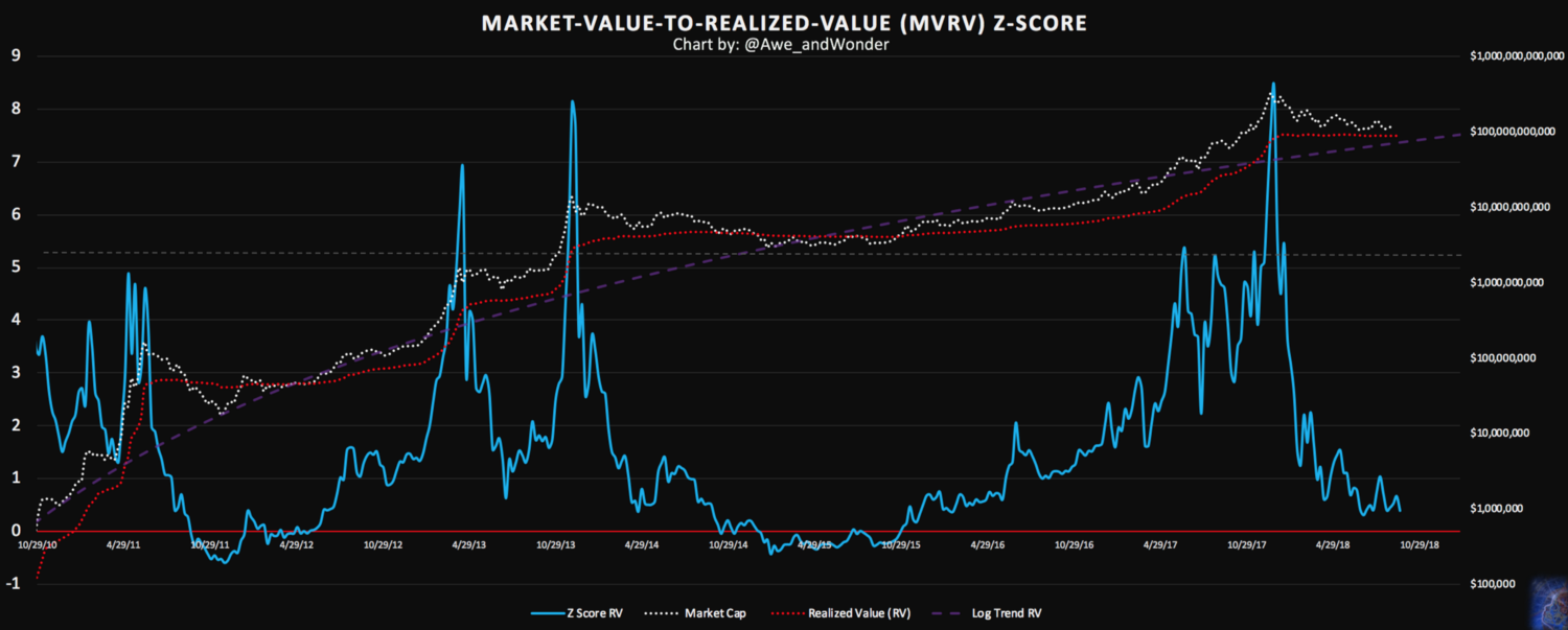 z-score distance from realized value as of 9/9/18
As you can see, the parabolic spikes triggered alarm one, two, and three weeks in advance, respectively. Coupling this metric with other buying climax patterns like say, daily returns exceeding two standard deviations from the mean makes for a killer combination.
Successful trading is all about finding and capitalizing on market imbalances. Markets that are in balance cannot be exploited.
Momentum (where strong moves beget stronger moves) eventually create market imbalances. The mean reversion effect, on the other hand, is a market’s response to excess momentum as it seeks to counteract this force. In a perfect random walk market, these forces eventually balance each other out. However, certain trigger events can tilt the scale in favor of one force winning over the other. This creates an environment where big moves can be reasonably expected to at-least partially reverse.
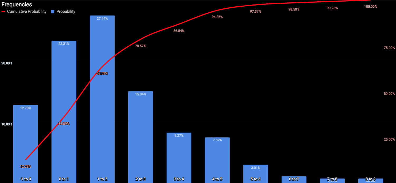
Weekly closes above z-score value of 5 occurred 5.64% of the time. Loosely speaking, a 94.36% chance of reversal can be attached to any observation above this value. Similarly, weekly closes below realized value occurred 12.78% of the time. Or from a historical perspective, expected to be above this zone 87.22% of the time. As we all know, history doesn’t repeat but it often rhymes. For example, in the next overvaluation cycle, the top may not exhibit a parabolic spike like in the past. This emphasizes the need to combine multiple sources of evidence to come to a sound conclusion and not rely on this metric alone. With that said, these observations add more confidence to the 4400–5000 region.
Furthermore, observing the log trend line in respect to realized value, one can see that price coincidentally bottomed at this zone twice. Currently, the trend line sits at 74B and is expected to rise to 88B by 1/6/19. This amounts to a rate of growth about 5.88% per month (compared to 10% four years ago). Since this trend line is increasing in value at a decreasing rate, its reasonable to expect that the market cycles may start to elongate to some degree. But thats a topic for another day.
 MVRV ratio emphasizing percentage change
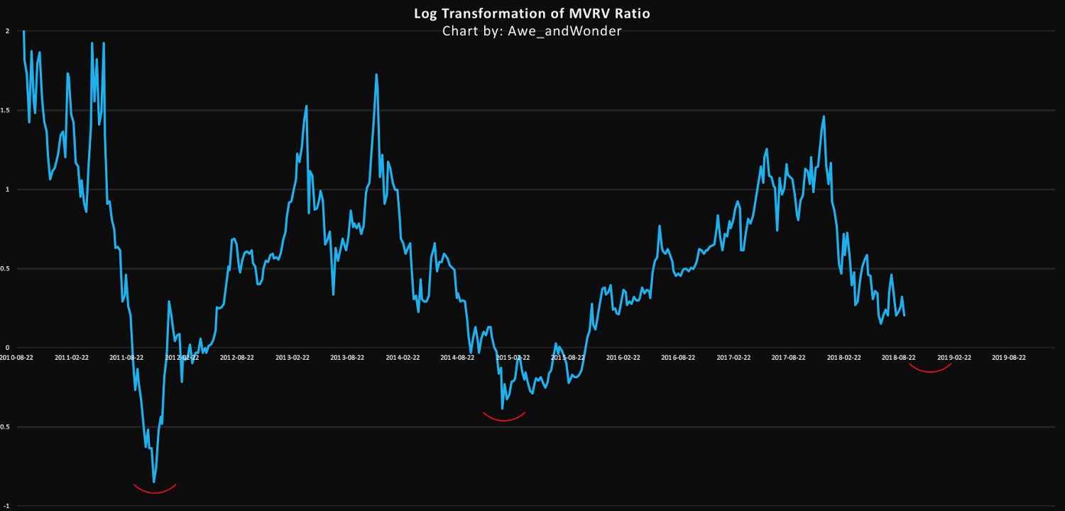
The chart above represents the original MVRV ratio but with an applied log transformation to amplify visual clarity.
Note that the January 2015 bottom was 32% higher than 2011. Applying this same haircut, the estimated z-score deviation below realized value is 0 to -0.25.
This is perfectly reasonable. Markets stabilize though price and time. Considering the outsized returns of the 2017 bull market plus the parabolic blow off top that followed, it should be of no surprise that this market may need more time to stabilize and level off before the next bull run.
In conclusion, its important to remember that these type of models are only as good as the simplifications and assumptions they make, and that no metric should be used in isolation. The MVRV Z-Score metric from a historical perspective has worked incredibly well. I’d imagine combining this metric with exponential and logarithmic regression confidence intervals, to name a few, would make for a killer combination…
PS.
Thanks to Nic Carter and Antoine Le Calvez for providing the data.
Please follow if you’d like further analysis.
Bitcoin Delta Capitalization
A New View of BTC Long-Term Valuation
By David Puell
Posted February 14, 2019
Disclaimer: Nothing contained in this article should be considered as investment or trading advice.
As a follow-up to Willy Woo’s recently-introduced Bitcoin Valuations live chart, this article aims to present delta cap with the goal of answering two of the most pressing questions in speculators’ minds at the present moment:
- Where is the bottom?
- When is the next bull run coming along?
Something’s Amiss
Two sets of items originated the search for what later became delta cap:
- Awe and Wonder’s studies on Bitcoin’s logarithmic regression and Plan B’s studies on Bitcoin’s power regression (R² of 0.93 and 0.95 respectively), which seem to suggest that the BTC trend is increasing at a decreasing rate.
- Murad Mahmudov’s exploration of historical moving averages, expressing a dissatisfaction with any particular SMA or EMA as definitive enough to “catch the bottom” in every bear cycle.
This initiated the search for a metric that both adapted to Bitcoin’s rapid, high-velocity parabolic moves and accounted for its overall trend decay over time. Two other valuation models seemed to provide a tentative answer: realized cap for the former and average cap for the latter.
Delta Capitalization
Delta cap is, as seen next, a hybrid of sorts — half “fundamental,” half “technical.” It is calculated through the following formula, measuring the difference between two long-term Bitcoin moving averages:
For the purposes of this piece, let’s review these definitions:
Realized capitalization
Invented and presented by the brilliant team at Coinmetrics, instead of counting all of the mined coins at current price, the coins are counted at the price when they last moved through the blockchain. This approximates the USD value paid for all the bitcoins in circulation. Best put by its co-creator Nic Carter, it can be described as an on-chain volume-weighted average price (VWAP) of BTC.
Average capitalization
Instead of setting a fixed period for calculating a moving average (e.g., a 200-day MA), this is a life-to-date, cumulative simple moving average that serves as the true mean of the whole history of market cap. Due to its “laggy” nature, it is the perfect mechanism to help decay the upward speed of delta cap over time. Shoutout to Renato Shirakashi for first pointing out this average.
Below, a view of both lines, courtesy of Willy Woo:
The aforementioned substraction of the two in turn provides the following delta cap line, both reactive locally and decaying globally:
As seen at first glance, delta cap provides an excellent framework for catching global bottoms — or at the very least bottoms near the floor of the bear cycle. Please see the caveats of this indicator below to have a more nuanced view of the current state of affairs, since having just touched delta cap does not guarantee that we have bottomed.
Time Analysis
Another interesting (and still experimental) exploration of delta cap emerges when comparing it to its parent inputs through a logarithmic view, as follows:
We can easily gauge periods were delta approaches realized cap during the bubble tops, and then evermore slowly descends to almost touching the average cap during the phases of breakout price behavior, signaling the inauguration of the new bull run.
The good news? If this pattern continues, people will have lots of time to buy up. The bad news? This bear-to-sideways market may last for an unprecedented while, going as far as projecting a post-accumulation breakout as late as Q2, 2020 — the moment when it could be expected for delta cap to get nearest to average cap if the extension of these lines continues as-is. Bear in mind that this is all pending on the overall rate of drop of realized cap and the rate of rise of average cap — local price action, velocity, and dormancy are all in play. Time domain here is still a broad estimate.
It goes without saying that we lack enough bottom samples to claim this as a certainty, but long-term investors must stay mentally prepared for this possible delay. It is further evidence that suggests Bitcoin’s cycles are elongating.
Yes, Another Ratio: MVDV
Since most will be curious about how the Market-Value-to-Delta-Value (MVDV) Ratio looks like, here it goes:
A few notes on it:
- Just as seen on MVRV Ratio and the Mayer Multiple, MVDV seems to indicate that each of Bitcoin’s blow-off tops is losing momentum. This is not necessarily bearish, as I believe it merely implies that each bubble is becoming less exuberant and getting closer to the mean.
- Major bearish divergences seem to announce global tops (red circles) while differentiating them from previous local tops of the same cycle.
- The bottoms seem to maintain a steadier horizontal longitudinal threshold at 1 (green line). If market cap were to revisit delta cap today at a lower low, the oscillator would present this event as a double bottom.
Caveats
- _Having touched delta cap recently does not imply a global bottom:_One must remember that delta cap is currently sloping down — and it will continue to do so for several months — so the likelihood of market cap revisiting it is not out of the question. Add to that the fact that the NVT tools are still just slowly trending into normal historical conditions and velocity remains weak. Touching delta cap on a lower low in the following months is still a likely possibility. Every penetration of market cap into delta cap should be best used as one componet of an averaging-in strategy over a prolonged period of time.
- Despite timeboxed halving days, the Bitcoin cycle seems to be elongating: This makes perfect sense, since larger bull runs require larger liquidity. The experiment here is to continue evaluating delta cap as a mean that keeps adjusting to Bitcoin’s curved trend. That being said, the time analysis section of this article remains highly speculative, especially for signaling the breakout events, so let’s take it one day at a time.
- _The market currently holds a major dissonance:_That of delta cap providing a good “baseline” for a relatively optimistic market floor, versus the current state of velocity as seen on NVT Ratio,Network Momentum, and NVT Caps— on life support relative to price.
- Delta cap remains experimental: Just as with most technical and on-chain tools, these indicators should be used with prudence and in the company of other trading mechanisms and a sound risk management strategy. Past events don’t reflect future outcomes.
Acknowledgements
Many thanks to the following individuals:
- Willy Woo, for the beautiful charts and valuable feedback.
- Murad Mahmudov,Phil Bonello,Hans Hauge,PositiveCrypto, and Plan B, whose comments helped perfect this article.
Sources
- Woobull.com : Charts and early market cap data archeology.
- Coinmetrics.io : Realized cap data.
- Blockchain.com : Market cap data.
Author
David Puell, Head of Research @ Adaptive Capital
Bitcoin Data Science (Pt. 1): HODL Waves
By Dhruv Bansal
Posted April 17, 2018
This is part 1 of a series
- Bitcoin Data Science (Pt. 1): HODL Waves
- Bitcoin Data Science (Pt. 2): The Geology of Lost Coins
- Bitcoin Data Science (Pt. 3): Dust & Thermodynamics
Bitcoin uses a curious accounting structure called a UTXO — an Unspent Transaction Output. All UTXOs are timestamped by the transaction/block in which they were created. Since all bitcoin in existence is contained in some UTXO, this means that all bitcoins have an age: not the age/time when that bitcoin was first mined, but when it was last used in a transaction.
Since Bitcoin stores its full transaction history in the blockchain, it is possible to look backwards and analyze the age distribution of UTXOs over time. Unchained Capital first analyzed Bitcoin’s UTXO history a few years ago and what we learned encouraged us to start our crypto-lending product. We are now sharing our analyses publicly because we think they are fascinating and informative. Let us know if you agree.
On to the data science!
The Bitcoin UTXO Age Distribution
The following chart displays the age distribution of Bitcoin’s UTXO set historically back to the genesis block (Note: this chart does not display correctly on mobile devices.)
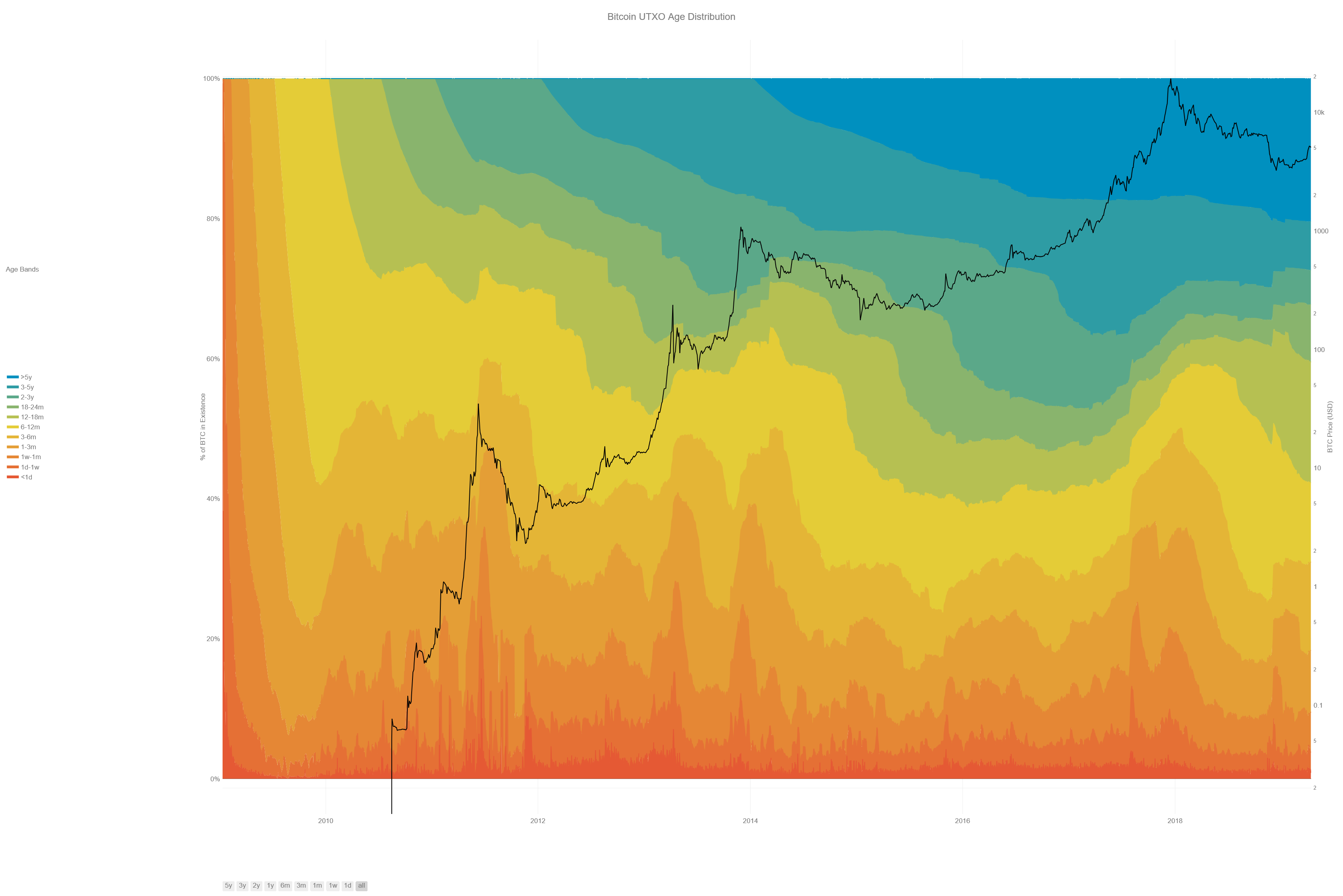 The colored bands show the relative fraction of Bitcoin in existence that was last transacted within the time window indicated in the legend. The bottom, warmer colors (reds, oranges) represent Bitcoin transacting very recently while the top, cooler colors (greens, blues) represent Bitcoin that hasn’t transacted in a long time. Bitcoin’s money supply grew from 50 BTC to ~ 17M BTC over this time period, so the chart has been normalized by the BTC in existence at each date (left y-axis). The black line shows the USD/BTC price (logarithmically, right y-axis). Chart lovingly made by Nelson Morrow based on prior work by @jratcliff [Direct Link]
This chart is fascinating because it displays the macroscopic shifts that have occurred in Bitcoin’s ownership through history. Spikes in the bottom, warmer-colored age bands (<1 day, 1 day — 1 week, 1 week — 1 month) indicate large amounts of bitcoin suddenly transacting. The steady growth of the top, coolor-colored age bands (2–3 years, 3–5 years, >5 years) shows bitcoin that’s not being transacted with, idling between rallies. The interaction between these two patterns illustrates the behavior of Bitcoin’s investors during market cycles.
It is not possible to make charts such as the one above for traditional asset classes. It’s only Bitcoin and other public blockchains that meticulously track these data throughout their whole histories. This enables post-hoc analyses of large-scale market behavior.
Introducing: The HODL Wave
A common pattern after every rally in Bitcoin’s price is what we have named a “HODL wave.” A HODL wave is created when a large amount of Bitcoin transacts on the way up to and through a local price high, becoming recent BTC (1 day — 1 week old), and then slowly ages into each later band as its new owners HODL.
A HODL wave manifests visually on the chart as a pattern of nested curves caused by each age band becoming suddenly much fatter (taller) at progressively later times from the rally. The image below traces a few of the largest HODL waves.
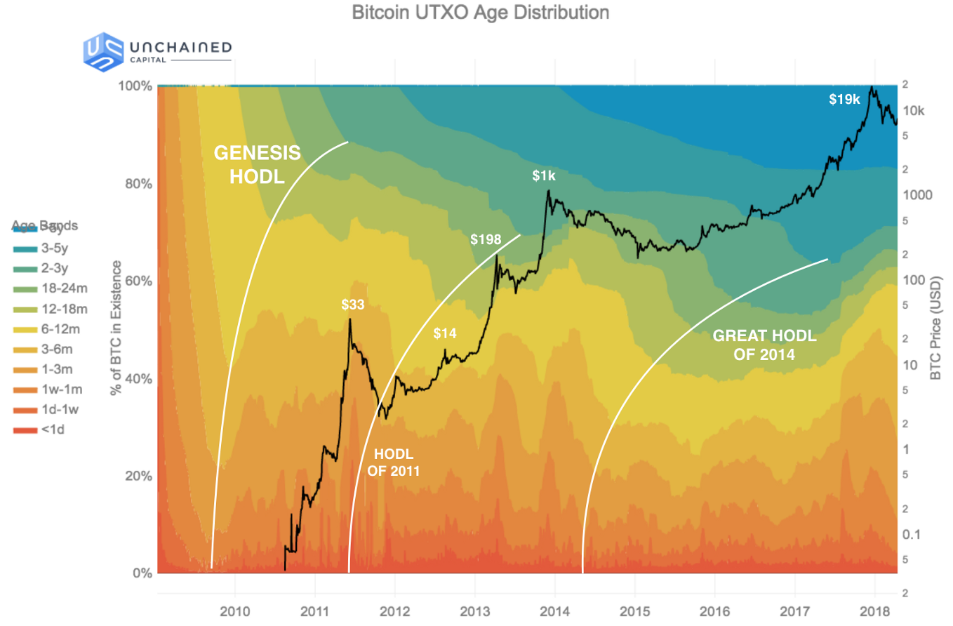 An annotated image of the UTXO age distribution. Local price peaks are labeled. The solid white lines trace “HODL waves” — a pattern of newly recent Bitcoin aging into each subsequent band, indicating that its new owners are HODLing. Only the three largest HODL waves are traced — many smaller HODL waves are also present.
A Short History of HODL Waves
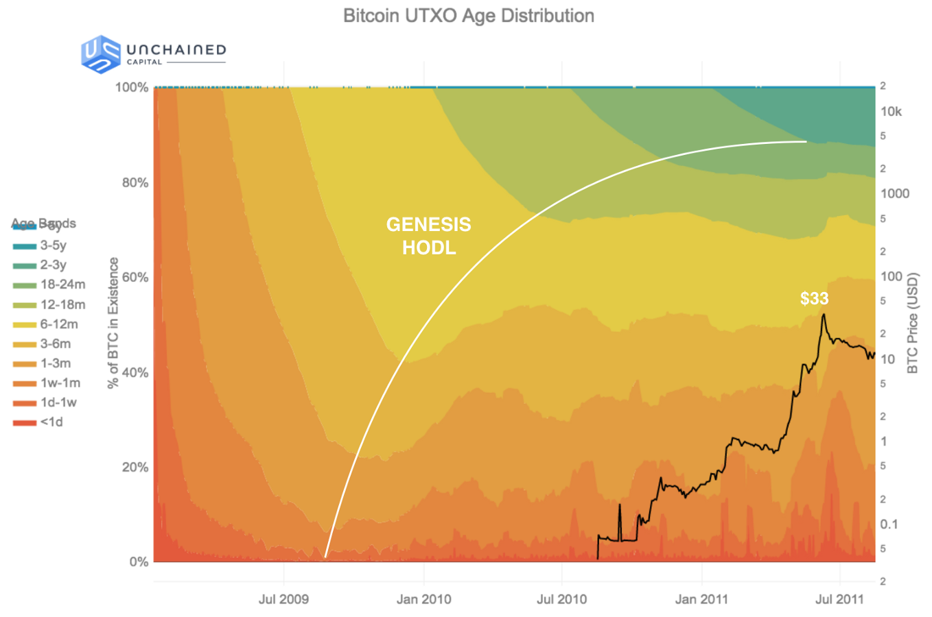
The Genesis HODL: January 2009 — June 2011 ($0 — $33)
 The Bitcoin UTXO age distribution zoomed in to a timespan covering the “Genesis HODL” — the first HODL wave in Bitcoin’s history.
The first HODL wave — the “Genesis HODL” — was not caused by a price rally because Bitcoin had no price at that time. Instead, it was caused by the initial acquisition of Bitcoin by Satoshi and the other first miners.
During the first year of Bitcoin’s history the community was extremely small, transaction volume was low, and there were no exchanges to establish a USD/BTC price. The coins being mined during 2009 weren’t included in transactions very often for these reasons. They sat around and progressively accumulated into later age bands.
Consequently, each of the colored age bands appears suddenly in the diagram once sufficient time has passed since the genesis block (e.g. — the green 12–18 month age band appears exactly 12 months after the genesis block). The age band grows for a time, but then begins shrinking as all the existing Bitcoin ages into the next band.
Because there was nowhere to sell Bitcoin at the time, the Genesis HODL is one of the clearest HODL waves on the chart: early miners had no choice but to hold their Bitcoin and surf the wave. Later HODL waves are much frothier as holders could exit into fiat whenever they wanted.
The first time this pattern shifted was in mid-2010, going into 2011. The first Bitcoin exchanges, including Mt. Gox, launched in 2010. Bitstamp, Kraken, Coinbase all launched in 2011. The fraction of coins older than 12 months stopped growing in June 2010 for the first time. This is the first era where holders could trade Bitcoin online. Bitcoin’s price wouldn’t reach even $1 till February, 2011, but early miners likely had many thousands of BTC. Why not make a little cash?
By April 23rd, 2011, Satoshi had left Bitcoin, right as Bitcoin reached $1. Satoshi is estimated to hold ~ 1M BTC, so he/she/they/it was already a millionaire at this point. Maybe that was enough?
I’ve moved on to other things. — Satoshi Nakamoto, April 23rd, 2011 (1 BTC = $1).
What a casual bastard. :)
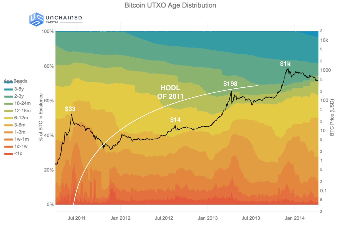
The HODL of 2011: June 2011 — December 2013 ($33 — $1k)
 The Bitcoin UTXO age distribution zoomed in to a timespan covering the “HODL of 2011” — the second major HODL wave in Bitcoin’s history.
Starting in June 2011, Bitcoin’s price suffered its first major collapse, from $33 all the way down to $2–3 by November 2011. It took almost two years to recover when it rallied to $198 in April, 2013.
During the rally up to $33 in June 2011, all the holders who sold were early miners by definition. No one else could really have acquired BTC to sell.
But the rally up to $198 was different. The age bands which shrunk the most leading up to the rally were between 12 months to 24 months. These were likely the first wave of investors — not miners — selling to realize gains. These investors would have acquired their BTC leading into the prior $33 price rally and afterwards.
Bitcoin collapsed again from $198 in April, 2013, down to $69 in July, 2013 only to soar past $1k by December, 2013. There wasn’t much time for panic-selling before a new surge of euphoria.
This was the first major rally that was covered in the news. Many major exchanges such as Bitstamp, Kraken, & Coinbase — not to mention Mt. Gox — had been around for a few years and were mature enough to service a large wave of demand for the first time.
Right after the rally to $1k, more than 60% of BTC had been spent within the last 12 months. This was the most “recent” moment for BTC’s money supply in history — the moment at which the average last time of use of a Bitcoin was lowest. Who sold? Once more, it was the investors who purchased in the prior 2–3 years, through the $33 peak and the $198 peak.
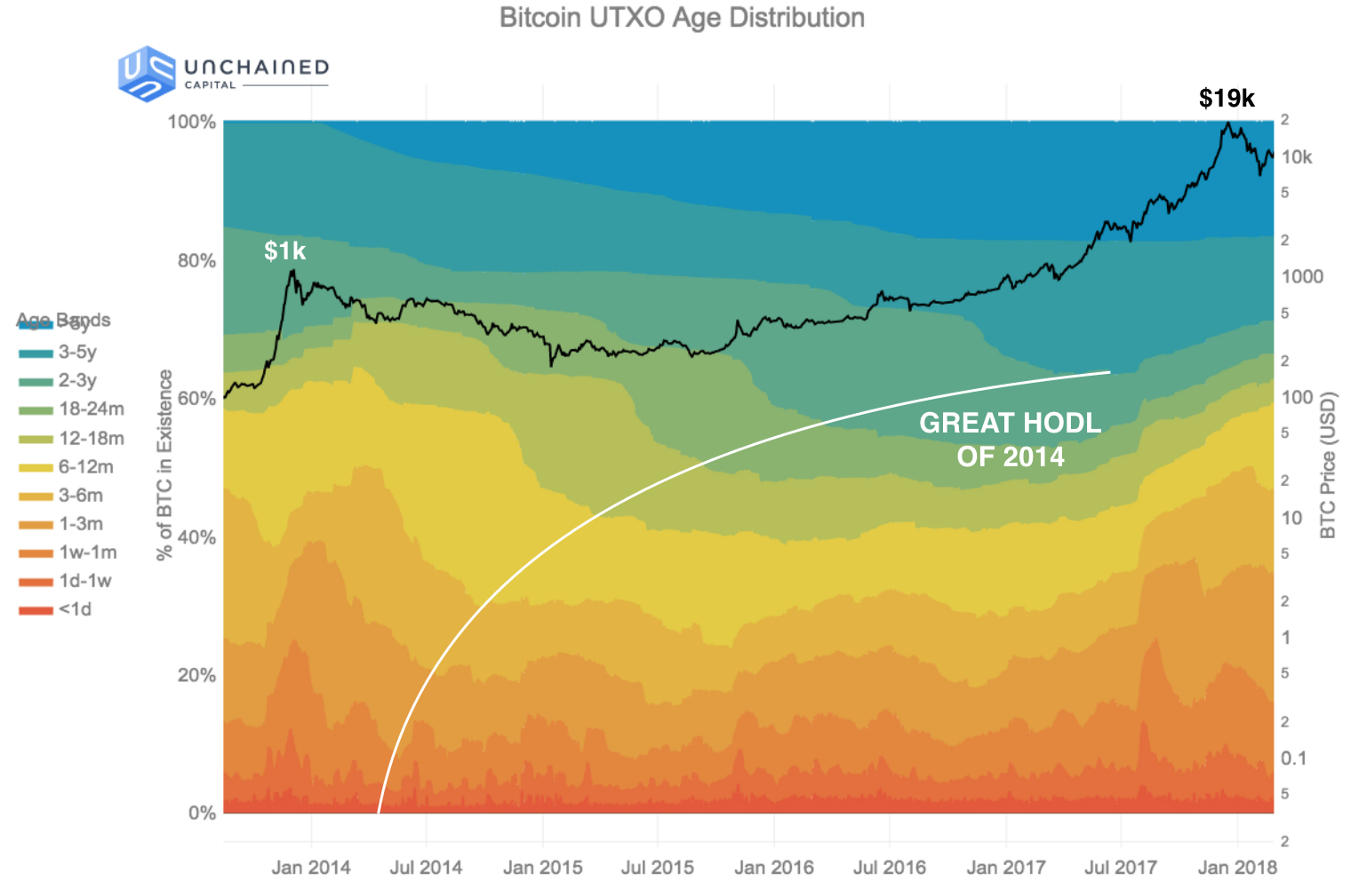
The Great HODL: December 2013 — December 2017 ($1k — $19k)
 The Bitcoin UTXO age distribution zoomed in to a timespan covering the “Great HODL of 2014” — the third major HODL wave in Bitcoin’s history.
Ahh, the long winter of Bitcoin. After collapsing in December 2013, Bitcoin wouldn’t reach $1k again till February 2017, more than 3 years later.
But the rally to $19k, reached by the end of the year in December 2017, was truly spectacular. There was much more mainstream press coverage and many more new investors, including some extremely “traditional” investors such as institutions and funds.
As the price was crossing $1k in February, 2017, almost 60% of Bitcoin was older than 12 months. A year later, just after the peak at $19k, only 40% of Bitcoin was older than 12 months. During 2017, 20% of Bitcoin in existence was transacted with for the first time in years. Why? We see three separate, related reasons.
Capturing Gains
Some of the transaction volume in 2017 was about capturing gains. Investors who’d held BTC for 12 months or more were the sellers, with particular emphasis on those who’d held for 2–5 years. Fully 15% of BTC moved out of those age bands and became young again during this rally. The selling started almost as soon as BTC crossed $1k again, in February 2017.
ICOs
But this time period also corresponds with the rise in Ethereum, ERC20 tokens, and ICOs. Many ICOs accepted Bitcoin and many Bitcoin holders felt that investing their BTC into ICOs was a way to capture the meteoric rise in value of the ETH-ecosystem, as no similar growth was yet occurring in Bitcoin. So perhaps it was ICO fever that compelled Bitcoin holders into the warm embrace of ETH and ERC20 after enduring many years of frosty Bitcoin winter?
Bitcoin Cash & Segregated Witness
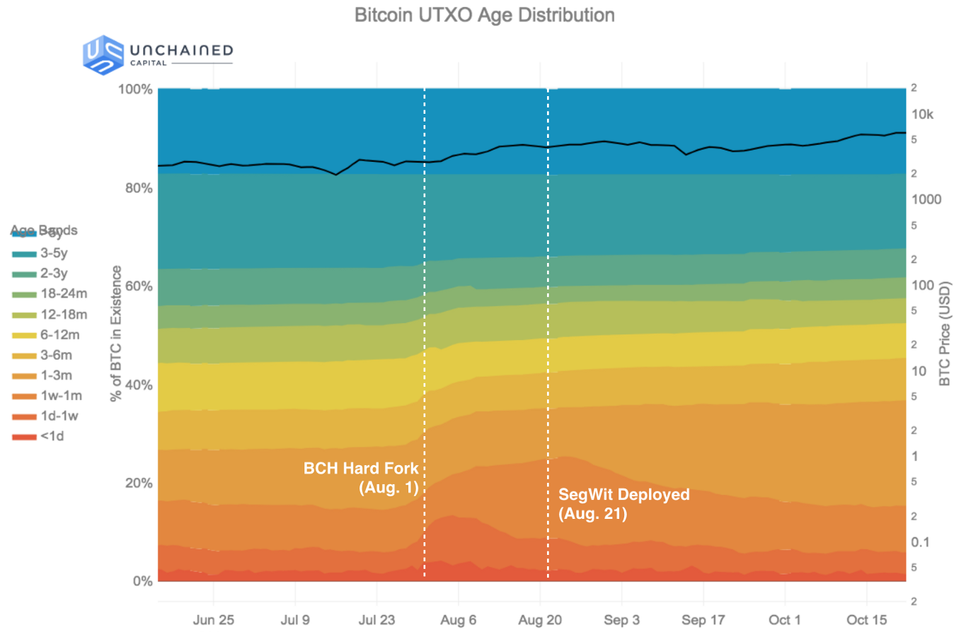 The Bitcoin UTXO age distribution zoomed in to a timespan covering the Bitcoin Cash hard fork (Aug. 1) and the deployment of segregated witness (Aug. 21).
The final factor was the Bitcoin/Bitcoin Cash hard fork of August 1st, 2017, and the subsequent upgrade (on the Bitcoin side) to using segregated witness, on August 21st, 2017. Both these events caused large amounts of Bitcoin to transact for the first time in years as holders acted to claim coins on both sides of the fork and move their Bitcoin to new segwit addresses.
The data clearly shows the significance of this event. In the month of August 2017, 25% of bitcoin became less than one month old. That equates to nearly 4M BTC, or $17B of value at then prices.
The Next HODL: December 2017 onwards ($19k — ?)
Today, after the rise of 2017 and the fall in 2018, the fraction of Bitcoin older than 12 months has dropped to just 40%, making the average age of Bitcoin almost as “recent” today as it was just after the last big rally to $1k.
And after every great rally, there’s been a great HODL. As the data shows us, there is already the development of another generation of holders settling in for the long haul. Beginning in January 2018, the category of bitcoin that are 6–12 months old rebounded from a low of 7.76% to 14.63%, a doubling of its population.
It will be interesting to follow this new HODL wave over the next few months and years. What price will be required for the wave to break and a new cycle of gains-taking to occur? How much older will the average bitcoin get before the cycle begins again? How much larger will the next cohort of hodlers be?
If you’re curious about the answers, check back on this blog post over time. We will be continuously updating the UTXO age distribution chart above (also available as a direct link).
Many thanks to Taylor Pearson, Kyle Samani, Tushar Jain, هیهات منا الذلة, & Orie Steele for their invaluable feedback when reviewing this post.
This post is the first in a series using data science to tell stories about Bitcoin. It describes the behavior of Bitcoin HODLers during market cycles.
Stay tuned for
- Part 2: In which we quantify how much Bitcoin is lost.
- Part 3: In which we analyze UTXO dust in the chain.
Unchained Capital has been doing data science on blockchains for years. Discovering the large amount of Bitcoin UTXOs older than 12 months convinced us to start a lending business to help cryptocurrency owners get value from their digital assets today while continuing to hold them into the future. If you are holding BTC (and soon ETH ) and you’d like to borrow against your holdings, please sign up for an account on our website and apply for a loan.
Remember: Friends don’t let friends sell Bitcoin.
Bitcoin Average Dormancy
New Views of a Classic On-Chain Metric
By David Puell & Reginald Smith
Posted June 20, 2019
Download Reginald’s research paper: Bitcoin Average Dormancy
Disclaimer: Nothing here should be considered trading or investment advice.
So what is average dormancy (or simply, “dormancy”)? First proposed by this article’s co-author Reginald Smith in 2018, it has not been given enough attention relative to its importance as one of the foremost metrics of BTC’s long-term economic health. In summary, dormancy is the average number of days destroyed per coin transacted in any given day, as per the following formula:
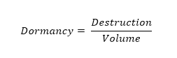
Here, destruction equals the total number of coindays destroyed, and volume equals the total number of coins transacted through the blockchain (and not at exchanges). This ratio describes the average number of days each coin transacted remained dormant, unmoved. The higher the dormancy, the older the coins transacted that day are on average, and the more old hands are releasing their bitcoins into circulation. In other words, average dormancy refers to spent or realized destruction relative to transactions.
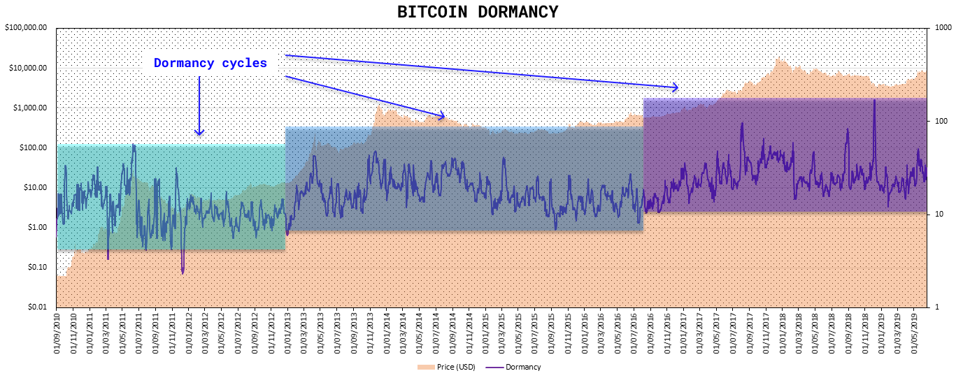
Fearful Symmetry: Accumulation and Distribution
As pointed out in dormancy’s original paper, on-chain destruction and on-chain volume equate to being perhaps the two most important metrics of Bitcoin’s economic state; the reason being that, especially when compared as a ratio such as dormancy, they describe the state of what smart money is doing in the market at any given time—accumulation or distribution. Based on first principles, the following assumptions emerge:
- Accumulation describes the act of smart money (last-resort buyers) taking cheap coins from dumb money (panic sellers), while distribution describes the act of smart money (old hands) releasing expensive coins into the hands of dumb money (bag holders). Accumulation occurs at market bottoms and distribution occurs at market tops.
- Destruction describes the actions of mostly a single market actor: old hands selling or spending their bitcoins. Volume describes the actions of two market actors: buyers and sellers dealing with investor flows at different prices.
- High destruction is bearish (old smart holders releasing coins into circulation) and low destruction is neutral (since in itself it implies holders are maintaining their position but not necessarily that buyers are coming in). High volume in itself is neutral (high number of transactions between both buyers and sellers) and low volume is bearish (confirming no demand for the asset as per a lack of buyer’s activity). From the above, the following simplified matrix emerges:
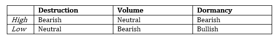
Dormancy integrates all these narratives into a single metric, by comparing both ratio components at all times, and displaying them in a simple oscillation by which, on a trending basis, high dormancy is bearish and low dormancy is bullish.
Supply-Adjusted Dormancy
Since the age of the market allows for an ever-increasing amount of destruction (the numerator of average dormancy), adjusting for supply (an increasing creation of minted coins) in the denominator seems to provide a clearer, more proportional historical oscillation that helps best visually detect the health of the market — or, in this case, dormancy per coin, calculated as follows:
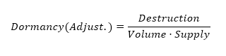
This formula produces the chart below:
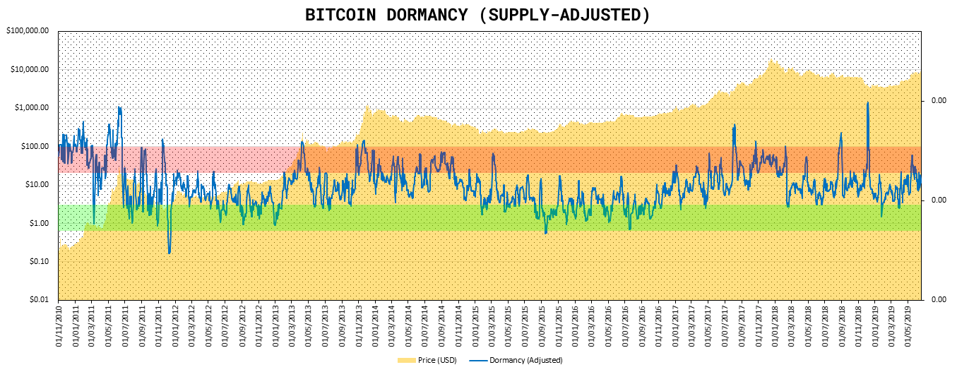
DUA Ratio (by Reginald Smith)
Just as with pure transaction volume and its variants like NVT Ratio, NVT Signal, or Network Momentum, the dormancy concept has opened the door into a new inflow of indicators for long-term Bitcoin market diagnostics. What follows are two examples of this.
Dormancy-to-UTXO-Age Ratio measures the relation between dormancy and the average age of all UTXOs at any given time, calculated by taking the ratio of average dormancy of the last 30 days between the average of all HODL waves in existance, as follows:
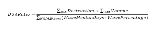
In which median days represents the median time of the HODL wave age band, and wave percentage represents the percentage of UTXOs in any given age band. In this particular case, both coindays destroyed and on-chain volume are aggregated throughout 30 days to smooth out the dormancy numerator.
Since dormancy measures the average holding time of continuously on-chain trading Bitcoin, the average age of UTXO, which includes bitcoin both in the HODL and lost states, is always longer — so average dormancy is always less than the average age of UTXOs. Therefore, the ratio is always less than one.
In periods where long-term holders accumulate (HODL) Bitcoin, the average dormancy is low and the average age of UTXO increases, lowering the ratio. When long-term holders offload their holdings to short-term traders, the average dormancy increases and the average age of UTXO decreases, raising the ratio. This tool is therefore useful in identifying market trends that often lead to HODL waves detecting periods of bitcoin selling by long-term holders in bull markets, and then re-accumulation after the onset of the bear market when the UTXO average age begins to rise and dormancy once again drops.
Dormancy Flow (by David Puell)
Another attempt at capturing phases in BTC’s market cycles, dormancy flow is calculated by dividing current market capitalization by annualized dormancy value (USD), as follows:
Dormancy flow provides the following chart, ideal for both bottom-catching historical global lows and assessing whether the bull market remains in relatively normal conditions:
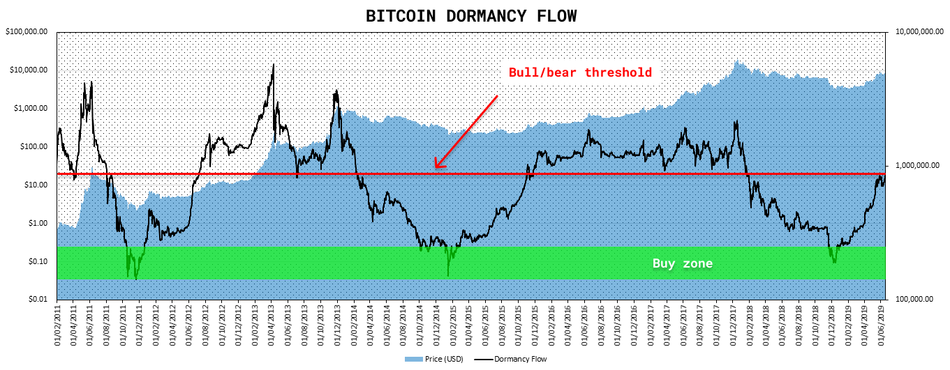
Whenever network value remains high relative to the yearly moving average of its realized dormancy in USD, the bull market can be considered as “healthy,” since price remains high relative to the market’s annualized spending behavior. Whenever dormancy value overtakes market capitalization at lowest longitudinal levels, the market can be considered in full capitulation — a good historical buy zone.
Caveats
- Destruction (dormancy’s numerator) is prone to false signals on daily variance. The most prominent example of this is last December, when the Coinbase exchange moved nearly 5% of Bitcoin’s total supply. To avoid misinterpreting these false positives, it is recommended to best use dormancy by looking at continuous trends in the oscillator (smoothed by medians or moving averages) as opposed to its daily noise.
- Just like with NVT and other on-chain metrics, dormancy should be viewed with an increasing caution for major fundamental shifts in detecting on-chain activity. Several recent or future developments in the Bitcoin ecosystem will ultimately contribute, at different stages and in different degrees, to a loss of power in the signals provided by these indicators. Examples of this may include: concentration of speculative liquidity in BitMEX and other exchanges, new custody solutions for institutions, the Lightning Network, sidechains, among others.
Acknowledgements
Many thanks to Willy Woo, Adam Taché, and Murad Mahmudov for their invaluable input and support in the improvement of this piece.
Sources and Data
- Smith, Reginal D. “Bitcoin Average Dormancy: A Measure of Turnover and Trading Activity.” Ledger, February 2018.
- CoinMetrics.io : Coindays destroyed, transaction volume, supply, and price data.
- Unchained-Capital.com: HODL waves data.
Authors
- Reginald Smith, independent researcher.
- David Puell, Head of Research @Adaptive Capital.
NVTS NVT Signal
UXTO Realized Price Distribution
By Renato Shirakashi
Posted May 31, 2019
UTXO Realized Price Distribution shows how many bitcoins moved at each price range. This is different than transaction volume by only considering the prices of the last time UTXOs moved.
This is the UXTO Realized Price Distribution. It shows the quantity of btc the was last moved in each price range. This can show us price ranges to look at, since some people may be reaching break-even point or starting to have losses at those points
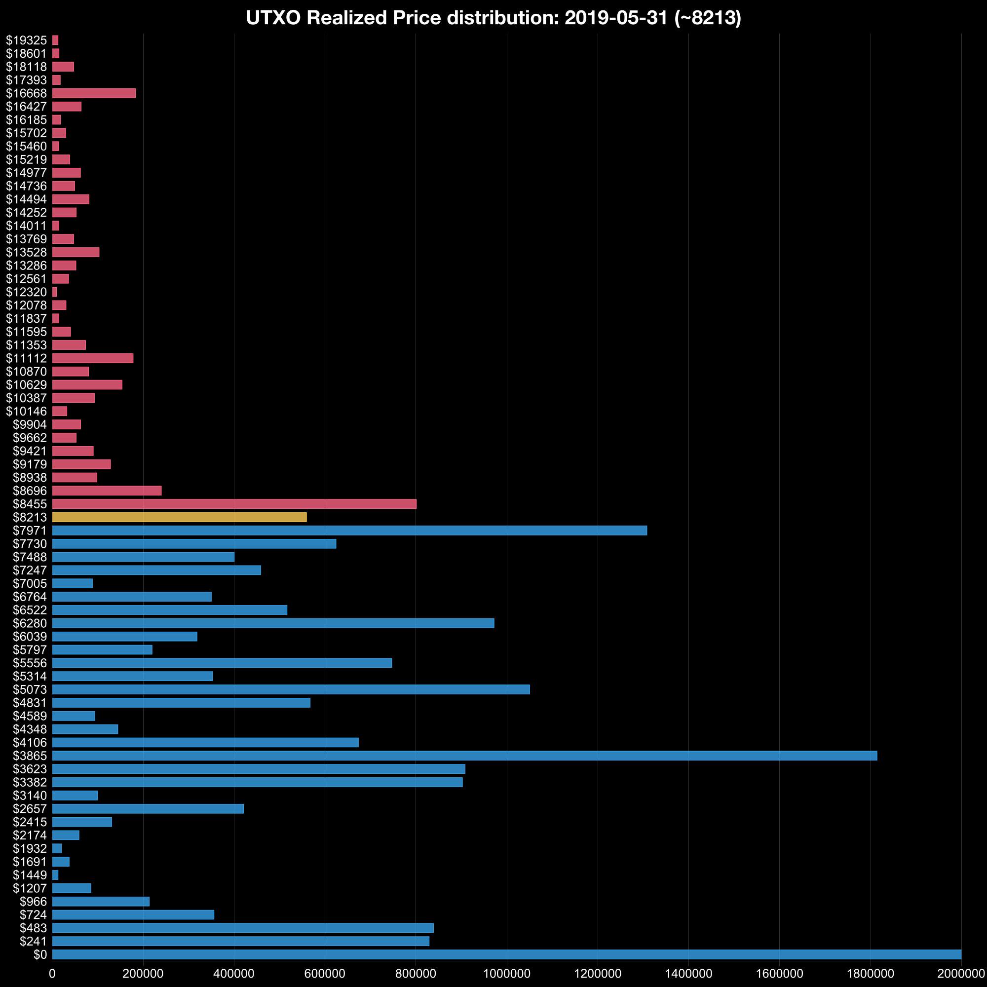
Liveliness of Bitcoin
By Tamas Blummer
Posted December 29, 2018
29. December 2018 by Tamas Blummer
Liveliness is new quantitative measure that gives insight to shifts in HODLing behavior.
Whenever someone moves Bitcoins there is a record of that on the blockchain. The blockchain records the move’s time point, the amount and the source of every Bitcoin involved, which again discloses the length of the recent holding period. Such an insight is unique to an asset tracked on a blockchain, and is not attainable in traditional financial markets. Let’s use this information to derive a quantitative measure that gives more insight to investor’s behavior than those available in traditional markets.
Liveliness
A holding period multiplied with the amount is often called stake. We define Liveliness as the ratio of sum of stakes used and sum of all stakes existed.
 [ti, to] is the recent holding period, c(t) is coin issued at t. Time is measured as difference of block numbers.
Liveliness would temporarily reach 1 if all coins would move within a single block and remain at 0 for a blockchain that have not yet had a transaction other than issuance. Liveliness will trend down for a blockchain with dormant units and up for a vivid ecosystem. A reading between 0 and 1 hence may be understood as a measure of Liveliness.
Liveliness gives us insight to behavior of investors. It increases as long term holder liquidate positions and decreases while they accumulate to HODL.
Liveliness could be used to weight market cap if comparing crypto currencies, as it will be close to zero for currencies that have inflated market cap through pre-mined coins or wash trading of the same few units.
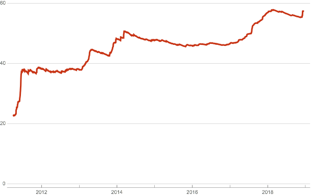 Liveliness of Bitcoin in percentage
Liveliness is the inverse measure of lost or HODLed Bitcoins and alerts us of moves of large or old stashes. For this purpose subtract Liveliness from one and multiply with coins issued.
 Approximate number of lost or HODLed coins in millions (red) price on log scale (gray)
It is apparent that Liveliness increases (and HODL decreases) during time periods of Bitcoin price increases and investors accumulate to HODL during periods of range bound prices.
I developed the concept of Liveliness during 2018 and wrote the software to calculate it from the Bitcoin blockchain. See related work at https://github.com/rust-bitcoin . Plots were drawn with mathematica. The price data for illustration is from blockchain.info.
Median Spent Output Lifespan
Bitcoin Network Momentum
A new leading indicator for Bitcoin price during its major market cycles
Philip Swift (@PositiveCrypto)
October 18, 2018
There have been some exciting developments in blockchain analysis over the past few months. Highlights include:
- Willy Woo’s NVT Ratio and Dmitry Kalichkin’s NVT Signal
- Recent work presented by Nic Carter at this year’s Honey Badger conference
- The subsequent MVRV (Market Value to Realised Value) paper written by Murad Mahmudov and David Puell
This sort of analysis is valuable and unique to the world of cryptoassets. For the first time, absolutely anybody who is investing in a particular asset can observe its underlying activity and performance — by using blockchain analysis.
This is not possible for the average investor investing in traditional stocks and shares. In those markets leading fund managers and top company execs are typically the only people who know in real time what’s happening within the underlying business of any given stock or share. So if you find the idea of cryptoassets bringing financial equality to the world exciting, then it is essential to understand the role that blockchain analysis plays in that.
Bitcoin Network Momentum is another piece of the puzzle to help our understanding of Bitcoin fundamentals and their impact on price. Bitcoin Network Momentum looks at the relationship between Bitcoin’s price and the BTC value of daily transactions flowing through the blockchain.
It is important to note here that we are using the BTC daily value flowing through the blockchain, not the USD daily value which NVT Signal uses.
What we see when we look at this is that the BTC value of daily transactions acts as a leading indicator of Bitcoin’s major market phases.
Note: This article will also discuss the recent introduction of Bitcoin Liquid and its impact on blockchain analysis metrics.
Bitcoin Network Momentum and its relationship with price
When we overlay Bitcoin’s price with the BTC value of transactions running through the blockchain each day, we see that they both follow patterns.
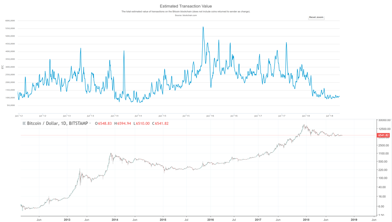 Daily Network Transaction Value (in BTC) and Bitcoin price chart.
At first glance, it is clear that both daily transaction values and price move in cyclical patterns, but that those patterns are not in sync with each other.
On closer inspection, we see that BTC daily transaction values provide a leading indicator insight into what stage of the market cycle price is at and therefore where price is likely to go next.
This can be broken down into three phases as we can see when we look at the previous market cycle:
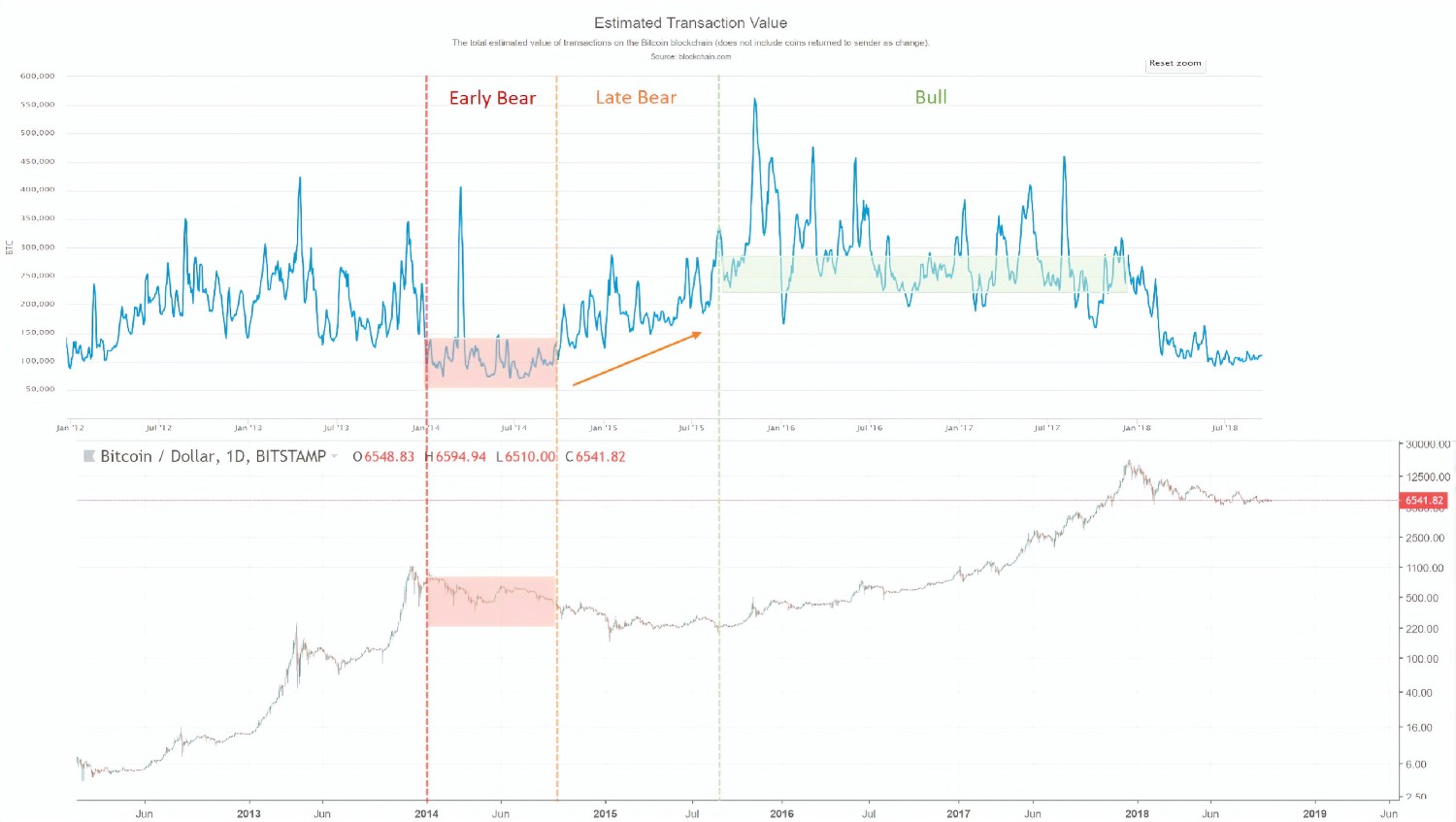
- Early Bear phase: Daily transaction values have dropped right down to around 100k BTC a day. Price is falling.
- Late Bear phase: Daily transaction values are rising. Price is broadly flat.
- Bull phase: Daily transactions have reached a sufficient minimum value (220k in the last market cycle, 150k in the one before) where the market finally responds and price starts to increase. We will explore in a moment why this phenomenon occurs.
So by monitoring the blockchain momentum in this way we are able to identify when we are closing in on the start of the next BTC price bull run.
Why is network BTC daily transaction value a leading indicator to Bitcoin price?
To understand this, we need to recognize that there is a divergence in behavior between short-term market participants who are dictating short-term price action, and longer-term HODL’ers and investors who are purchasing Bitcoin on-chain.
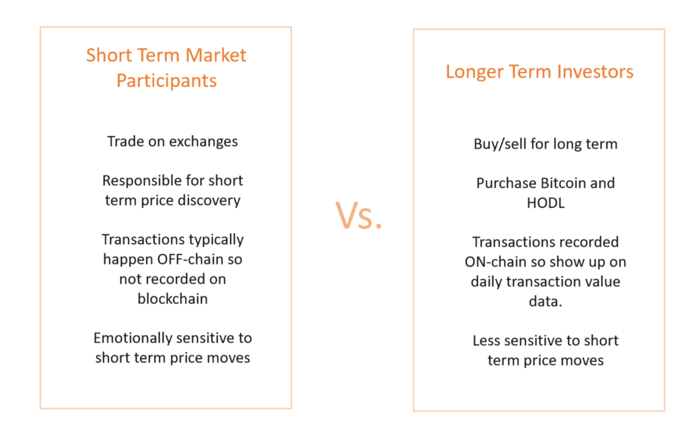
This explains why we see both daily transaction values and price exhibit cyclical patterns but not in sync with each other. Both are driven by different human emotions and motivations.
Short-term mindset traders heavily influence the Bitcoin price, long-term mindset investments are more likely to be recorded on the blockchain so have a greater contribution to the network BTC daily transaction value.
So why does price lag behind when daily transactions are initially increasing during that Late Bear phase we saw in the previous chart?
At this stage as short-term mindset market participants continue to sell, big buyers with a long term view are stepping in. The buyers’ volume steadies the price decline over time and creates the sideways accumulation zone where sells are roughly equal to buys. More and more smart money investment starts to come in until eventually the ‘healthy’ level of BTC daily transactions is reached. This is the point where the general market herd realizes that things are looking good again for Bitcoin (with its strong level of daily blockchain activity) so price goes up and the next bull market and FOMO cycle starts all over again.
It is worth remembering that this Late Bear phase needs to occur before we see a significant price increase. Which is why I become concerned when I see people expecting the price of Bitcoin to jump up immediately on news stories about institutions planning to buy into crypto. Even if they do, we still need actual network daily transaction value in BTC terms to increase to a sustained healthy level before price reacts in a significant way.
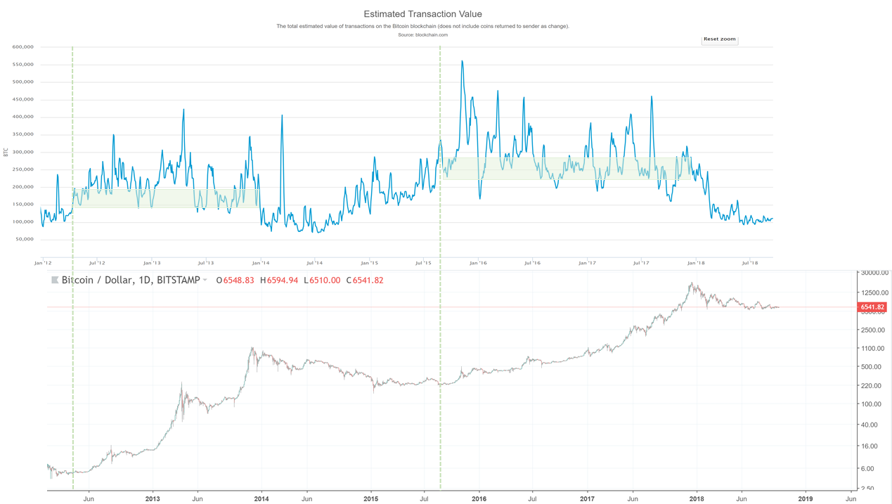 The minimum daily transaction levels of the previous market cycles that kicked off the new bull runs for BTC price.
This principle, therefore, helps to explain why we are seeing opportunities highlighted by other blockchain indicators such as MVRV (Market Value to Realized Value) and NVT Signal. For example, when we look at MVRV we can now understand that the market value picks back up above the Realized Value because the network’s daily transactions in BTC terms have reached their healthy level and confidence comes back into the market from both short term and long term mindset investors.
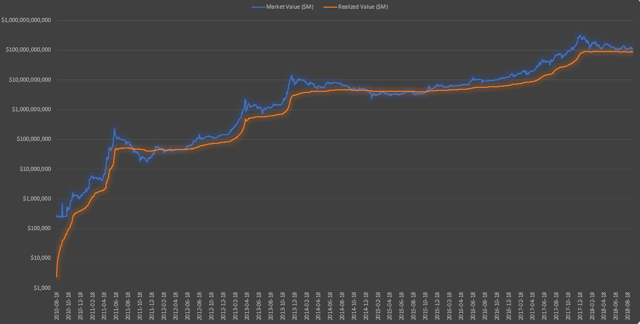 Market Value to Realized Value Ratio (MVRV)
What we can expect going forward for the next bull run
Daily transaction values are currently low, at around 100k BTC. This means we still have to go through the Late Bear phase where transaction values rise before we start to see a new bull run and any meaningful price increases.
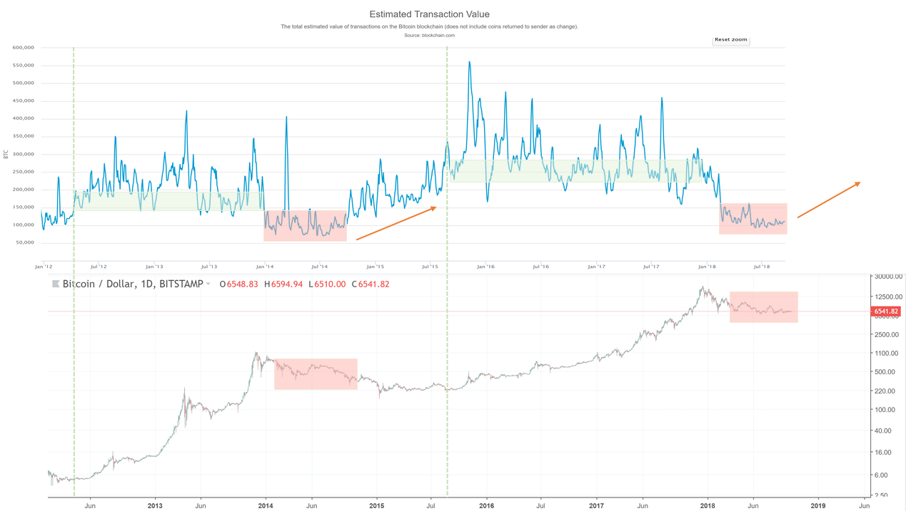 Bitcoin Network Momentum: where we need to go next.
You can see that the network’s healthy level kicking off a new bull run was higher in the 2015–2017 market than it was in the 2012-14 market. The reason for this is most likely due to the increased number of coins in circulation — shout out to Willy Woo for sharing this thought. As more coins become available, the healthy level of daily transaction value in BTC terms marking the start of the next bull run will need to increase.
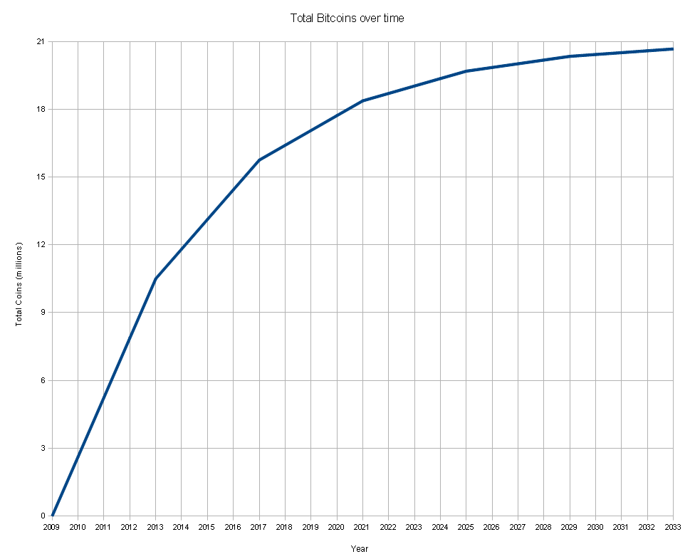 Projected number of Bitcoins in circulation over time
Bitcoin Liquid and its Confidential Transactions
Another factor that we now need to consider with this and other blockchain analysis is the recently launched Bitcoin Liquid. Bitcoin Liquid is a sidechain that allows large exchanges to transfer funds to each other off the main chain in a way that provides much faster and secure transactions. It also supports Confidential Transactions. This means that it will not be possible to view any of the transactions that use this service using blockchain analysis. This is significant because exchanges that account for 50–60% of all trading volume will now be using Bitcoin Liquid.
So does this make blockchain analysis such as Bitcoin Network Momentum and NVT Signal redundant if we now can’t see such a large proportion of transactions? Well, no it doesn’t, it just means that we no longer have the full picture of the total market. We will now only be able to analyse the remaining section of the market that isn’t using Liquid Confidential Transactions, which is still sizable.
One could argue this development will actually make such analysis cleaner as the blockchain transactions we see going forwards will capture less short term exchange driven transactions and have a higher proportion of transactions from long-term investors.
Either way, the data we see is still driven by human emotions and so we will continue to observe these cyclical patterns take place and therefore a relationship between the blockchain data and price.
In summary, Bitcoin Network Momentum is a valuable tool in helping us understand why Bitcoin price is at a particular point in the market cycle and also where it is likely to go next.
Given the currently low levels of daily transaction value flowing through the network it is likely to be several months before we start to see the next bull run. Daily transaction value will first need to rise to it’s minimum healthy level before we see price react positively in a sustained manner.
If you would like to check out an interactive chart of Bitcoin Network Momentum have a look on Willy Woo’s site here. If you found this article interesting you can follow me on Twitter here.
The Puell Multiple
A New Barometer of Bitcoin’s Market Cycles
By cryptopoiesis
Posted April 4, 2019
Most metrics aimed at timing or quantifying Bitcoin’s market cycles, from a fundamental perspective, have by and large focused on the velocity of value settled on chain, or lack there of, thus analysing the cycles from a buyer/investor’s perspective. Realised Cap, NVT Ratio, Market-Value-to- Realised-Cap (MVRV) and HODL Waves are just a few powerful metrics and visuals that have provided valuable insight.
 Being David Puell
Another type of metric, which has recently gained some attention in the Crypto community, is the the Dollar Value of Mined Coins on daily basis or Bitcoin’s Daily Issuance. This metric proved to have consistently identify all the swing lows based on previous All Time Highs like clockwork. This relationship held for the two major, halving associated, bull-bear market cycles as well as the several shorter ones during the early years.
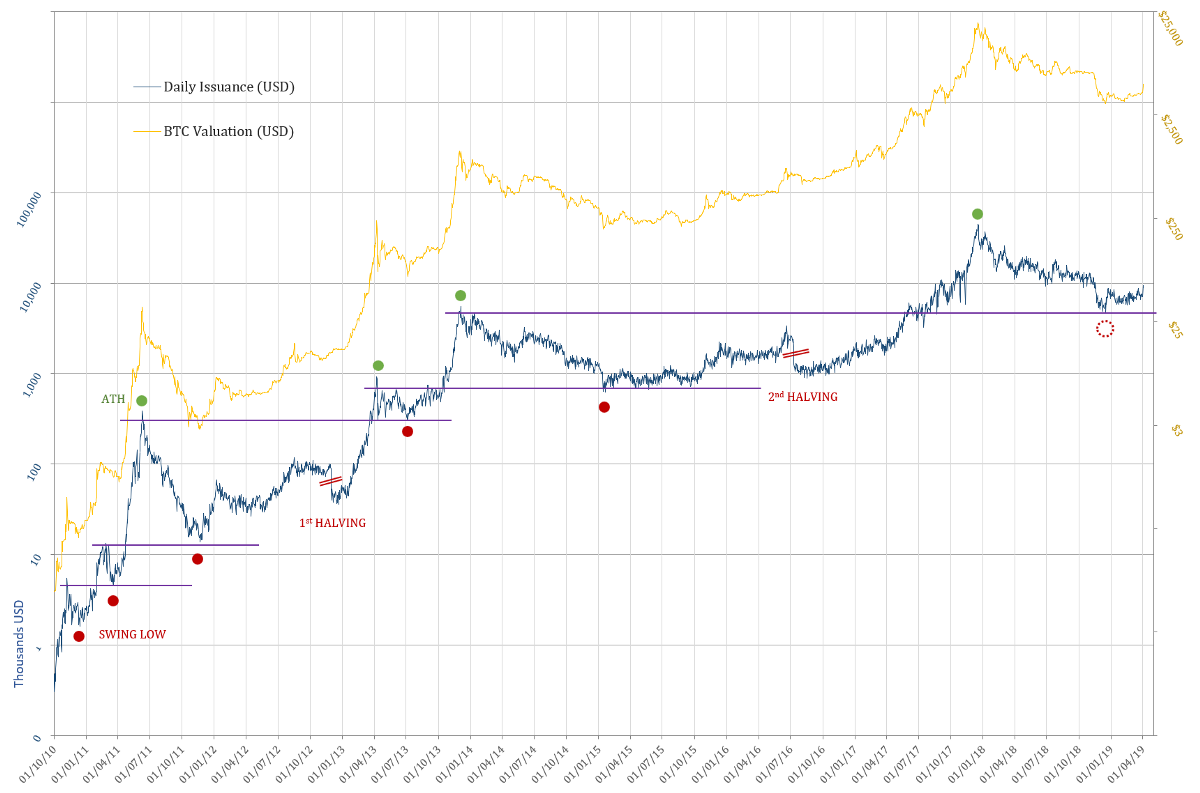
This metric shines a light onto the other side of the coin from the proverbial Hodlers of Last Resort, namely the Compulsory Sellers and the fundamentals of mining profitability that are at play in shaping Bitcoin’s market cycles. David Puell’s simple yet ingenious idea of adjusting this metric by its yearly simple moving average has produce a new, powerful and elegant tool to gauge the market cycles from a Mining Profitability/ Compulsory Sellers’ perspective.
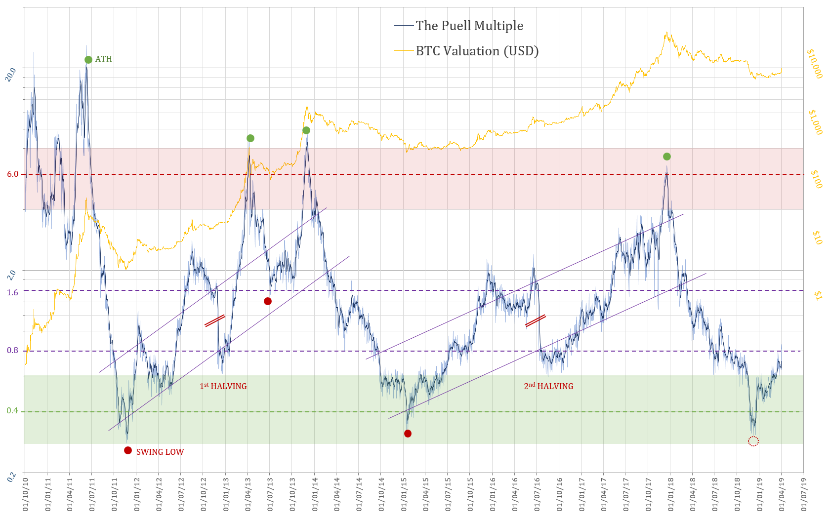 The Puell Multiple
As the mechanism which underpin the correlations are dictated by the dynamics of Mining Profitability, the daily bitcoin issuance coming from block rewards has so far sufficed — daily coin issuance having currently a theoretical average of 1,800 bitcoin daily. However, after the next (third) halving which is due in mid 2020, the transaction fees collected by miners will no longer be trivial by comparison to block rewards. The relationship of this metric therefor, would most likely have to include the entire Daily Mining Revenue, which incorporates the transaction fees in addition to the block-reward e.g.:
Previous attempts at quantifying the fundamentals from the miner’s perspective, used as a starting point the PetaHashDollar metric (Daily Mining Revenue divided by Daily PetaHashes). The attempts at normalising, either by a trend, or more organically by using the Difficulty Adjustment, have all fallen short of producing a simple and accurate metric. Furthermore, all the different averages which have been tried out so far to calculate the Puell Multiple, have proven to skew the metric in one way or another. They failed at achieving a virtually perfect alignment of the tops, bottoms and, interestingly enough, the levels at which both previous halvings took place.
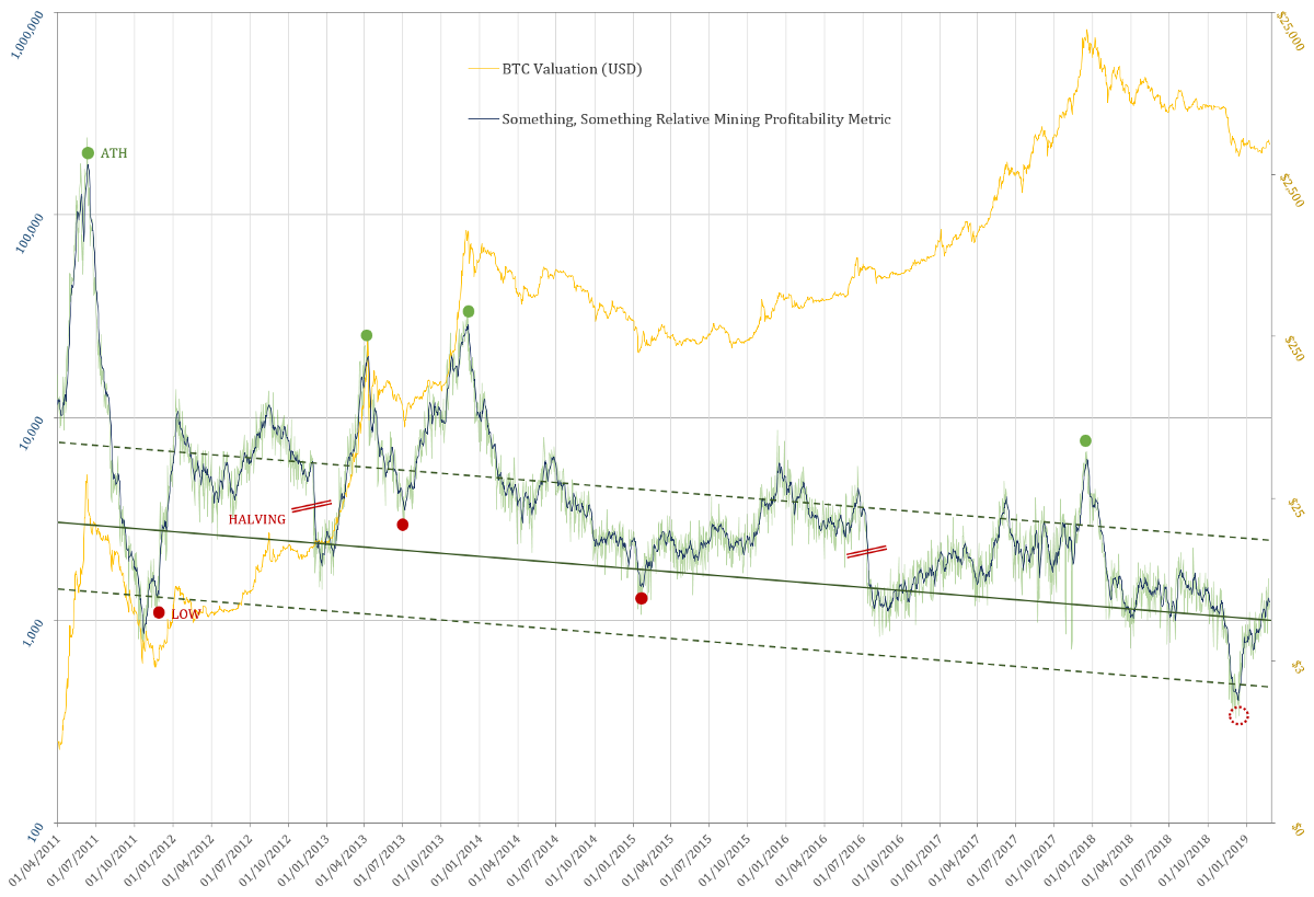 Example of a work in progress Mining Profitability Metric that took into account and adjusted for: Hash Rate, Mining Revenue and Difficulty Adjustment
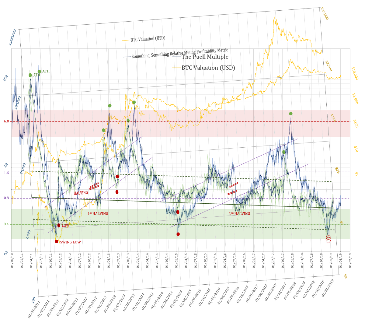 The same Mining Profitability Metric superimposed onto the Puell Multiple
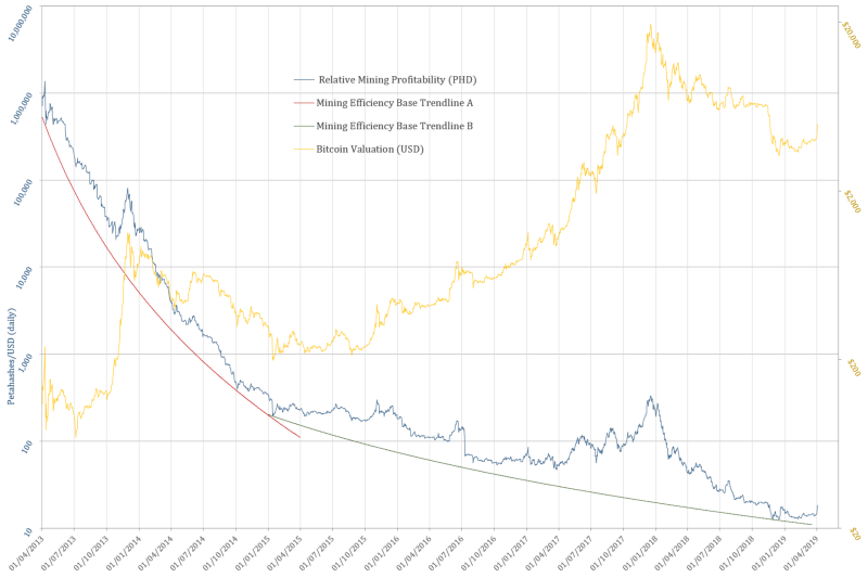 Another example: PetaHashDollar = Mining Revenue / Hash Rate
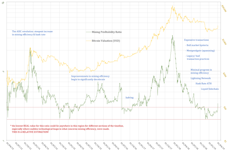 Mining Profitability Ratio derived from PetaHashDollar normalised by the baseline equations
Where To?
If one is to expect the next halving to occur at levels of the Puell Multiple in line with the two previous ones (1.6), it would be an interesting exercise to use it in approximating the price of Bitcoin around the next halving. As no data that would go into making the Daily Coin Issuance 365 days SMA is in at this time, only an eyeballing approach can be employed for this purpose. This would allow comparing this hypothetical range to the one which can be calculated by the forward projection of the non-linear regression of the price.
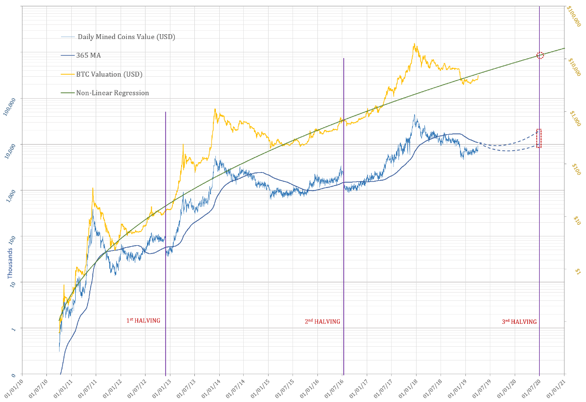
A variation on Renato Shirakashi’s Non-Linear Regression Curve for Bitcoinhas been developed with new parameters as to minimise the total of daily percentage divergence from the original Shirakashi’s Regression, and which can be said to “better hug” the base of the price-line. As the volatility and magnitude of future bull-markets/ bubbles are expected to decrease with the maturity and growth of this financial asset, this version had been chosen for the purpose of this projection.
Eyeballing the 365day SMA of the Puell Multiple between the values shown in the the graph above would imply a price in the range from $8,889 to $17,778,that of course if the halving would occur, once more, at Puell Multiple level of ~ 1.6.
The non-linear regression would be at this point in time at a level of $11,667. The first halving occurred below this regression model, while the second occurred at the level… will this trend continue… and see us above the non-linear regression model at the time of the halvening in mid 2020? Yes, with a large dose of hopeium :)
Acknowledgements
- David Puell
- Renato Shirakashi
- TusenPi All reference data used throughout this article has been sourced from:
- BitcoinVisuals.com (Hash Rate, Coin Supply)
- Blockchain.info (Daily Market Price, Daily Transaction Fees/BTC)
- CoinMarketCap.com (Closing Daily Price)
Postscriptum
Bitcoin is Beautiful!
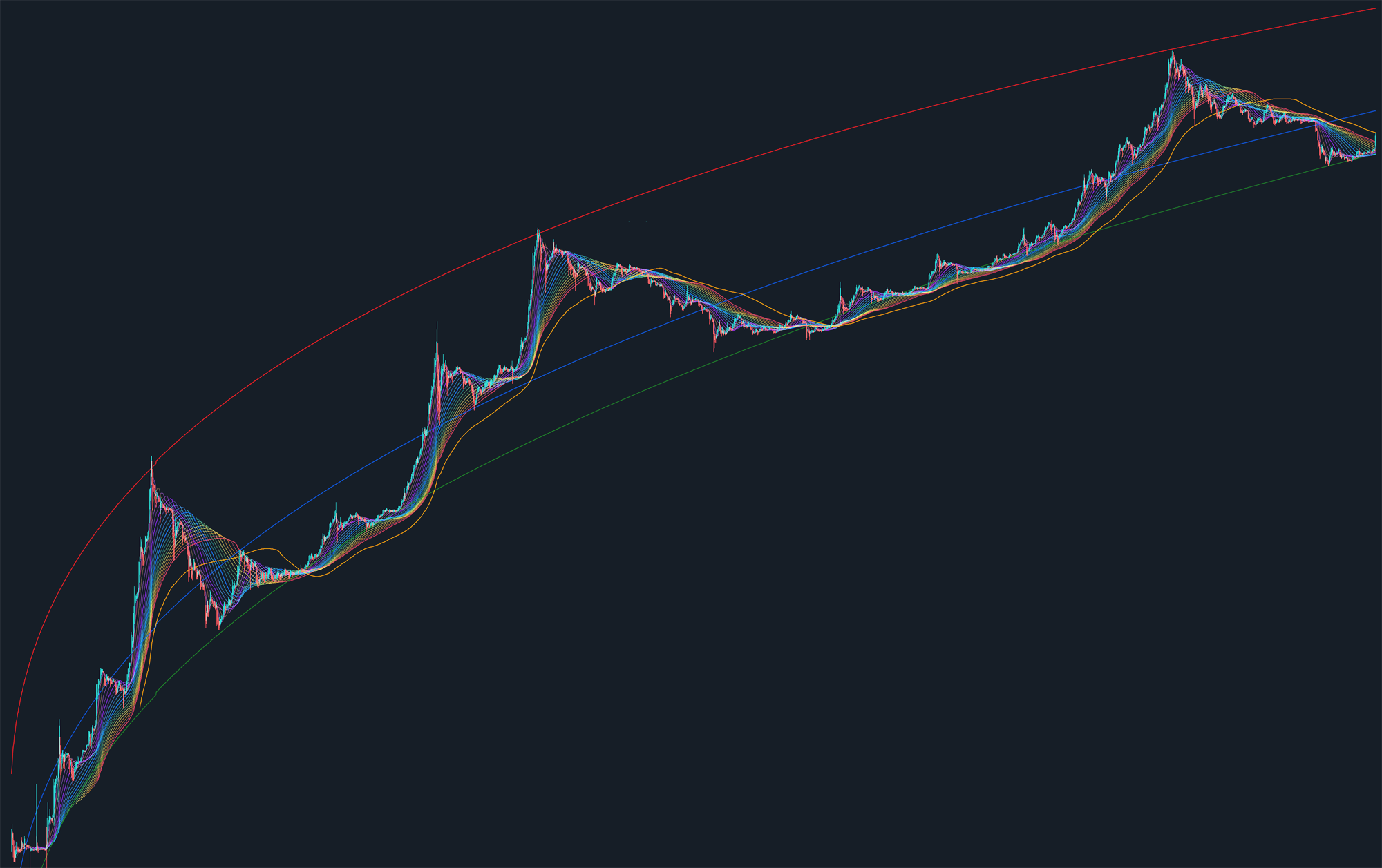 Bitcoin’s Non-Linear Regression Curve by Renato Shirakashi & Multiple SMA by TusenPi
Introducing Binary Adjusted BDD, VOCD and Reserve Risk
An Exploration of Bitcoin Days Destroyed
By Hans Hauge
Posted May 30, 2019
Bitcoin has been an endless source of fascination for us here at Ikigai for a number of reasons. Not the least of these is the fact that Bitcoin has a fixed issuance schedule which halves every four years and will terminate in the year 2140. Since price ultimately boils down to the intersection of supply and demand, and the supply is known; if we can quantify demand then we should be able to frame some price expectations into the future.
Unfortunately, quantifying demand is nontrivial, and forecasting demand can be perilous. Many attempts have been made to this end, but much confusion remains.
One way to characterize demand is to separate long-term investors from speculative traders via the age of the coins being moved. To illustrate this concept, imagine two participants in the Bitcoin network:
| Bitcoin Newcomer “Newb” | Bitcoin Veteran “Vet” | |
| Age of Coins Held | Recently purchased | Held for years |
| Information Edge | Low information; confused | High information; confident |
| Conviction | Highly speculative; weak hand | HODLer; strong hand |
The movements of the Newb are more likely to be sporadic, random, or unwise. For example, buying into the top of a bubble or selling at the bottom.
On the other hand, the Vet is more likely to be familiar with the market cycles and to time his purchases and sales in order to maximize his return on investment.
While there are exceptions to every rule, in the aggregate we believe we can make the following broad assumptions:
| “Newb” | “Vet” | |
| Buying | Greed / Random | Bullish |
| Selling | Fear / Random | Bearish |
Now then, having made this distinction, let’s consider what information may be hiding in plain sight within the Bitcoin UTXO set.
HODL Waves
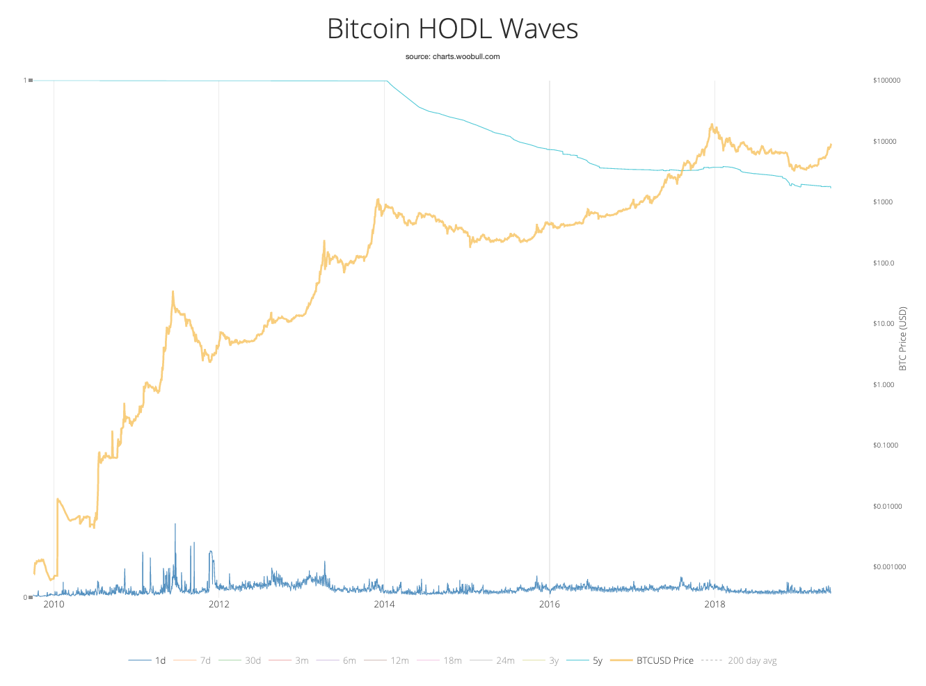 Source: Woobull.com
The chart above shows what percentage of the UTXO set is at which age. Note that the “5y” group has increased dramatically (shown by moving down in this case) and now accounts for more than 20% of all Bitcoin in circulation (over $30B at this time).
Compare this with the static sideways action of the seven-day segment for example . Essentially, short-term speculation has remained relatively constant while long-term holding is constantly increasing. We find this to be deeply bullish.
What are Bitcoin Days?
Bitcoin days are defined as the quantity of Bitcoin multiplied by the number of days since those coins were moved. The idea here is to segment coins in circulation into the Vet and Newb buckets. Of course, we could attempt to identify as many groups as we like - lost coins; algo market makers; the Winklevoss twins; etc. But the swing traders (or Swing HODLers if you prefer) would be somewhere between Newbs and Vets, who hold Bitcoin for 1-3 years and attempt to capitalize on the patterns of bubbles that have emerged over time. More on the Swing HODLers later.
By assigning a higher value to a coin that has been idle for longer, Bitcoin days more accurately reflect market participants who have been in the ecosystem for longer. Since the price has increased markedly over time, these users have seen their investments multiplied by orders of magnitude. In other words, a newcomer selling one Bitcoin he bought last week is less meaningful than the movements of very old coins owned by the participants from the early days.
Why do Bitcoin Days accumulate?
Bitcoin days accumulate over time because Bitcoin is not a perfect method of exchange (MoE). We can imagine a world where each Bitcoin is exchanged with someone else or for something else each day. If we lived in that world, Bitcoin days would never accrue.
We will revisit this concept in a moment.
What are Bitcoin Days Destroyed?
Now that we understand how Bitcoin days are created, let’s talk about how they are destroyed. Once a Bitcoin has been idle for a period of time, moving that Bitcoin “destroys” the number of days that it has accrued. As an example, if I purchased 1 Bitcoin and held it for 7 days, when I move that Bitcoin from my wallet the Bitcoin days are considered destroyed. One BTC held for 7 days would destroy 7 Bitcoin Days when it was moved (7 BDD).
The Bitcoin itself is not actually destroyed here, just to be clear. BDD is just a metric. Rather it’s assumed that the Bitcoin has been used to purchase something (Pizza, Lambo, etc), or it was moved to an exchange to be sold and now has a new owner.
There are two noteworthy points we should mention before proceeding:
1. Exchange operators hold large amounts of Bitcoin. From time to time they may need to move cold wallet funds to upgrade their wallets, or for other reasons. This movement can be misclassified as “whales cashing out” when it’s actually a nonevent. 2. The number of Bitcoin in circulation is increasing over time. Therefore, the number of Bitcoin days that are created each day is increasing too. If we simply look at the number of BDD over time, it at first appears that an exit stampede is underway.
To understand this more fully, consider the following chart that simply displays the number of BDD over time.
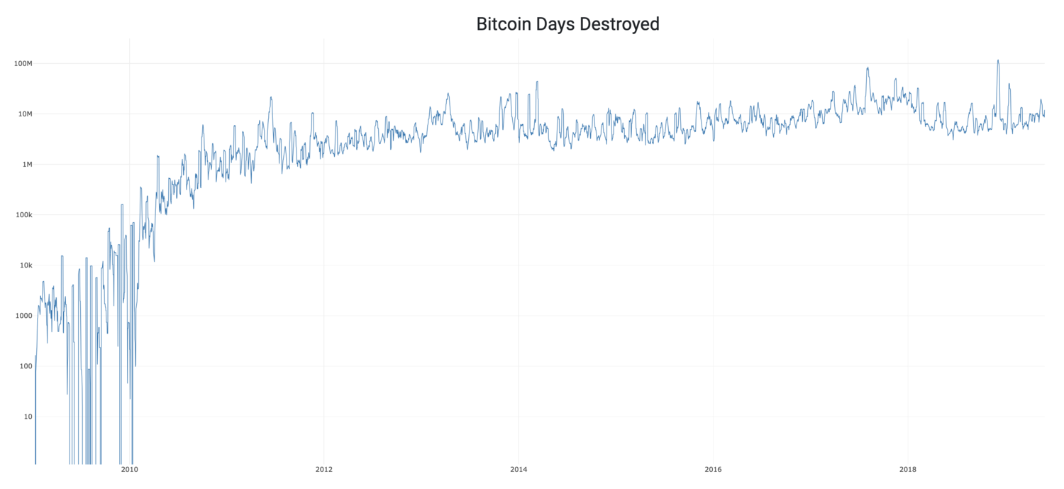 Source: Blockchair.com
In order to account for this increase over time, we have created Adjusted Bitcoin Days Destroyed, which simply divides BDD by the circulating supply (total BTC issued) on each day. Adjusted BDD more accurately represents the quantity of Bitcoin sold by long-term holders over time.
Adjusted BDD = BDD / Circulating Supply
In order to minimize the impact of exchange movements, which do not accurately reflect behavior of the long-term holders (HODLers), we took the mean destruction over time and asked a simple question. “Were there more Adjusted BDDs destroyed today than average?” The answer to this question can be seen below. Red Candles represent days in which the answer was “YES.”
 Source Data: Blockchair.com, Blockchain.com
As we can see, mid to long-term market participants seem to do a fairly good job of exiting the market near the peaks of bubbles. Even more interesting is to think about the times when the answer to this question was “NO.”
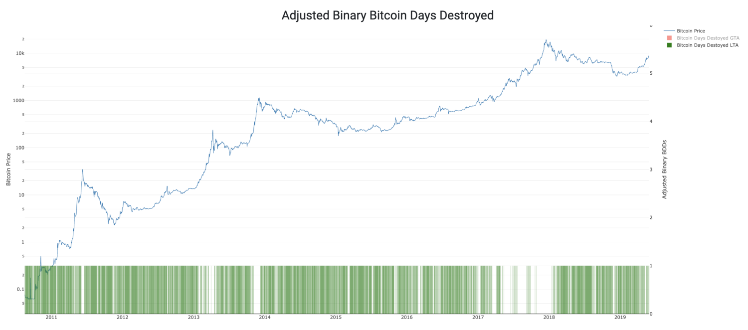 Source Data: Blockchair.com, Blockchain.com
Here we can see times of accumulation marked by the green candles. This buy-side support sets the stage for what’s to come.
Now that we have an understanding of how BDD and especially Adjusted BDD can be useful to us, what else can we do with this information? When we started off, we said that quantifying demand was paramount for Bitcoin valuation. Might there be a way to use the UTXO set to help quantify this?
Let’s revisit the concept of the HODLer calculus. If someone has a Bitcoin today and decides against selling it, what is their motivation? Logically they are expecting that it’s going to be worth more in the future. So, what if we put a number to the opportunity cost given up by this decision.
Value of Coin (Days) Destroyed
If I have a single Bitcoin today, the value I can get from that coin is the market price of 1 BTC. In terms of US Dollars that would be around $8,400 at time of writing. If we look at the number of BDD on a given day, we will note that this figure rarely exceeds the circulating supply. There are, however, some exceptions to this - such as during the peaks of bubbles - when more Bitcoin days are destroyed than the supply of Bitcoin in circulation. Those periods are worth noting.
Stated differently, if every Bitcoin that has been issued so far were to change hands today, and each of those Bitcoin had been held for exactly one day, then the number of BDD that day would equal the circulating supply (this means Bitcoin days would remain unchanged). In this instance, the BDD * BTC Price would equal the market cap. Or, simply the Adjusted BDD equals 1. To illustrate this, we have created the Value of Coin (Days) Destroyed, or VOCD.
VOCD = ∑ (Daily Bitcoin price * Adjusted BDD)
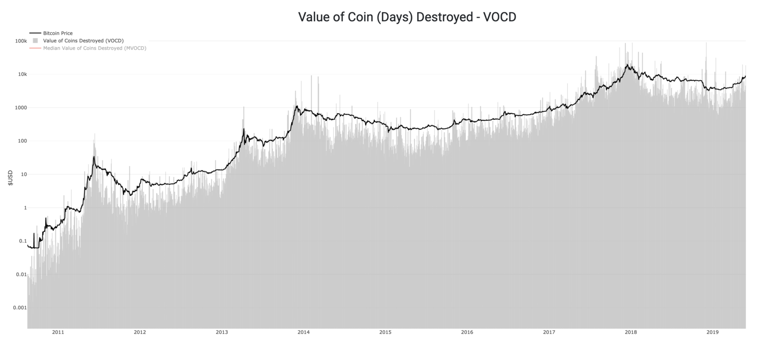 Source Data: Blockchair.com, Blockchain.com
BDD is a time-Bitcoin quantity metric. VOCD is a time-USD quantity metric. When the gray line overtops the black line, that means the VOCD is greater than the Bitcoin price, or that more BDD are being destroyed than created on that day.
MVOCD
In order to back out those large exchange wallet migrations we mentioned earlier, we take the median of VOCD over 30 days and create the MVOCD.
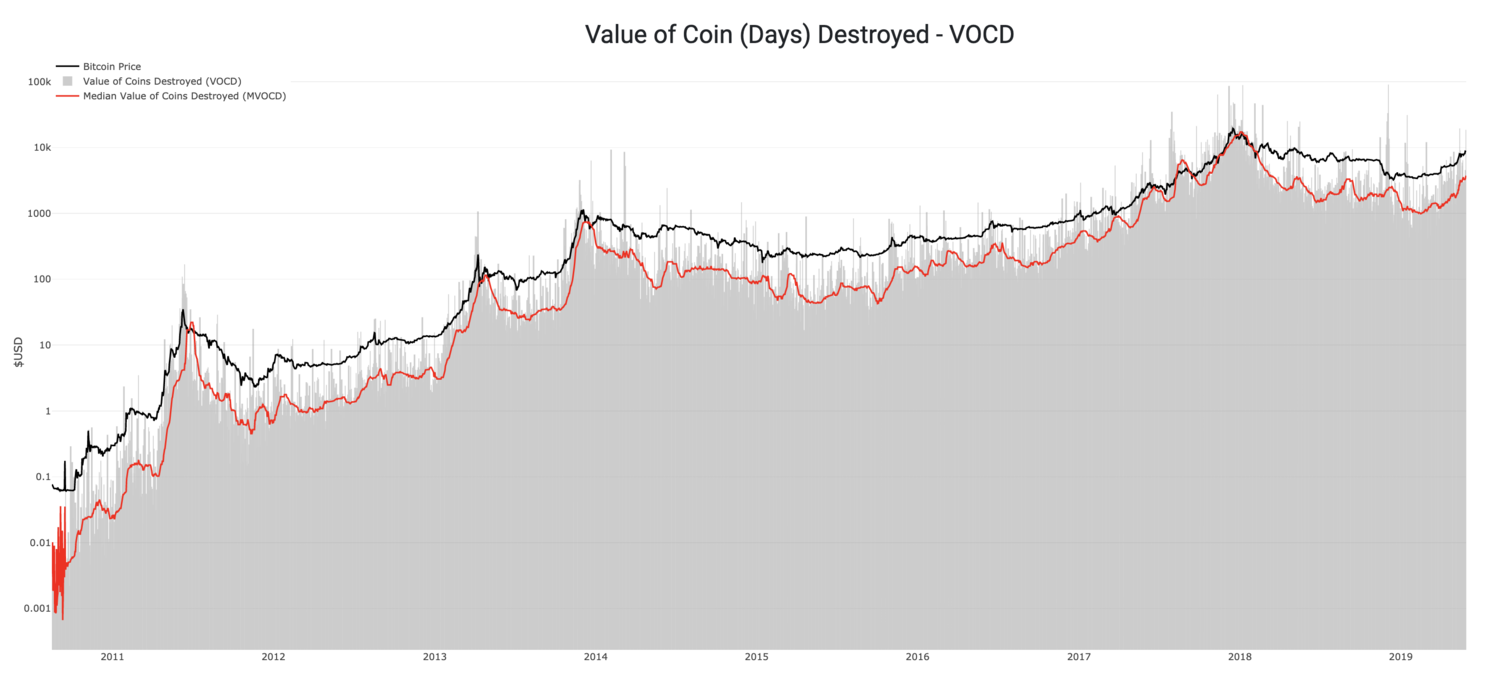 Source Data: Blockchair.com, Blockchain.com
Each day that MVOCD does not exceed the price of Bitcoin, more Bitcoin days are being created than destroyed. We might think about this as the opportunity cost of the holder. If I hold a Bitcoin today that’s worth $8,400 on the open market, I’ve given up $8,400 in order to keep holding.
By summing the aggregate US Dollar amount over time, you arrive at the cumulative opportunity cost that made the decision to hold rather than sell over the lifetime of the Bitcoin network (scaled down to a single Bitcoin value terms). That is the HODL Bank.
HODL Bank
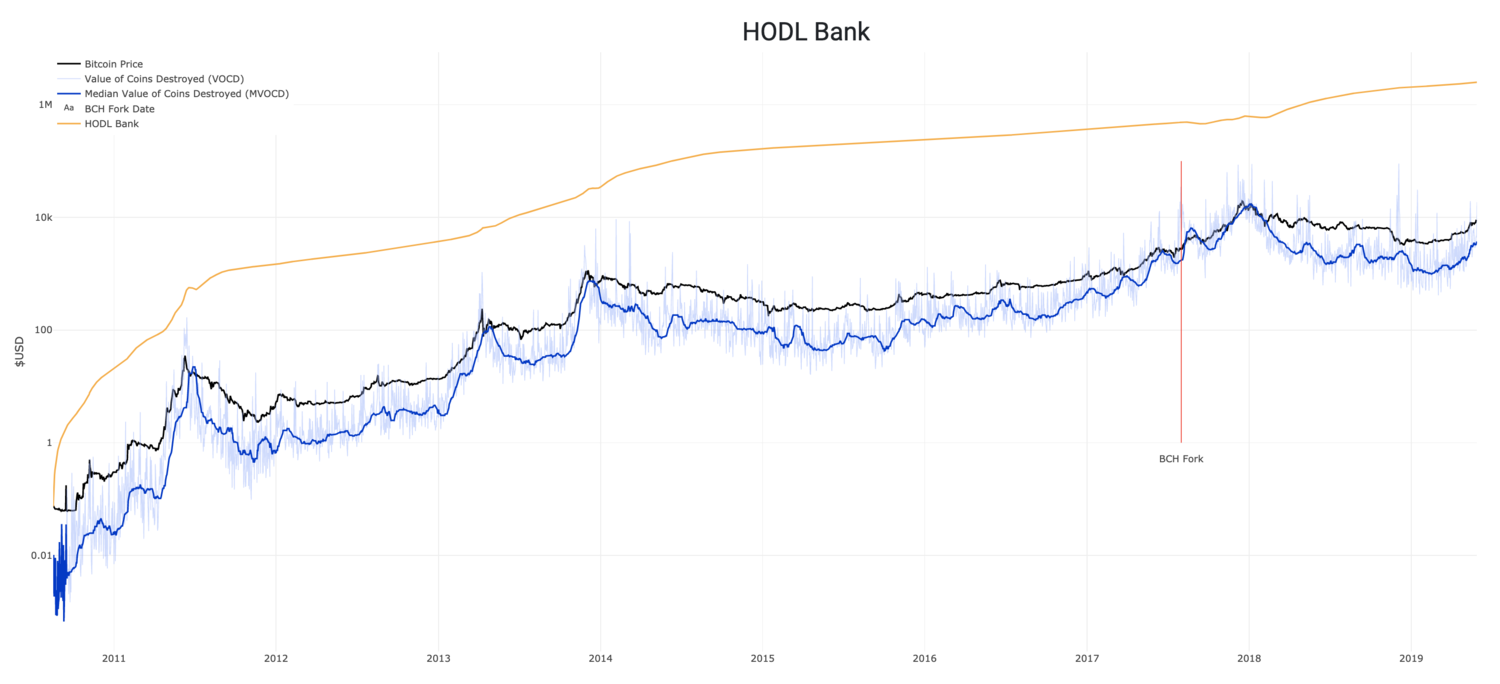 Source Data: Blockchair.com, Blockchain.com
How should we interpret the decision by holders to defer spending over time? A reasonable conclusion is that each day the network participants make this choice, they are placing a vote of confidence in the future economic value of Bitcoin. Think about it like this - how confident is the market in Bitcoin?
We might even suggest that the choice to purchase a Bitcoin is backed by the confidence of the existing and future participants. Would you want to buy into something that everyone is fleeing? What about something with a limited supply and increased HODLing? How can we determine which is the case?
The attractiveness of the price of Bitcoin today could be evaluated as the cost to buy Bitcoin today relative to the sum total of confidence built over time. If confidence is high and the price is low, then essentially the risk/reward is skewed attractively. Likewise, if the price is high and confidence is low, the risk/reward is skewed unattractively.
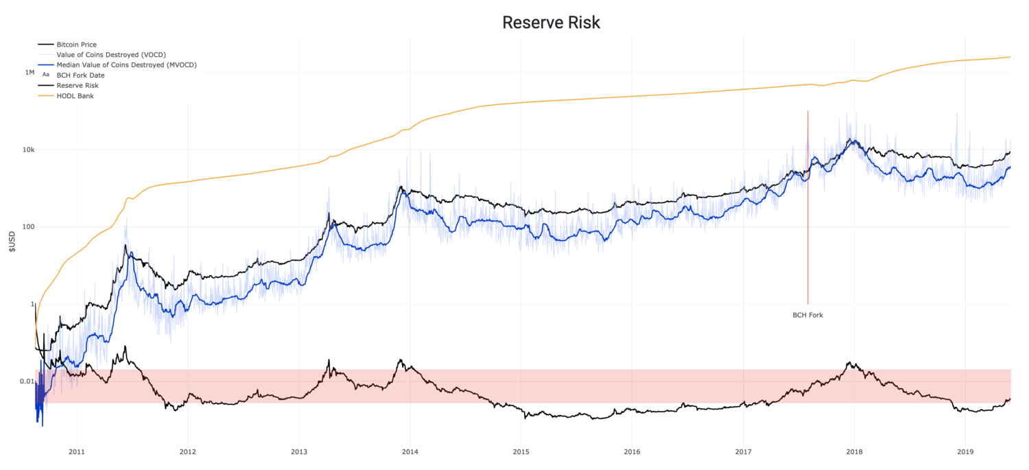 Source Data: Blockchair.com, Blockchain.com
We can accomplish this by dividing the price of Bitcoin at any point in time by the HODL Bank. This creates what we’ve called Reserve Risk.
Here we can see that purchasing Bitcoin when the Reserve Risk is the lowest (defined by a large HODL bank relative to the price at the time) has produced outsized returns. Reserve Risk in 2019 has recently hit a low near what was seen in 2011, but not quite as low as in 2015. Binary Adjusted BDD, VOCD and Reserve Risk give us conviction the market bottom is behind us, and give us clues to what the future may look like.
Special thanks to David Puell.
Modeling Bitcoin’s Value with Scarcity
By PlanB @100trillionUSD
Posted March 22, 2019
 Address: 1PRoNLcWHzM8DuKpGE4YM9hb1PjSEnWRpn
Signature (title is message): IFszV+izKMnmVmSlTIJYR6sEhAGbehh2aaFk84henG5NPCb33BxY8yZANVHUli/5RcgHhiAuGVrVfLwNBCDhqtI=
Introduction
Satoshi Nakamoto published the bitcoin white paper 31/Oct 2008 [1], created the bitcoin genesis block 03/Jan 2009, and released the bitcoin code 08/Jan 2009. So begins a journey that leads to a $70bn bitcoin (BTC) market today.
Bitcoin is the first scarce digital object the world has ever seen. It is scarce like silver & gold, and can be sent over the internet, radio, satellite etc.
” As a thought experiment, imagine there was a base metal as scarce as gold but with the following properties: boring grey in colour, not a good conductor of electricity, not particularly strong [..], not useful for any practical or ornamental purpose .. and one special, magical property: can be transported over a communications channe l” — Nakamoto [2]
Surely this digital scarcity has value. But how much? In this article I quantify scarcity using stock-to-flow, and use stock-to-flow to model bitcoin’s value.
Scarcity and Stock-to-Flow
Dictionaries usually define scarcity as ‘a situation in which something is not easy to find or get’, and ‘a lack of something’.
Nick Szabo has a more useful definition of scarcity: ‘unforgeable costliness’.
“What do antiques, time, and gold have in common? They are costly, due either to their original cost or the improbability of their history, and it is difficult to spoof this costliness. [..] There are some problems involved with implementing unforgeable costliness on a computer. If such problems can be overcome, we can achieve bit gold.” — Szabo [3]
“Precious metals and collectibles have an unforgeable scarcity due to the costliness of their creation. This once provided money the value of which was largely independent of any trusted third party. [..][but] you can’t pay online with metal. Thus, it would be very nice if there were a protocol whereby unforgeably costly bits could be created online with minimal dependence on trusted third parties, and then securely stored, transferred, and assayed with similar minimal trust. Bit gold.” — Szabo [4]
Bitcoin has unforgeable costliness, because it costs a lot of electricity to produce new bitcoins. Producing bitcoins cannot be easily faked. Note that this is different for fiat money and also for altcoins that have no supply cap, have no proof-of-work (PoW), have low hashrate, or have a small group of people or companies that can easily influence supply etc.
Saifedean Ammous talks about scarcity in terms of stock-to-flow (SF) ratio. He explains why gold and bitcoin are different from consumable commodities like copper, zinc, nickel, brass, because they have high SF.
“For any consumable commodity [..] doubling of output will dwarf any existing stockpiles, bringing the price crashing down and hurting the holders. For gold, a price spike that causes a doubling of annual production will be insignificant, increasing stockpiles by 3% rather than 1.5%.”
“It is this consistently low rate of supply of gold that is the fundamental reason it has maintained its monetary role throughout human history.”
“The high stock-to-flow ratio of gold makes it the commodity with the lowest price elasticity of supply.”
“The existing stockpiles of Bitcoin in 2017 were around 25 times larger than the new coins produced in 2017. This is still less than half of the ratio for gold, but around the year 2022, Bitcoin’s stock-to-flow ratio will overtake that of gold” — Ammous[5]
So, scarcity can be quantified by SF.
SF = stock / flow
Stock is the size of the existing stockpiles or reserves. Flow is the yearly production. Instead of SF, people also use supply growth rate (flow/stock). Note that SF = 1 / supply growth rate.
Let’s look at some SF numbers.
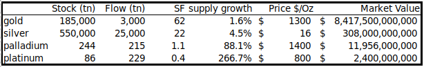
Gold has the highest SF 62, it takes 62 years of production to get current gold stock. Silver is second with SF 22. This high SF makes them monetary goods.
Palladium, platinum and all other commodities have SF barely higher than 1. Existing stock is usually equal or lower than yearly production, making production a very important factor. It is almost impossible for commodities to get a higher SF, because as soon as somebody hoards them, price rises, production rises, and price falls again. It is very hard to escape this trap.
Bitcoin currently has a stock of 17.5m coins and supply of 0.7m/yr = SF 25. This places bitcoin in the monetary goods category like silver and gold. Bitcoin’s market value at current prices is $70bn.
Supply of bitcoin is fixed. New bitcoins are created in every new block. Blocks are created every 10 minutes (on average), when a miner finds the hash that satisfies the PoW required for a valid block. The first transaction in each block, called the coinbase, contains the block reward for the miner that found the block. The block reward consists of the fees that people pay for transactions in that block and the newly created coins (called subsidy). The subsidy started at 50 bitcoins, and is halved every 210,000 blocks (about 4 years). That’s why ‘halvings’ are very important for bitcoins money supply and SF. Halvings also cause the supply growth rate (in bitcoin context usually called ‘monetary inflation’) to be stepped and not smooth.
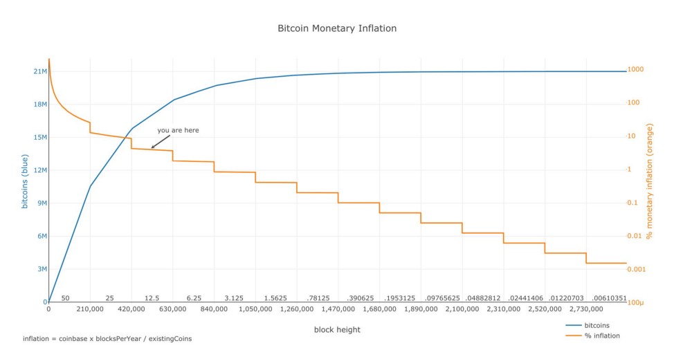 source: https://plot.ly/~BashCo/5.embed
Stock-to-Flow and Value
The hypothesis in this study is that scarcity, as measured by SF, directly drives value. A look at the table above confirms that market values tend to be higher when SF is higher. Next step is to collect data and make a statistical model.
Data
I calculated bitcoin’s monthly SF and value from Dec 2009 to Feb 2019 (111 data points in total). Number of blocks per month can be directly queried from the bitcoin blockchain with Python/RPC/bitcoind. Actual number of blocks differs quite a bit from the theoretical number, because blocks are not produced exactly every 10 minutes (e.g. in the first year 2009 there were significantly less blocks). With the number of blocks per month and known block subsidy, you can calculate flow and stock. I corrected for lost coins by arbitrarily disregarding the first million coins (7 months) in the SF calculation. More accurate adjusting for lost coins will be a subject for future research.
Bitcoin price data is available from different sources but starts at Jul 2010. I added the first known bitcoin prices (1$ for 1309 BTC Oct 2009, first quote of $0.003 on BitcoinMarket Mar 2010, 2 pizza’s worth $41 for 10,000 BTC May 2010) and interpolated. Data archeology will be a subject for future research.
We already have the data points for gold (SF 62, market value $8.5trn) and silver (SF 22, market value $308bn), which I use as a benchmark.
Model
A first scatter plot of SF vs market value shows that it is better to use logarithmic values or axis for market value, because it spans 8 orders of magnitude (from $10,000 to $100bn). Using logarithmic values or axis for SF as well reveals a nice linear relationship between ln(SF) and ln(market value). Note that I use natural logarithm (ln with base e) and not common logarithm (log with base 10), which would yield similar results.
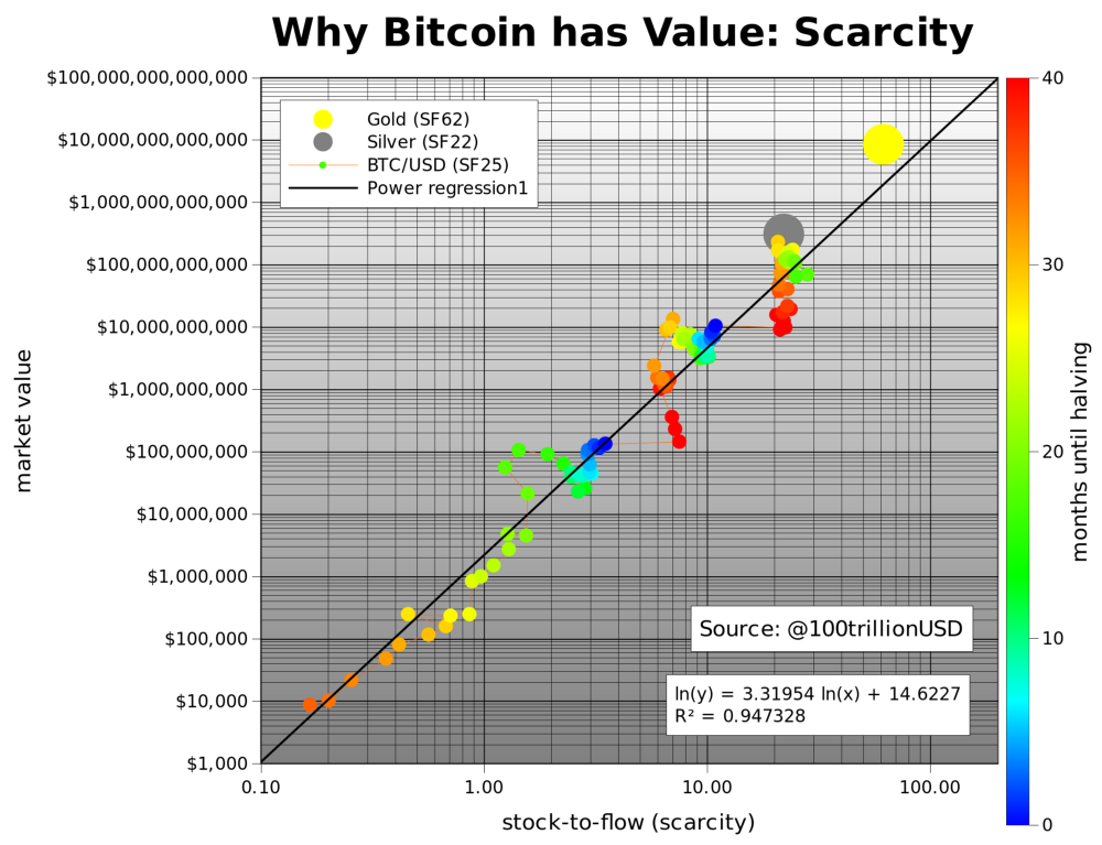 Charts made with gnuplot and gnumerics
Fitting a linear regression to the data confirms what can be seen with the naked eye: a statistically significant relationship between SF and market value (95% R2, significance of F 2.3E-17, p-Value of slope 2.3E-17). The likelihood that the relationship between SF and market value is caused by chance is close to zero. Of course other factors also impact price, regulation, hacks and other news, that is why R2 is not 100% (and not all dots are on the straight black line). However, the dominant driving factor seems to be scarcity / SF.
What is very interesting is that gold and silver, which are totally different markets, are in line with the bitcoin model values for SF. This gives extra confidence in the model. Note that at the peak of the bull market in Dec 2017 bitcoin SF was 22 and bitcoin market value was $230bn, very close to silver.
Because halvings have such a big impact on SF, I put months until the next halving as a color overlay in the chart. Dark blue is the halving month, and red is just after the halving. Next halving is May 2020. Current SF of 25 will double to 50, very close to gold (SF 62).
The predicted market value for bitcoin after May 2020 halving is $1trn, which translates in a bitcoin price of $55,000. That is quite spectacular. I guess time will tell and we will probably know one or two years after the halving, in 2020 or 2021. A great out of sample test of this hypothesis and model.
People ask me where all the money needed for $1trn bitcoin market value would come from? My answer: silver, gold, countries with negative interest rate (Europe, Japan, US soon), countries with predatory governments (Venezuela, China, Iran, Turkey etc), billionaires and millionaires hedging against quantitative easing (QE), and institutional investors discovering the best performing asset of last 10 yrs.
We can also model bitcoin price directly with SF. The formula of course has different parameters, but the result is the same, 95% R2 and a predicted bitcoin price of $55,000 with SF 50 after May 2020 halving.
I plotted bitcoin model price based on SF (black) and actual bitcoin price over time, with the number of blocks as color overlay.
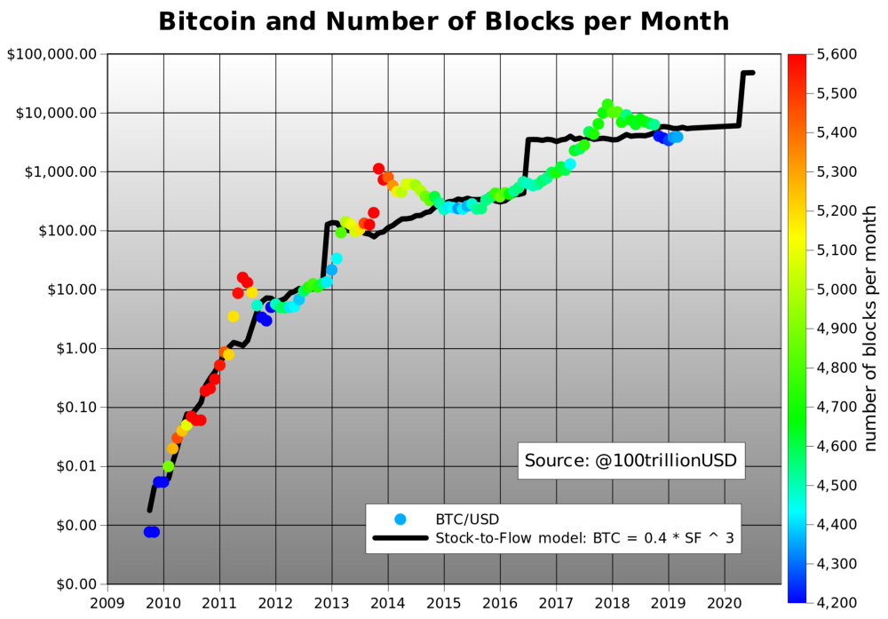 Charts made with gnuplot and gnumerics
Note the goodness of fit, especially the almost immediate price adjustment after Nov 2012 halving. Adjustment after Jun 2016 halving was much slower, possibly due to Ethereum competition and the DAO hack. Also, you see less blocks per month (blue) in the first year 2009 and during downward difficulty adjustments end2011, mid2015 and end2018. Introduction of GPU miners in 2010-2011 and ASIC miners in 2013 resulted in more blocks per month (red).
Power Laws and Fractals
Also very interesting is that there is indication of a power law relationship.
The linear regression function: ln(market value) = 3.3 * ln(SF)+14.6
.. can be written as a power law function: market value = exp(14.6) * SF ^ 3.3
Power laws are scarce, you don’t find them very often. The possibility of a power law with 95% R2 over 8 orders of magnitude, adds confidence that the main driver of bitcoin value is correctly captured with SF.
A power law is a relationship in which a relative change in one quantity gives rise to a proportional relative change in the other quantity, independent of the initial size of those quantities. [6]. Every halving, bitcoin SF doubles and market value increases 10x, this is a constant factor. See appendix for some famous power law examples.
Power laws are interesting because they reveal an underlying regularity in the properties of seemingly random complex systems. Complex systems usually have properties where changes between phenomena at different scales are independent of the scales we are looking at. The picture we take at one scale is therefore similar in some way to the picture we take at another scale. This self-similar property underlies power law relationships . We see this in Bitcoin too: 2011, 2014 and 2018 crashes look very similar (all have -80% dips) but on totally different scales (resp. $10, $1000, $10,000), if you don’t use log scales, you will not see it. Scale in-variance and self-similarity has a link with fractals. In fact, parameter 3.3 in the power law function above is the ‘fractal dimension’. For more information on fractals see the famous length of coastlines study [7]. Power laws and fractals in bitcoin will be a subject for future research.
Conclusion
Bitcoin is the first scarce digital object the world has ever seen, it is scarce like silver & gold, and can be sent over the internet, radio, satellite etc.
Surely this digital scarcity has value. But how much? In this article I quantify scarcity using stock-to-flow, and use stock-to-flow to model bitcoin’s value.
A statistically significant relationship between stock-to-flow and market value exists. The likelihood that the relationship between stock-to-flow and market value is caused by chance is close to zero.
Adding confidence in the model:
- Gold and silver, which are totally different markets, are in line with the bitcoin model values for SF.
- There is indication of a power law relationship.
The model predicts a bitcoin market value of $1trn after next halving in May 2020, which translates in a bitcoin price of $55,000.
References
[1] https://bitcoin.org/bitcoin.pdf — Satoshi Nakamoto, 2008
[2] https://bitcointalk.org/index.php?topic=583.msg11405#msg11405 — Satoshi Nakamoto, 2010
[3] https://unenumerated.blogspot.com/2005/10/antiques-time-gold-and-bit-gold.html — Nick Szabo, 2008
[4] https://unenumerated.blogspot.com/2005/12/bit-gold.html— Nick Szabo, 2008
[5] The Bitcoin Standard: The Decentralized Alternative to Central Banking — Saifedean Ammous, 2018
[6] https://necsi.edu/power-law
[7] http://fractalfoundation.org/OFC/OFC-10-4.html
Appendix —Power Law Examples
Kepler (planets)
Richter (earthquakes)
Kleiber (animals)
Introducing the Difficulty Ribbon, signaling the best times to buy Bitcoin
By Willy Woo
Posted August 1, 2019
Introducing the Bitcoin Difficulty Ribbon. When the ribbon compresses, or flips negative, these are the best times to buy Bitcoin. The ribbon consists of simple moving averages on mining difficulty so we can easily see the rate of change in difficulty.
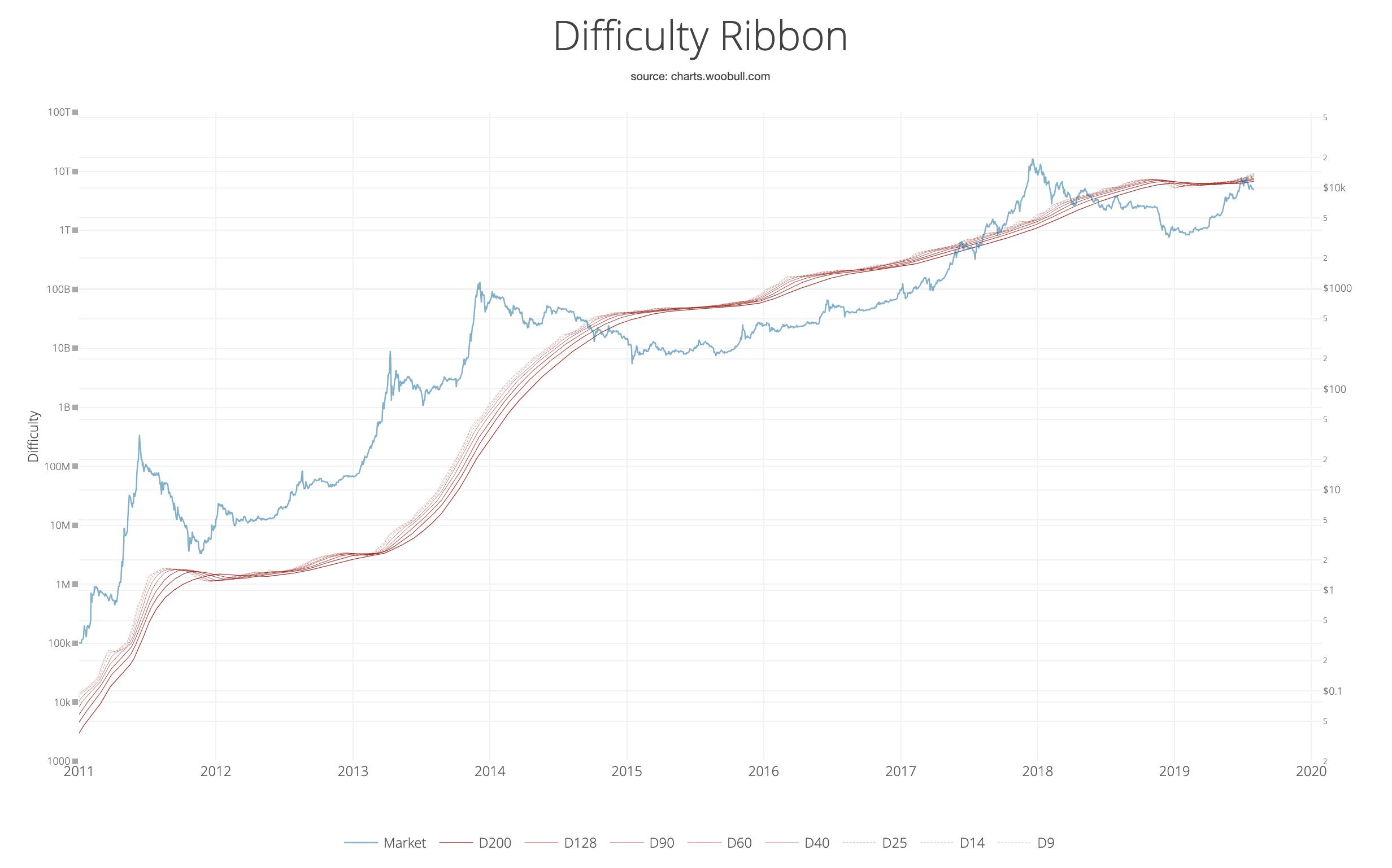
How it the Difficulty Ribbon works
This visualisation of network mining difficulty speaks to the impact of mining on Bitcoin’s price. As new coins are mined into existence, miners sell some of their mined coins to pay for production costs. This produces bearish price pressure.
The weakest miners sell more of their coins to remain operational. When it becomes unsustainable, they capitulate, hashing power and network difficulty reduces (ribbon compression), leaving only the strong, who sell less leaving more room for more bullish price action.
Typically we see this at the end of bear cycles, after miners capitulate, the lack of miner selling pressure allows the price to stabilise and then climb; the classic accumulation bottom.
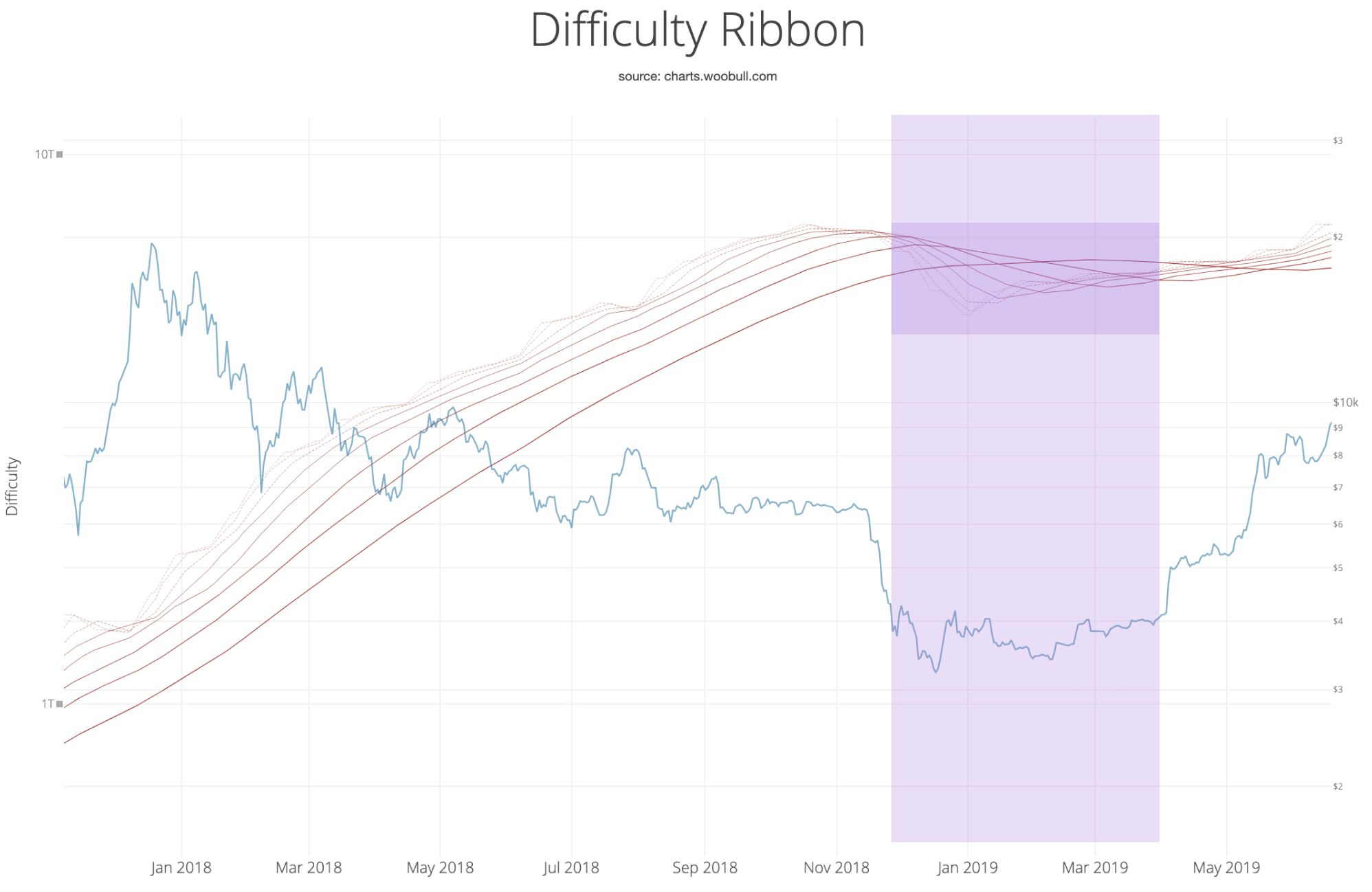
Credit goes to Vinny Lingham who was the first as far as I know to spot this dynamic in his April 2014 article on how Bitcoin finds its price equilibrium . We now have 5 more years of data to back it up.
Miners capitulate in bears, but also during block reward halvening events when suddenly only half the coins are mined for the same costs and the market price has yet to catch up to pay for it. We can easily see the compression after each halvening (marked as vertical lines) as miners die off.
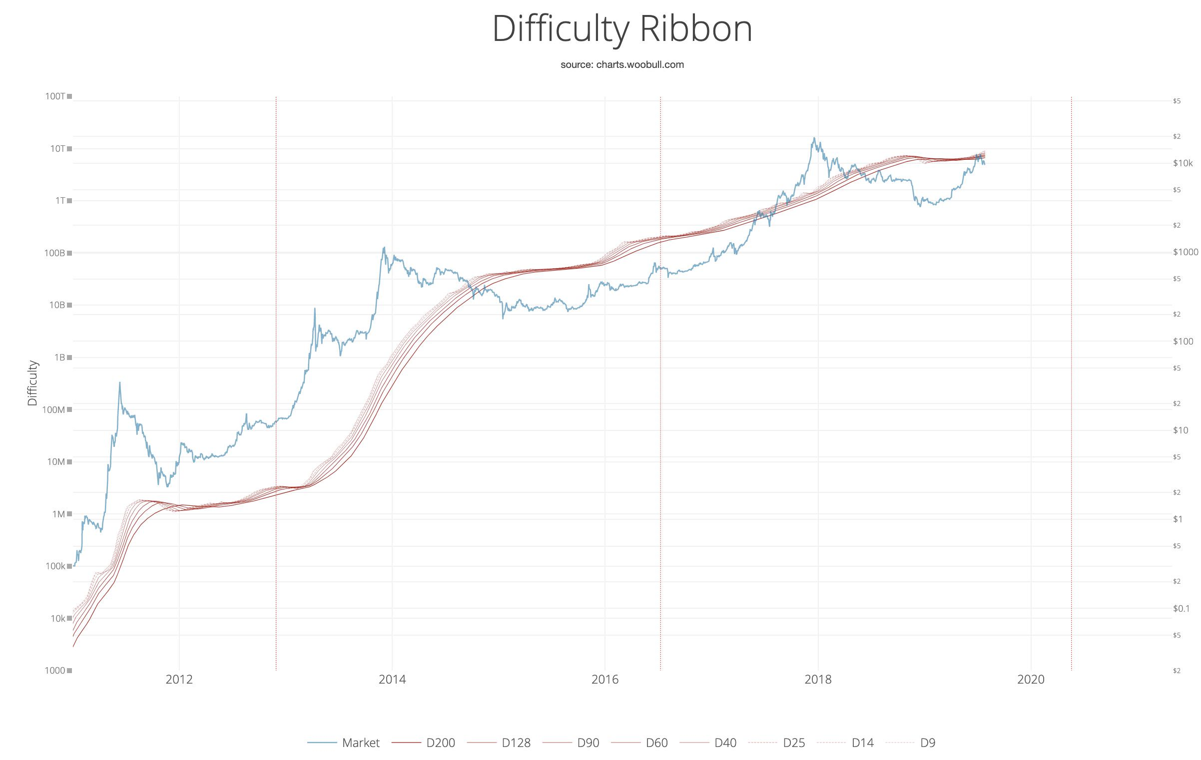
As a final note, notice how the 2019 the 2012 bull market have the same structure, we saw severe mining capitulation (i.e. the ribbon flipped negative), the resulting vacuum in selling pressure lead to a shorter accumulation band before price breakout. Thus this bull market has resembles 2012 more than 2016 structurally.
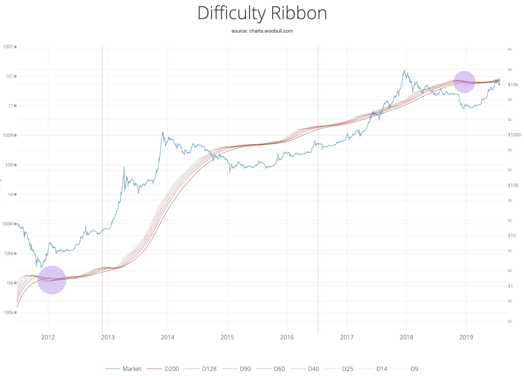
Tweetstorm: HODLer Index & HODLer Network
By Hans Hauge
Posted August 24, 2019
Today I’m introducing two new on-chain metrics and responding to this thread by @Checkmatey. On some points we agree, but I’m very bullish right now and I want to explain why using the blockchain.
First, I agree with this “Likely this was driven by leverage, deep pockets and speculation rather than HODLERs.” As whale HODLers move coins to cold storage they reducing the supply (bullish long-term) but this also means they’re not the ones driving short-term price action.
I also agree that MVRV is elevated, but if we look at the MVRV ratio over time there are two important things I notice.
- Cycle times are usually a couple years from a MVRV bottom to a top. We’ve only had a few months since the last bottom.
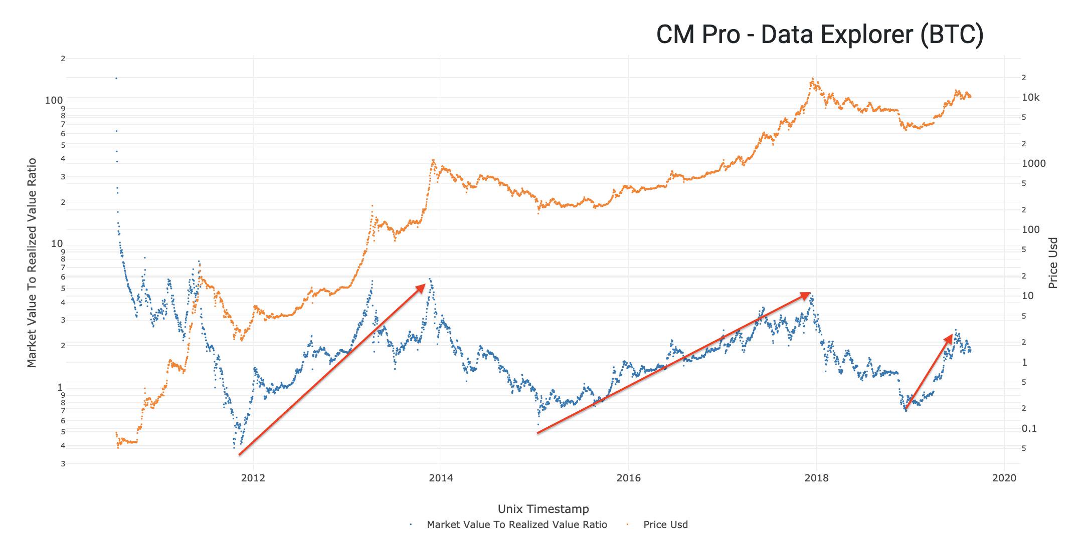
- Also in terms of the actual MVRV ratio at the bottom versus the top, we’ve seen bottoms of 0.4 and 0.6 and tops around 4 and 5. Translation, unless things are radically different this cycle we are still very early in the cycle.
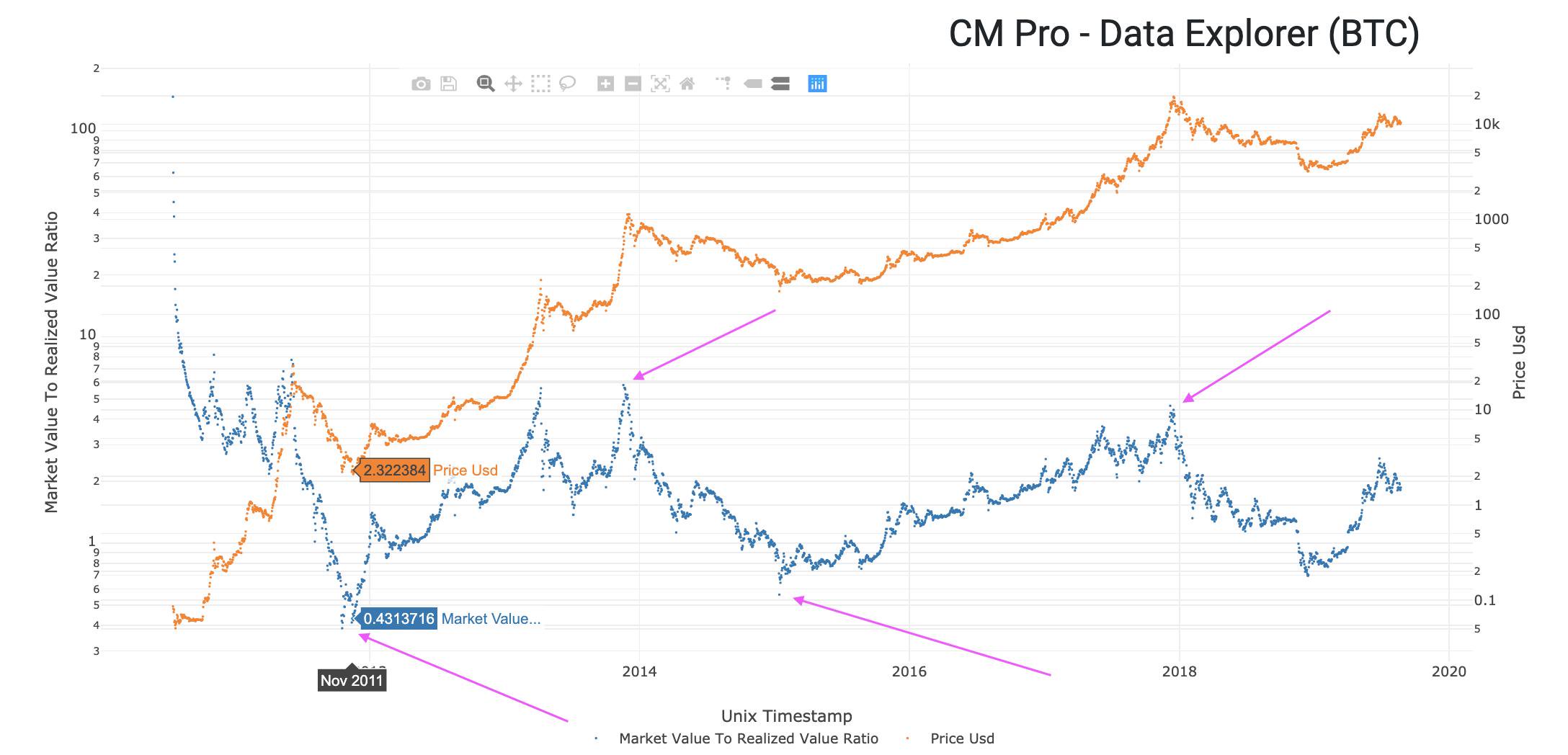
Remember that the price of Bitcoin has pulled back from a recent top close to $14k, wicking all the way down to the $9k region. This is a significant correction. Now, let’s talk the decline in USD transaction value.
Let me explain how I think about transactions. A transaction is a “mote of activity” that gives us evidence of Bitcoin adoption. In general more transactions is a good thing. This relationship is easy to visualize with transactions on the y-axis, price on the x-axis.
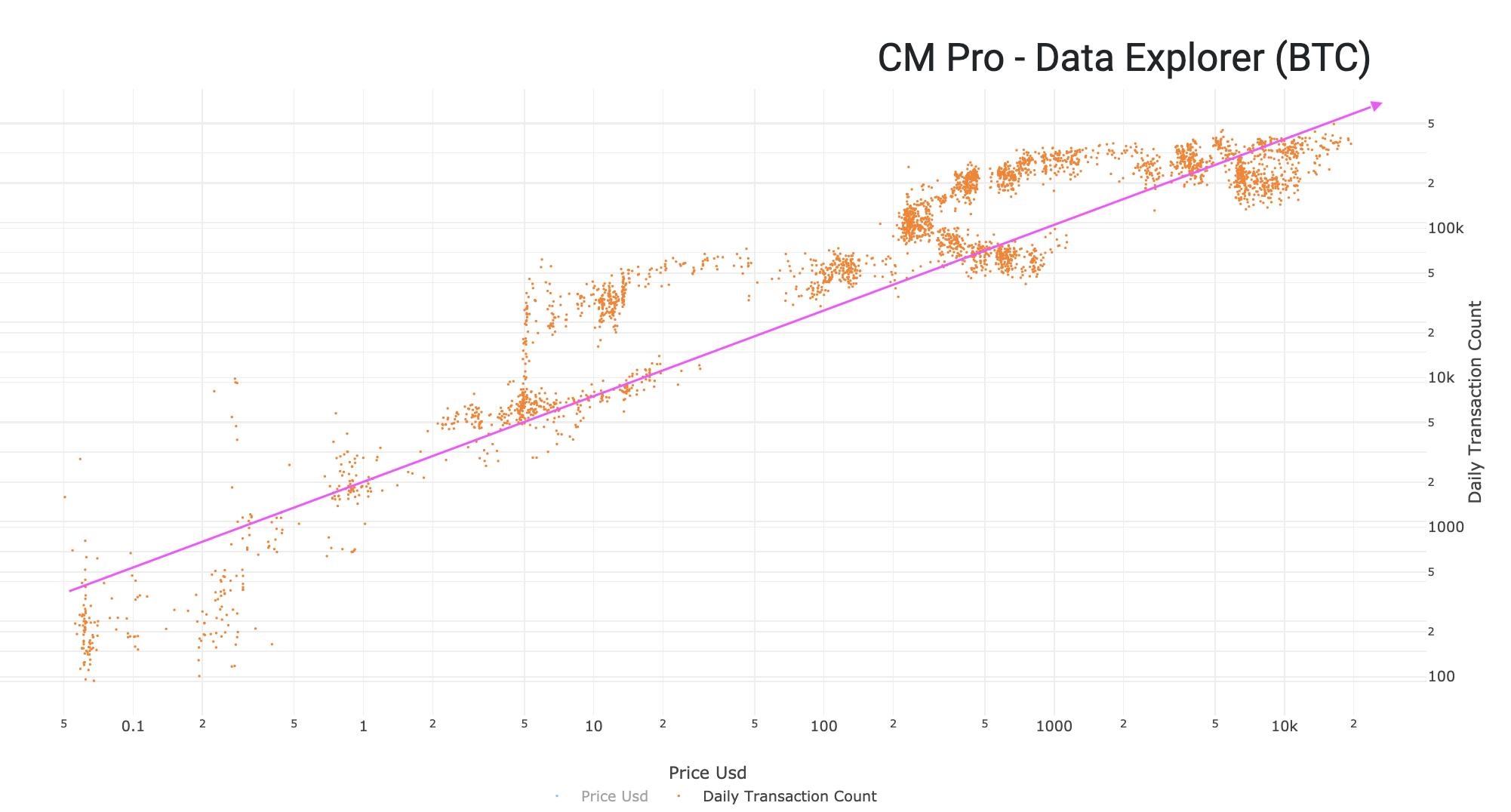
But, we also know that if a lot of Bitcoin Days are being destroyed then that means HODLers are cashing in. When this happens, HODLers move old coins from their cold storage to an exchange to sell it, which creates a transaction. So, highly destructive transactions are bearish.
This leads me to the first new metric that I’m introducing today, the HODLer Index. The HODLer Index is a ratio of Transactions to Bitcoin Days Destroyed. How to interpret this?

In the image below you can see how recent events affected the behavior of the network. Blocks filled up, less transactions were sent. Price dropped by 50%, people got scared. Price went up, people took profits. But what’s been going on the last few weeks?
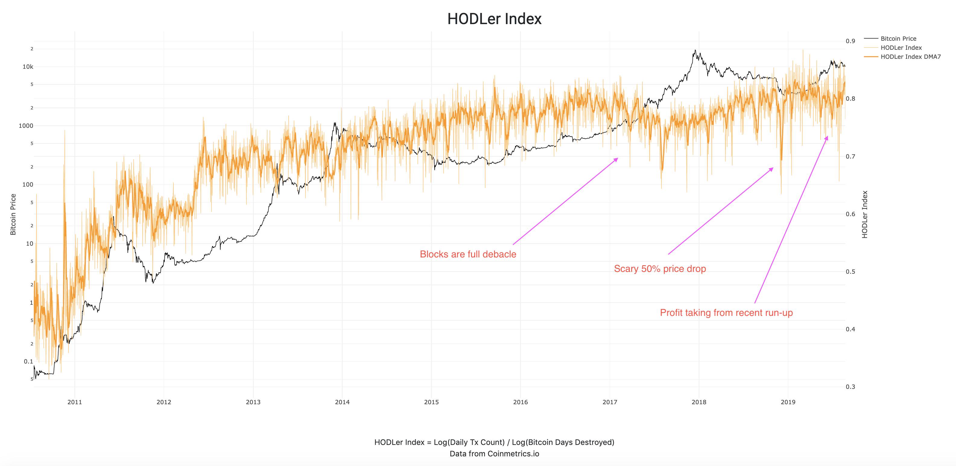
What I’m seeing is a change of direction at the very end of that orange line. HODLy transactions are increasing, meaning that the daily transaction count is increasing and Bitcoin Days Destroyed is falling.
Now let me introduce you to a special bonus (apologies to @nlw as this is turning into long reads Saturday). This is the HODLer Network, a slightly more sophisticated version of the HODLer Index, which also includes the number of unique addresses into the equation.
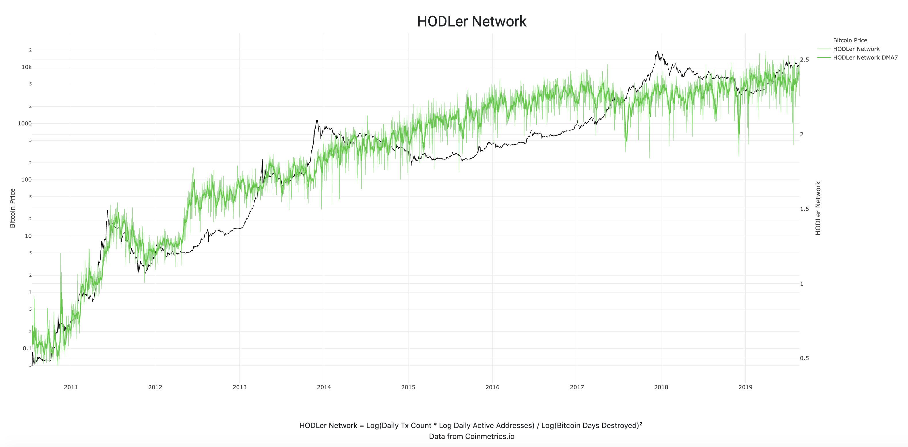
Just a couple days ago this metric made a new all-time high in the 7DMA. This is a very bullish sign to me as it shows that more people are HODLing more than ever. As @APompliano would say, “the virus is spreading.”