Tweetstorm: HODLer Index & HODLer Network
| If you find WORDS helpful, Bitcoin donations are unnecessary but appreciated. Our goal is to spread and preserve Bitcoin writings for future generations. Read more. | Make a Donation |
Tweetstorm: HODLer Index & HODLer Network
By Hans Hauge
Posted August 24, 2019
Today I’m introducing two new on-chain metrics and responding to this thread by @Checkmatey. On some points we agree, but I’m very bullish right now and I want to explain why using the blockchain.
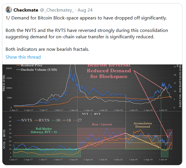
First, I agree with this “Likely this was driven by leverage, deep pockets and speculation rather than HODLERs.” As whale HODLers move coins to cold storage they reducing the supply (bullish long-term) but this also means they’re not the ones driving short-term price action.
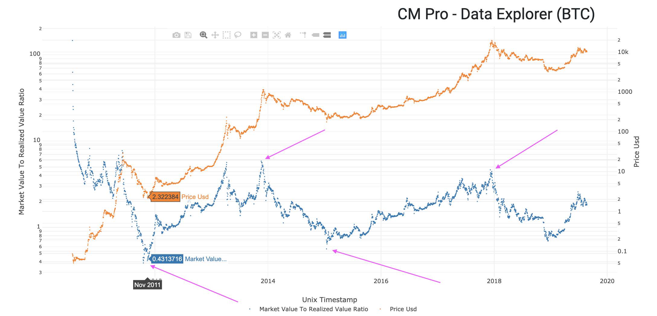
I also agree that MVRV is elevated, but if we look at the MVRV ratio over time there are two important things I notice.
- Cycle times are usually a couple years from a MVRV bottom to a top. We’ve only had a few months since the last bottom.
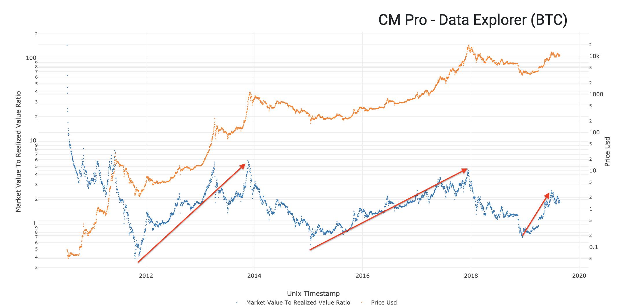
- Also in terms of the actual MVRV ratio at the bottom versus the top, we’ve seen bottoms of 0.4 and 0.6 and tops around 4 and 5. Translation, unless things are radically different this cycle we are still very early in the cycle.
Remember that the price of Bitcoin has pulled back from a recent top close to $14k, wicking all the way down to the $9k region. This is a significant correction. Now, let’s talk the decline in USD transaction value.
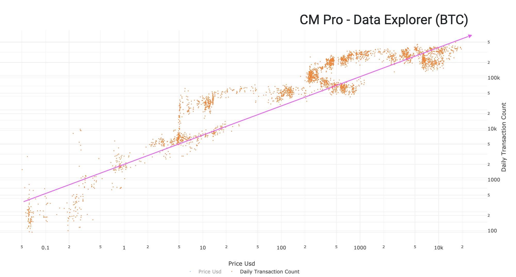
Let me explain how I think about transactions. A transaction is a “mote of activity” that gives us evidence of Bitcoin adoption. In general more transactions is a good thing. This relationship is easy to visualize with transactions on the y-axis, price on the x-axis.
But, we also know that if a lot of Bitcoin Days are being destroyed then that means HODLers are cashing in. When this happens, HODLers move old coins from their cold storage to an exchange to sell it, which creates a transaction. So, highly destructive transactions are bearish.
This leads me to the first new metric that I’m introducing today, the HODLer Index. The HODLer Index is a ratio of Transactions to Bitcoin Days Destroyed. How to interpret this?

In the image below you can see how recent events affected the behavior of the network. Blocks filled up, less transactions were sent. Price dropped by 50%, people got scared. Price went up, people took profits. But what’s been going on the last few weeks?
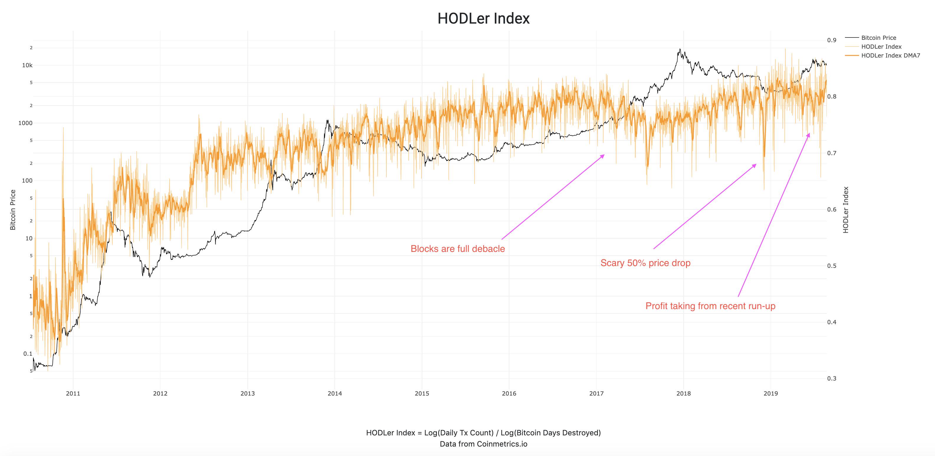
What I’m seeing is a change of direction at the very end of that orange line. HODLy transactions are increasing, meaning that the daily transaction count is increasing and Bitcoin Days Destroyed is falling.
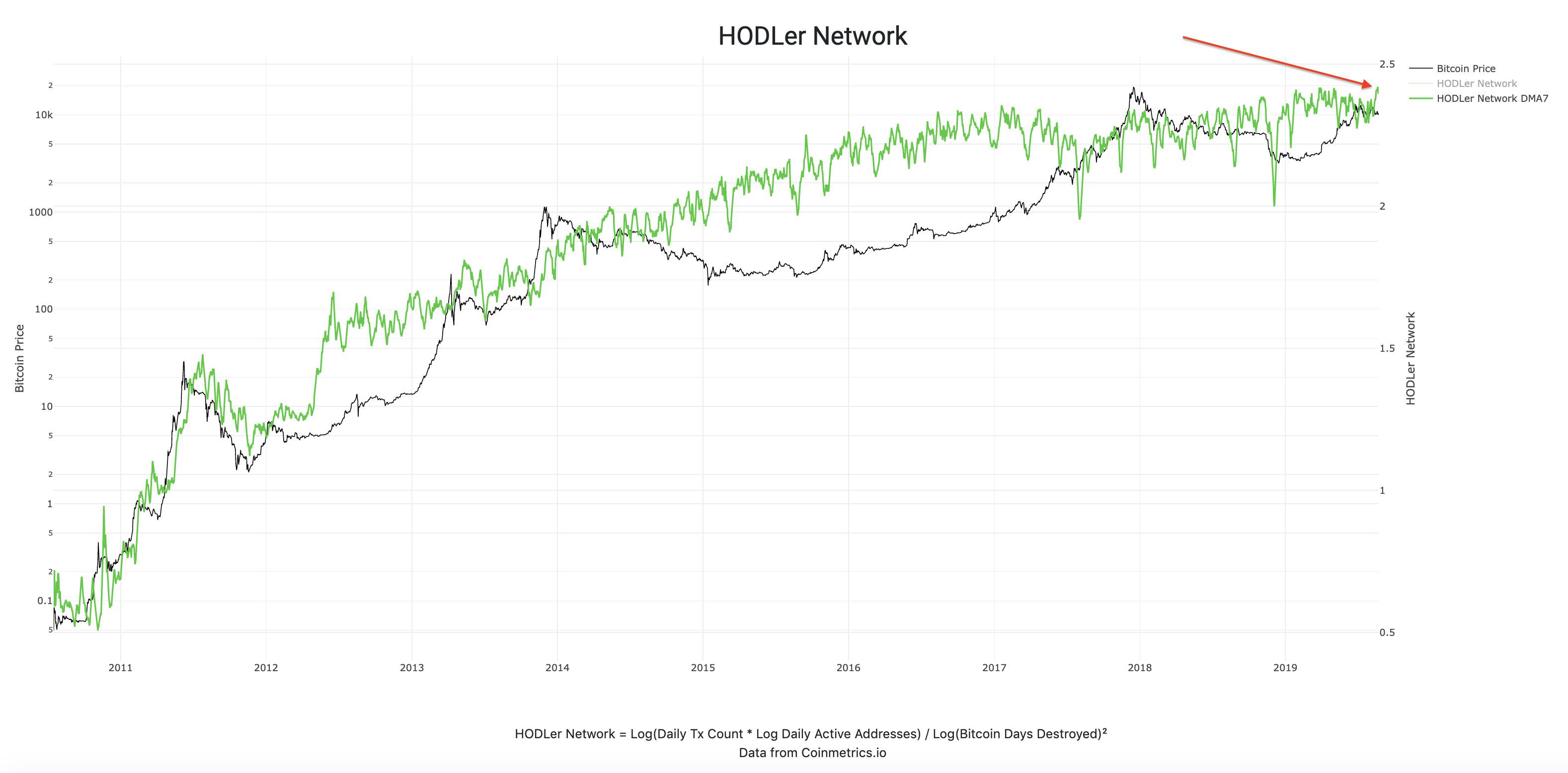
Now let me introduce you to a special bonus (apologies to @nlw as this is turning into long reads Saturday). This is the HODLer Network, a slightly more sophisticated version of the HODLer Index, which also includes the number of unique addresses into the equation.
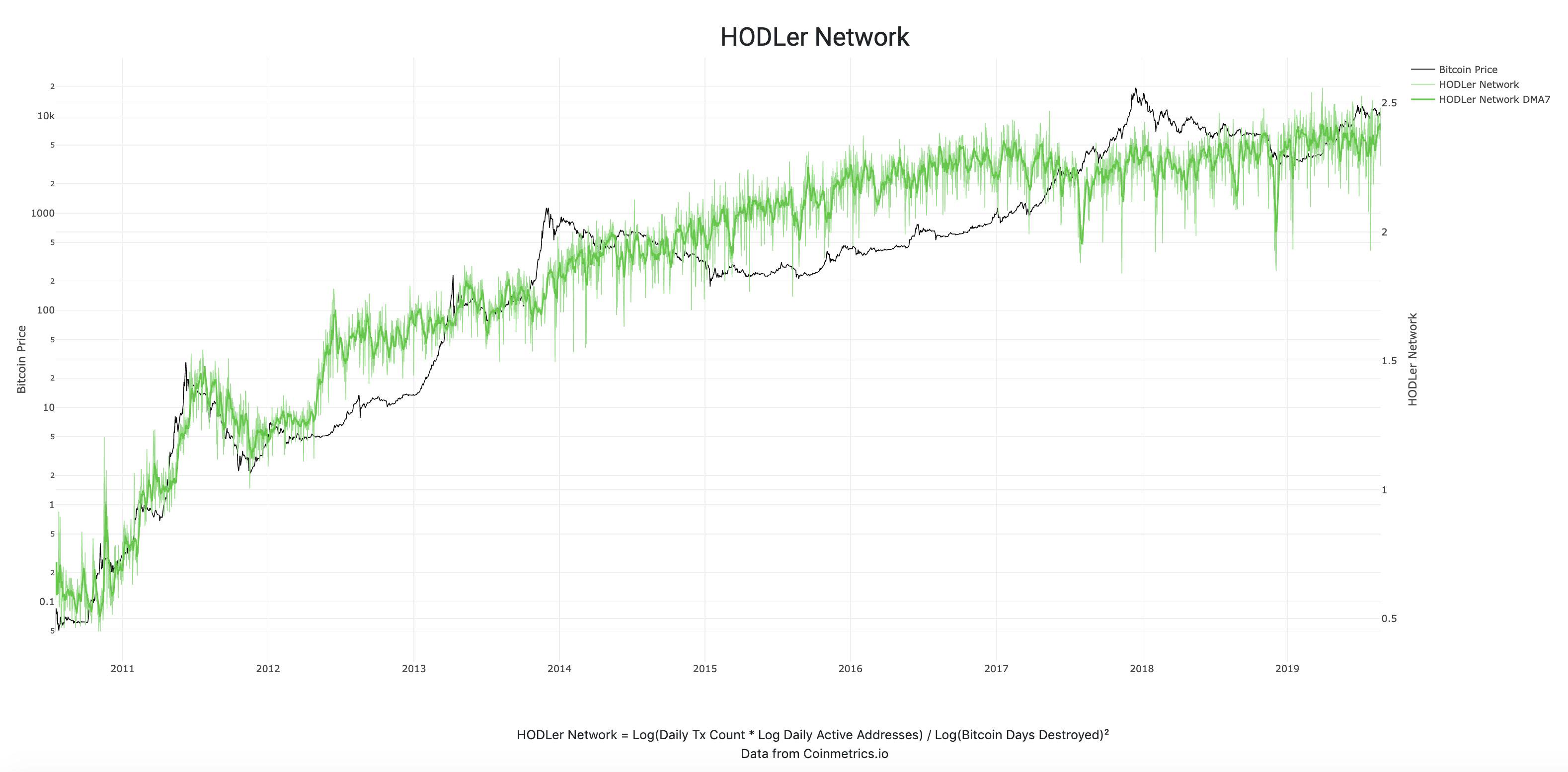
Just a couple days ago this metric made a new all-time high in the 7DMA. This is a very bullish sign to me as it shows that more people are HODLing more than ever. As @APompliano would say, “the virus is spreading.”