
Crypto Voices 2019 Q1 Global Monetary Base
| If you find WORDS helpful, Bitcoin donations are unnecessary but appreciated. Our goal is to spread and preserve Bitcoin writings for future generations. Read more. | Make a Donation |
Read This First Consider browsing our journals archive and be sure to subscribe to our newsletter and follow us on Twitter.
Crypto Voices 2019 Q1 Global Monetary Base
By Crypto Voices
Posted May 22, 2019
- Here is the @crypto_voices 2019 Q1 release on the global monetary base. This is the only comparable money supply with Bitcoin’s 21 million. #Bitcoin is currently the 12th largest money in the world. To dig deeper on what it all means, follow on below. 👇This is installment #4.
- Gold & silver is base money of the past. Government fiat is base money today. It comprises both physical cash… and a digital cash component! Bitcoin may be base money of the future. Before we get to the charts, it’s important to clarify a few common misconceptions in money.
- The first is everyone looking to value Bitcoin always jumps to the “narrow” or “broad” money supplies (M1/M2/M3). This is incorrect. The reason is those money supplies represent “claims” on something else. What is that something else? Answer: the base money supply!!
- Fiat base money today includes both physical (notes & coins) and digital (bank reserves at the central bank) components. Think of the digital part as the “account” each bank holds with its central bank. This & only this money supply compares economically with 21 million BTC.
- Another mistake that’s often made when comparing bitcoins to the analog monetary world is looking at a simple chart like US M1, or Eurozone M2. Besides again being incorrect on the M1/M2/M3 comparison, this method is inadequate because Bitcoin is global, and those… are not.
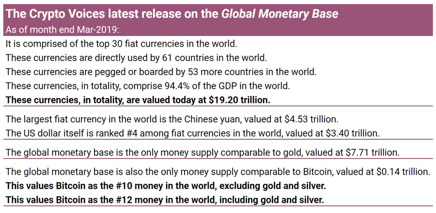
- We can’t simply look at one or two nation states’ base money supplies to gauge any kind of market depth. The sample must be global. We’ve done that here, tracking the top 30 floating currencies in the world. This is how the real, global fiat base money supply looks since 1970.
- This top 30 base money sample in fact covers 95% of global GDP, 114 countries, and 83 currencies. Why? The euro is one reason. The other is all the remaining countries/currencies either use one of these top 30 directly, or are legally pegged or fixed to one via currency board.
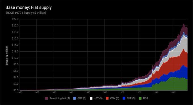
- Let’s look again at the global base money supply curve since 1970, but this time see how the split shakes out between physical versus digital base money. Note how bank reserves (the digital printing press) drastically increased its overall % from the 2008 financial slide.
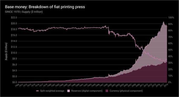
- And for the current breakdown of each country’s printing press - of the top 30 monetary bases - how much of each currency is physical, and how much of each is digital… that chart is here.
- Final point on fiat money. The monetary base is in fact a graph of the money monopoly today; meaning, it is the source of the printing press, and only central banks control this. If you’re curious where to find it, the answer is simple: the balance sheet of each central bank!
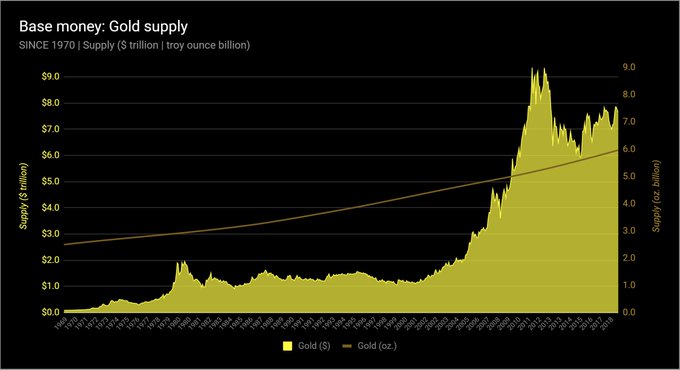
- Now let’s look at gold. Though central banks hold gold, it no longer acts as base money. This is another topic for another time, but everyone should still understand the global gold supply in both its native market unit (ounces), and in today’s unit of account (US dollars).
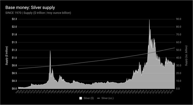
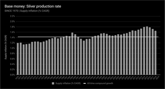
- Now silver. It’s true, 50%+ of silver demand today is industrial, not remotely monetary. But silver was base money well before gold. 50 billion ounces of the stuff has been mined throughout humanity, and it’s worth it to scan its supply curve. Since 1970, this is silver.
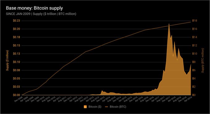
- And finally Bitcoin. Bitcoins are limited by the protocol to an eventual 21 million in supply by the year 2140. Bitcoins may circulate as base money of the future. Here is its global supply, both in native units (bitcoins), and in today’s unit of account (US dollars).
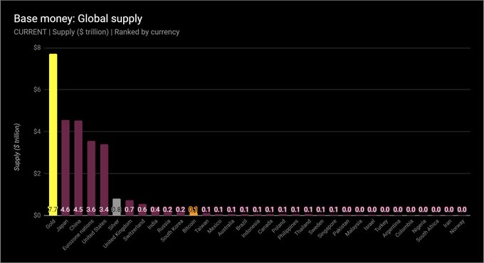
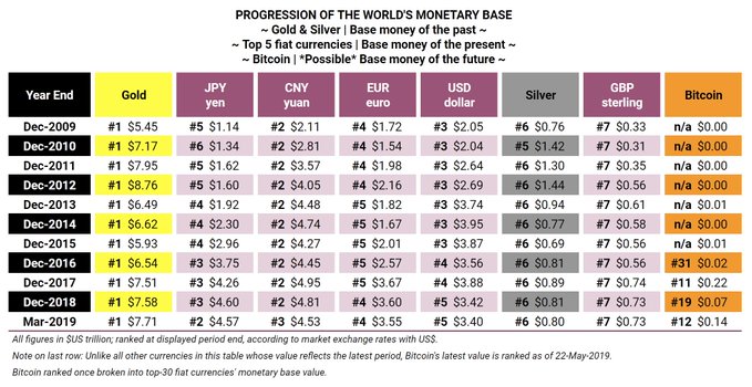
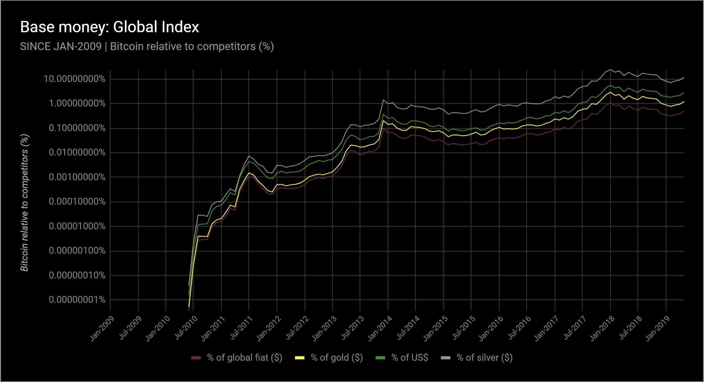
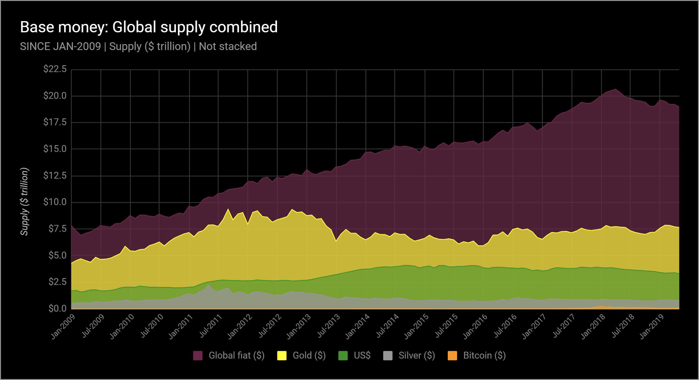
- And now we’ll put them altogether - global fiat, gold, silver, and bitcoin - today. Without further commentary, note that Bitcoin the system is ranked #12 across all money in the world, and #10 ex-gold & silver.
- And for a broad, historical ranking in table format, for the entirety of Bitcoin’s history since 2009, that information is here.
- Now for the main event of this analysis: Inflation. Inflation today means “price increases.” It’s usually measured by the central bank and usually wrong. There is no way all prices can ever be measured in a simple index. The input variables are changed all the time to boot.
- When we analyze inflation, we are using the classical definition, which is “monetary inflation.” In other words, “money growth,” or “money production.” Understanding this rate of increase can be very, very helpful when trying to understand money.
- Inflation is one of the most important things to understand about money, in fact. Money growth inflation reflects scarcity. But to be clear… The charts * that follow * have nothing * to do * with price growth * or prices * at all.
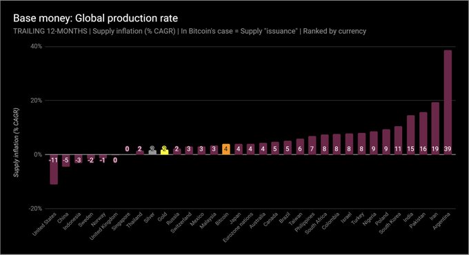
- Let’s jump right to the summary this time. This is the last 12 mos. of all base money growth. Remember, this is “unit” growth. % changes in dollars, euros, or yen, ounces of gold, or bitcoins. Maybe the results are surprising. The US hasn’t printed money in 5 years, in fact.
- But we need to look deeper. It helps to look long-term. Remember the global fiat supply curve? 👆 In 1970, the US$ equivalent of global base money was $100 billion. Today: $19.2 trillion. What does this mean? To understand it, you need to understand compound annual growth.
- Compound annual growth is an extremely important metric. It’s “stronger” than a simple, annual rate (Compound Returns vs. $ Over Time — Crypto Voices https://cryptovoices.com/compound-returns-vs-usd-over-time/). We can use this rate to understand investment returns, or long-term trends like population growth. We can also derive doubling time from this figure.
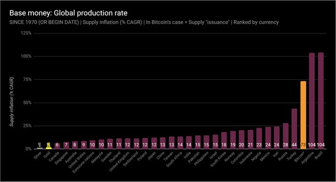
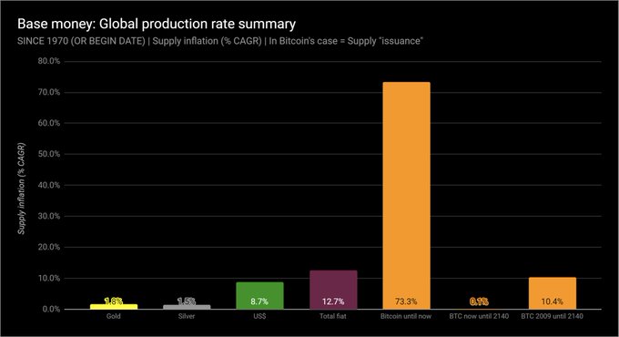
- So let’s start with the compound annual growth rates for the global monetary base since 1970. 50 years of data. About half the countries’ data goes back this far. For the rest, % displayed is since their start date. For bitcoin, the start date is Jan-2009.
- Doubling time also helps. From compound growth %, we can determine exactly how long it takes for an asset’s supply to double. Here is the exact same chart as just shown, since 1970 (and since 2009 in Bitcoin’s case), but displaying doubling time instead of compound growth.
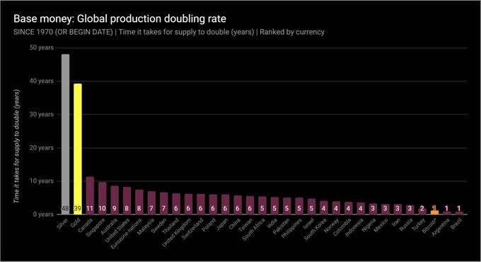
- It should be clear why gold and silver arose as past base money. ‘Twas very difficult to inflate them, and thus with low inflation rates they had long supply-doubling times. Fiat base money has typically been much quicker to double. Bitcoin… needs more explanation.
- These next 2 charts will make it easier to understand how Bitcoin’s supply works. From 2009 until now, yes, 50 bitcoins grew to 17.7 million. That’s a 73% compound annual growth rate, or doubling every 1.3 years. But, from now until 2140… that’s when things get interesting.
- Notice how the supply of bitcoins will only grow at 0.1% per year, or double every 483 years. And it gets even more unique, as the Bitcoin protocol won’t allow that doubling to happen, as it’s supply will cap at 21 million in 2140. No money in history has worked like this.
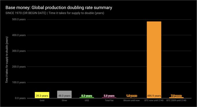
- To clarify, these are the long-term trends of past, present, & possibly future base money, since 1970: -Gold: 1.8% (2x in 39 yrs) -Silver: 1.5% (2x in 48 yrs) -US$: 8.7% (2x in 8 yrs) -Global fiat: 12.7% (2x in 6 yrs) -50 BTC in yr. 2009 to 21 million BTC in yr. 2140: 10.4%
- Let’s look back on a 50 year time series again, this time w/ inflation rates. Here is the total global fiat base money inflation rate, weighted averaged by each currency’s US$ equivalent. Notice it overall matches the 12.7% CAGR / 5.8 year doubling time we’ve already seen.
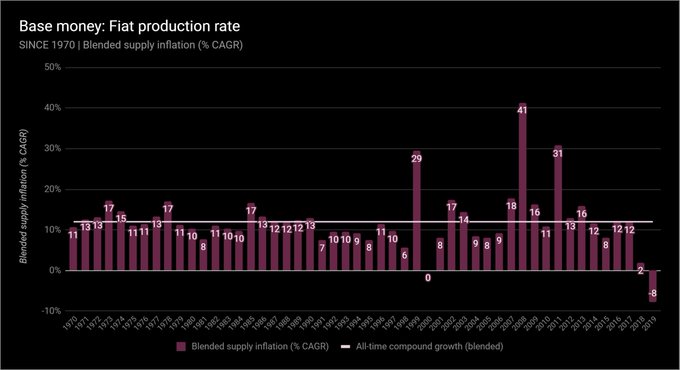
- Quick note on prior slide. What happened in 1999? Ppl were taking cash out like mad before Y2K. Interesting to note, 2018 and 2019’s trend are the lowest (& negative) growth rates of base money ever, as central banks try to unwind the massive stimuli from 2008 through 2013.
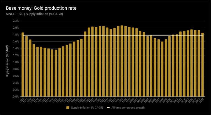
- Here’s gold. Same concept. Notice again the series’ overall compounding will match the summaries we’ve already seen.
- And here’s silver. Same deal.
- And now Bitcoin. Remember why the overall compound growth, thus far, is so high, and why it will never be that high again. And now is about the time for a clarification note on the Bitcoin system’s compound annual growth rate, specifically.
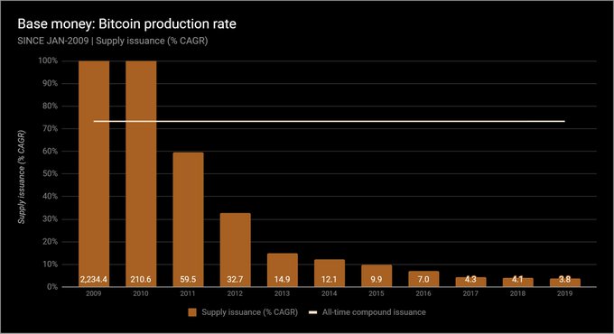
- Notice the phrase “supply issuance” for Bitcoin’s chart titles, & not “inflation.” Bitcoin’s “inflation,” economically, is already “baked in.” Everyone knows its max supply: 21 million coins. As already demonstrated, we can predict its growth rate & doubling rate until 2140.
- The fact that it’s predictable makes all the difference. In money or anything, this is unique. So for Bitcoin’s supply growth, “inflation” is not the best term. “Coin issuance” is more apropos, because the total supply is already known by all… unlike fiat, or even gold!!
- Alright. Now that we’ve seen all the data, let’s finally take a quick detour to some price chat, because even though I told you none of the above covers prices, I know you’re thinking about how all of this monetary inflation has affected or will affect prices.
- Milton Friedman said, “Inflation is always and everywhere a monetary phenomenon.” He meant price inflation (not graphed above) always and everywhere follows money inflation (painstakingly graphed above).
- The rub is it is impossible to predict how and when price inflation will happen. Hate to be the wet blanket, but it’s true. Hyperinflations (of prices) are impossible to predict. The best we can do is measure the money supply and its growth, as we’ve done here.
- But we can say this: If the supply of base money increases, and if there is no or a lesser increase in the demand for that money, then ceteris paribus, prices will rise. Ceteris paribus, a growing base money supply will always undermine that money’s purchasing power.
- A few notes before the final summary. Almost done! Remember these are the top 30 currencies in the world over the past 50 years. Zimbabwe & Belarus don’t make the cut, but as their market size is so tiny, their hyperinflations would barely move the needle on what’s presented.
- For the euro, its accounting creation began in 1999, and it started circulating in 2002. The ECB estimates a physical currency stock back to 1980. So from 1980 until 1999, we do use this physical currency for euro base money inflation, and then add in bank reserves from 1999.
- To be absolutely clear on the global fiat blended inflation rate: it’s calculated using a weighted factor of each country’s base money supply, based on how large their US$ equivalent actually is, during that period. This weight evolves as more currencies are added.
- As mentioned, only about 15 currencies have data back to 1970. For those that weren’t, they didn’t factor into that period. For example, the US dollar’s weight itself was 63% of the pie in 1970, and only 17.5% today, as (among others), data on China begins only in Dec-1999.
- Regarding compound annual growth rates: they’re always calculated from monthly fiat unit growth, then compounded to annual (to the 12th exponent). This is necessary due to cases like Brazil and Argentina, which had 6 and 4 different currencies respectively, since 1970 alone.
- Continuing, a compound annual growth rate from a 1970 currency to 2019 currency doesn’t make sense for Brazil. So the monthly rate must be taken across time and then compounded, ignoring those 6 months when the central bank reset (slashed zeroes) from the old currency.
- And finally, the mechanics of this method (compounding monthly growth rates to annual) were of course repeated across gold, silver, and bitcoin’s supply curves, for consistency.
- On our podcast @crypto_voices, @fernandoulrich I explore the varying economic nuances of Bitcoin as a contender for the global monetary base, for global money.
- To sum it up, this graphic includes all items. Print it out if you like. The base money of 114 nations is reflected inside the top 30 currencies, as well as gold, silver, and the supply of bitcoins. It is a supply-side summary of essentially all base money in the world.
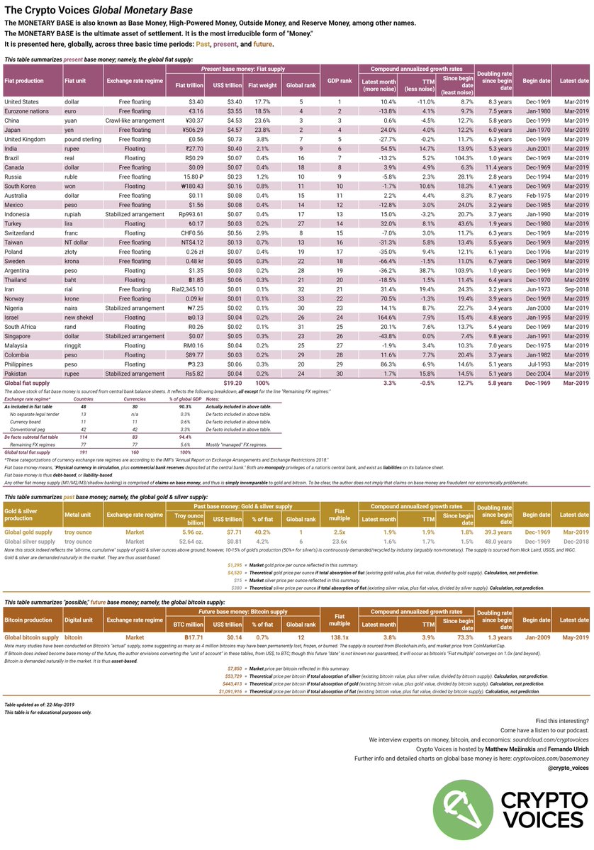
- The exhibits are located here:Base Money — Crypto Voiceshttps://cryptovoices.com/basemoney Fiat base money is sourced from central bank balance sheets, wonderful gold and silver history from Nick Laird, and bitcoin from @coinmetrics and @coinmarketcap.
- These final graphics show how Bitcoin’s supply (US$ equivalent) compares with all other monetary bases, past and present. We have been very pleased that some of #CryptoTwitter has been referring to this as the #RealBitcoinDominanceIndex.
 50.More to come in the future, the 2019 Q2 global monetary base will next be released and covered in depth @hodlhodl ‘s #bh2019 conference in Riga.
/fin
50.More to come in the future, the 2019 Q2 global monetary base will next be released and covered in depth @hodlhodl ‘s #bh2019 conference in Riga.
/fin