Bitcoin by Ross: On Charts
| If you find WORDS helpful, Bitcoin donations are unnecessary but appreciated. Our goal is to spread and preserve Bitcoin writings for future generations. Read more. | Make a Donation |
Bitcoin by Ross: On Charts
By Ross Ulbricht
Posted December 10, 2019
By Ross Ulbricht
Every week I have several Bitcoin charts send in to the prison so I can do my analysis and stay up-to-date (see here for context). They take a few days to get to me and a few days to get back and put up online, so everything you see is at least a week out of date. This is fine though because we will only be looking at large movements in the market on the scale of months, years and even decades. My analysis should still be relevant regardless of what has happened while it’s in the mail, but I will be mindful of this limitation and make note of scenarios that could play out during that time just in case.
The charts we will be looking at show the price of a bitcoin in US dollars over time. (See Fig 1). We are looking at the price in dollars rather than euros or anything else because the highest volume of trade throughout Bitcoin’s history has been in dollars. Our method of analysis, Elliot Wave, is based on mass psychology (see here), so the bigger the market the better.
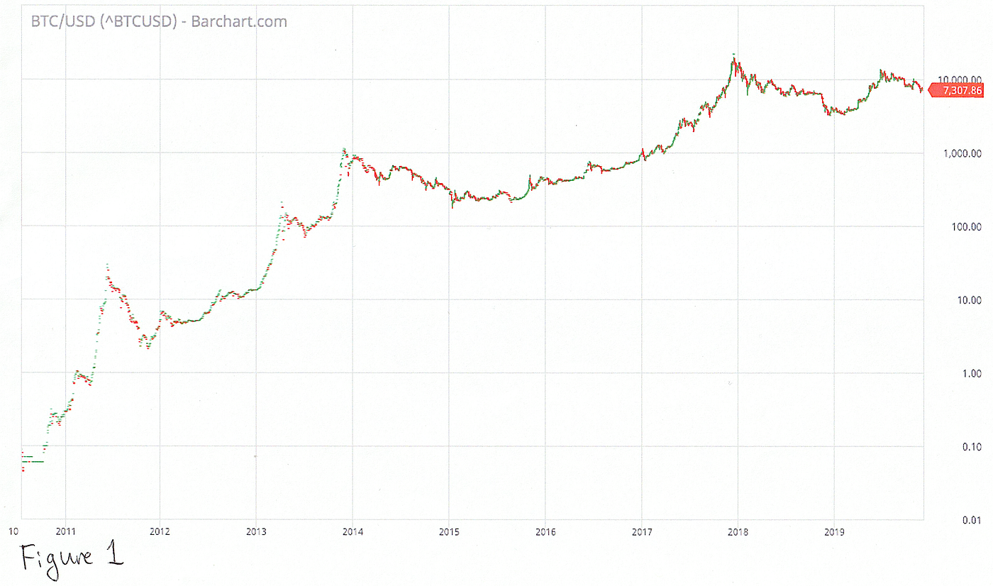
Fig. 1
The charts will be bar charts with the bars set close together. This display shows the full price range at every point, so we can determine if waves overlap (important for Elliot Wave), and it packs in relevant data. I will have to write wave labels and other notes on the charts by hand, but that will be part of the fun.
Finally, the charts will be in log scale. The vertical axis (the price) will increment by powers of ten (10, 100, 1000, etc…) rather than linearly (10, 20, 30, etc…). We do this because the log scale reveals movement in prices relevant to investors, and our thesis is that price movements are driven by the mass psychology of investors.
Let me illustrate with an example. Let’s say you bought $100 worth of bitcoins back when the price was $1. You would have ₿100. If you sold them at $18, you would have ₿1,800 (and you would be very sad today). Now let’s fast forward and the price is $1,000. Again you buy $100 worth, but this time you end up with only ₿0.1. If you sold this at $18,000, you would again have $1,800.
So the move from the $1 to $18 is just as significant as the move from $1,000 to $18,000 because an investor can make the same amount of money from it. On a log chart, these two moves are the exact same size vertically. On a linear chart, the $18 move would be dwarfed by the $18,000 move. You wouldn’t even see it. With the enormous price ranges Bitcoin has been through over the years, linear charts are practically useless for our purposes.
In the next post, we finally start seeing these charts with Elliot Wave analysis applied to them.